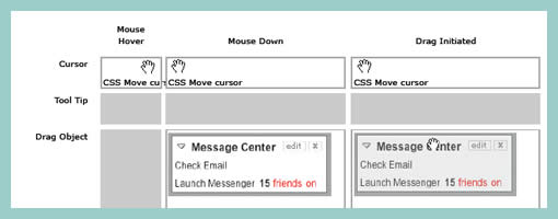
Multiple Elements & State Conditions Matrix
January 4th, 2009
Sometimes multiple elements change at once as a result of one user interaction. This is especially so during draggable interactions. Here is an interesting way of solving that visually by means of a matrix. On the left y axis all of the elements are listed, whereas on the top x axis the various state conditions are displayed.
Credits: Bill Scott


January 7th, 2009 at 2:29 am
I look at this and say "wow" impressive amount of thought and effort. But there seems to be something strangely odd when documenting interaction design. It's like storyboarding, it gives you a sens of what to expect but you don't get the full understanding until you can interact with it. Prototyping this example would probably prove to be a better way at driving towards a clean and graceful solution.
January 8th, 2009 at 12:25 pm
Yes, you are exactly right. Prototyping is the clearest way to express interactive requirements. However, sometimes you don't have time to build the prototype and just need to sketch up some ideas.
Generally the interesting moments grid is just printed out on a big sheet of paper and someone pencil sketches in the various interactions.
At Yahoo! I did this to capture the initial requirements for the YUI drag & drop library. We also did the same for inline editing and other rich interactions. That worked well. Before I developed this grid I had a 20 page document describing all the nuances for various drag drop scenarios. Once the matrix was done, then prototypes were built for our usability testing. The usability researcher also found it very helpful as he could easily build test scenarios around different interesting moments to see if users really got it or not.
Also, I have used it to post document the My Yahoo! drag and drop (which I used this matrix to help in the initial attempts at how it would play out [along with other designers]). The post documentation (or reverse engineering of the interaction) made it easy for other groups to understand what they might want to consider.
Here at Netflix we are doing a lot of testing around making the queue's drag and drop more discoverable, etc. Having the interesting moments grid made it easy to capture our discussions and flesh out several use cases.
Finally, I used it in my book, Designing Web Interfaces to explain the nuances of various drag & drop implementations.
As with all things in design there are many tools. And depending on how big teams are or how much communication has to go across teams will determine how useful these types of tools are (I use it sometimes to just check myself or validate that I am handling all the moments I need to).
January 22nd, 2009 at 1:17 pm
I've also used a variation of this matrix (inspired by Bill's example at a conference), to storyboard events in new functionality. While I fully agree that prototypes are the best proving ground, being able to document a base flow and set of functions helps development teams get a testable prototype built that meets the minimum needs of the designers…especially useful when the designers and development teams are somewhat spread out in the company.
There's also some indication in this artifact that sufficient research and thought has gone into the design process, if validating a business case is still neccessary.