Posts Tagged ‘user journey’

Business Model Canvas – Facilitator Cards

Friday, December 10th, 2010


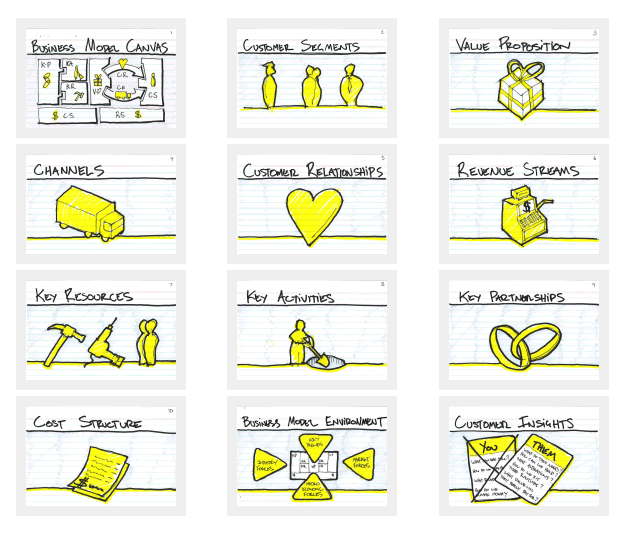
Jason does quite a lot of collaborative sketching, business modelling and multidisciplinary design workshops. Recently he shared a set of downloadable cards in PDF form that are aimed at helping to facilitate such sessions. The cards help move the conversation away from the tactical nature of interface design to more high level business strategy with keywords such as: customers, channels, cost structure and value proposition. Additionally, he also wrote up an awesome blog post about facilitating a collaborative process, which sheds more context into how these cards could be used. It’s always interesting to see design intersect with other disciplines (such as business in this case). Thanks Jason!

Credits: Jason Furnell

Grand Narratives & Play Points

Wednesday, April 21st, 2010


We can experience tiny operational interactions and we can experience grand narratives. Perhaps there is room for both of these when we think through and visualize experience, flows and time. Here is a quick idea to support these in an electronic sketch. A thicker line is basically used to denote the bigger story which is more linear, whereas the smaller interactions such as onlicks, hovers and drags are represented in a thiner style. The grand narratives also have starting points denoted by “play points”. These could be used to help guide readers to the important beginnings in a sea of little boxes. Just thinking (uhmm… I mean drawing) out loud. What do you think?

Credits: Jakub Linowski

Blueprint+ (Service Design Visual)

Wednesday, April 14th, 2010


The academic group over at Hochschule Luzern (Competence Center) in Switzerland have recently explored a visual representation that captures the interaction of various people across multiple services or touch points. Done in the context of a service design assignment, the Blueprint project portrays the flow of time horizontally and captures multiple actors vertically. More so, the visualization also layers additional data underneath and contains such things as fail lines, emotions and costs, while at the same time leaving more room for additional variables. In some way, the deliverable shares some resemblance to the Experience Maps posted earlier.

As an additional note, Blueprint+ is still a work in progress and will be turned into a toolkit in the future. Stay tuned. :)

Credits: CC Explanations and Services, Hochschule Luzern (Andy Polaine, Roman Aebersold, Robert Bossart and Andrea Mettler)

Experience Maps

Wednesday, February 24th, 2010


An interesting depiction of user experience has surfaced the other week over at the nForm blog in the form of an experience map. Gene and his team has come up with a way to represent gaming related experiences of three distinct gamers. In a way then this is a merger between a persona and a time based representation. The other interesting thing about this is the visualization and separation of at least three types of experiences: ongoing, exploratory and influenced. Each type of experience has been shown in a standardized and specific way. Furthermore, the diagram also captures and represents a variety of channels which the personas are utilizing at a given point in time. Overall, it’s always interesting to see when designers attempt to convey such comprehensive and unified high level deliverables.

Credits: Gene Smith of nForm

Dwell Time Diagram

Friday, November 27th, 2009


Here is an interesting idea of showing a user’s experience in the context of multiple browser tabs. In the modern browser it’s quite popular that people spend their attention in various modes of activity as they switch back and forth. Nik here tried to capture just that in a diagram which shows the currently selected tab over time. I guess it’s interesting to see a sample which aims to represent multiple potential activities that the a person can engage in, instead of a single over simplified linear one. Even more generally, a diagram such as this perhaps could even step above tabs and represent tasks or activities outside the browser just as well. Nik writes:

I’d like to share a little chart I put together to illustrate the concept of Dwell Time. This has come up more and more recently as clients are asking if the recent trend in tabbed browsers is responsible for an observed upward trend in reported dwell times.

I think one thing we should bear in mind is that a high dwell time can be both good and bad, not just because we may be including time spent on another site (in another tab), but also a high dwell time on an experiential site would be considered a good thing. However similar values on a registration form may suggest usability issues.

Credits: Nik Lazell

Multiuser WireFlows

Tuesday, October 6th, 2009


I enjoy seeing flows which try to capture more complex activities. After all, interfaces are under constant strain from various people which use it in a multitude of ways. Carlos has just shared a sample which represents a flow containing at least three different persons attempting to interact with the same interface. The different coloured paths uniquely indicate how the different users take twists and turns over the same screens. Come to think of it, the various users which start off the flow, could just as well be replaced with various use cases belonging to the same person type.

In his own words:

It shows three different persona on a navigational journey through a cross-linking architecture, that takes them through 2-3 different sections of a site — not including the home page, from which they all start. The “Self Referral” persona goes through three sections or the site: Who We Serve, Outcomes & Case Studies, and Services on their path.

The journey starts with the informational intent of the persona. From there you can follow their journey via a line colored for that persona, which describes action-events in brief notes on the line itself. The page thumbnails are the actual wireframes shrunk down. This document is meant to be read along side the wireframes, casting light on them, and vice versa.

Credits: Carlos Abler

Sketching Alternative and Social Activities

Friday, February 20th, 2009


Recently as I was thinking about an assignment of designing a new playlist system at work, a number of ideas collided all into one and resulted in this design sample. The desire was to explore alternatives, quickly, of high level activities, which would have to support interactions between a number of actors or people. So I jumped back into pencil, paper and marker mode. As simple or obvious as it may seem, what I think might of worked well worth noting is the use of colours to denote different (or same) people. Another thing that perhaps worked out was the use of one activity as a starting point in the center and then branching out toward alternatives.

I think this little sample was influenced by other’s work as well worthy of noting. First of all, here at TU Delft we were exposed to quite a bit of mind mapping exercises which in a way resemble the interface sketches of Jonas Löwgren. Then again, this sample also shares the high level characteristics of a user journey submitted by Steve Johnson. Finally, as I’ve written in my personal blog I’ve also began questioning the sterility of one path user flows wondering about how to explore the diversity of activities.

The sample isn’t perfect, and as is argued in Pencils before Pixels, the lower the fidelity of the sketch the harder it is to use it to communicate with others. However when I showed the sketch to others, and supported the sample verbally, it enriched the conversations.

Credits: Jakub Linowski

User Journeys

Wednesday, January 7th, 2009


Steve sent me a User Journey sample today and I thought it was pretty interesting. Besides there being an article on Boxes and Arrows on this technique, perhaps I can add my 5 cents on what I am seeing here. Other than the iconographical style, two important ideas become apparent. First, the duration of the interactions in this visual are wider than usual. Typical user flows represent quite narrow time lengths, whereas the deliverable shows interactions spanning out over the weekend, and even a month afterwards. Secondly, the computer screen is represented as only one item in a bigger context of the physical world. The little people here interact with other physical objects such as magazines, MP3 players and PDAs. Taken together I find this sample as an interesting way to think and represent activity beyond the desktop screen within a richer reality.

Here is also what Steve writes:

I have been working on creating these 3D characters for some time now to bring to life some (often boring) User Journeys for our clients.

I have used them several times in pitches and key stakeholder meetings and they seem to be well received, while at the same working as a good platform to get our ideas across. Clients seem to get things more easily when they are illustrated or drawn out in front of them. I have also found people are more likely to contribute in meetings if they see ideas detailed in this way. If I have the library of assets with me, I can easily (using omnigraffle or equivalent) add their idea to the diagram in the meeting, increasing their sense of participation.

And just because you are illustrating your User Journey it doesn’t mean you are trying to dumb the information down. Before I create a diagram like this one I make sure I sketch out my ideas with a pencil and paper before hand to ensure all bases are covered.

Credits: Steve Johnson