Posts Tagged ‘sticky notes’

Rigged Stop-Frame Paper Prototype Animations

Thursday, December 10th, 2009
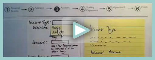

Superb. Very similar to the previous post on Protocasting, here is Chris’ approach to creating quick paper prototype animations which tell stories of rich interaction. This stop-frame animation approach requires a web cam, some video editing software (Quicktime in this case) as well as a desk attached rig to ensure things are visually stable. For showing changing text, Chris uses an erasable pen and overlaid acetate on top of the desk which he calls ‘the stage’. This powerful technique, which portrays interaction seamlessly, is a critical move forward if we are to battle change blindness brought on by shuffling disrupted and disjointed screens. In his own words:

The desk is the stage, and the action is framed inside a print-out of an empty browser to give it context. I wanted it to look so simple and sketchy that nobody could possibly confuse it with a design, so I used paper, card and Post-Its to build up the scene and laid a sheet of acetate on top, which I wrote on with OHP pen. There’s a rather crude cardboard mouse-cursor and a rotating paper ‘in progress’ icon.

There are 8 animations in total, each of which illustrates part of a user journey through the form and highlights complex validation behaviour I’d found tricky to explain. I was a bit worried that the developers might think it was gimmicky, but the novelty wore off quickly and they rapidly moved on to focus on the content. Because the videos illustrated a lot of the main ideas, everyone involved was spared long, tedious meetings talking about display conditions and validation behaviour. This was a big win.

The whole process is really quick and, most importantly, fun – developers and stakeholders engage fully even with dry subject matter. Non-techies can get involved too because the animation software only has about 3 buttons. Unlike with Flex or AJAX, there’s no learning curve.

Animation is famous for taking ages, but doing animations like mine is remarkably quick providing you’re tooled up and organised. It took me about half an hour to set the scene, based on some wireframes we’d already done. Then each animation took about 15 minutes.

Credits: Chris Neale

Net-Maps

Monday, November 30th, 2009


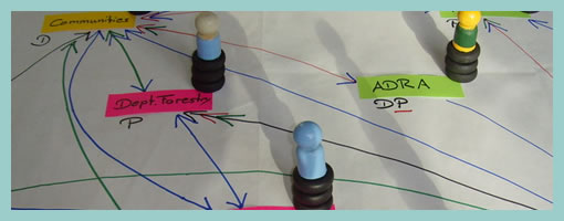
The Net-Map Toolbox is collaborative and physical tool developed by Eva Schiffer with the aim to visualize influencers in a social context. The maps generated with this approach are a snapshot of a social setting with key influencers being emphasized (raised). I found it interesting to see an attempt to capture more complex social situations with multiple people in the equation. In Alan Cooper’s book, The Inmates Are Running the Asylum, the traditional direction given was to design for a single user. Could this rule be breaking down today in light of designing for more complex contexts? Here is a description about the toolbox directly from the Net-Map website:

Net-Map is an interview-based mapping tool that helps people understand, visualize, discuss, and improve situations in which many different actors influence outcomes. By creating Influence Network Maps, individuals and groups can clarify their own view of a situation, foster discussion, and develop a strategic approach to their networking activities. More specifically, Net-Map helps players to determine

* what actors are involved in a given network,
* how they are linked,
* how influential they are, and
* what their goals are.

Credits: Eva Schiffer

Prioritized Stickynote Requirements

Thursday, September 17th, 2009


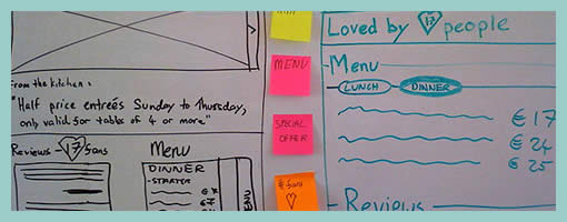
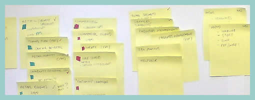
Des just sent me a link to where he describes his early design process with a few whiteboard wireframes. One thing he does is create some sort of inpage requirements with the help of sticky notes which are placed alongside the UI work for inspiration. These rough and abstract textual ideas or requirements guide his thinking during the wireframing process. More so, he goes even further and uses colour coded stickies to denote priority.

In his own words:

They’re colored by importance. For this project it was:
Yellow = super important, site is useless without
Pink = nice to have, but requires restaurant owners to do some work
Orange = social features, relies heavily on people using the site (might not be there at all).

At the same time, I also found it very interesting that Des explores variations or alternatives as not to fall into the pattern trap. There is another interesting article related to this which he wrote about, Thinking in Patterns, on his company blog.

Credits: Des Traynor

Hybrid Stickyframes

Tuesday, July 21st, 2009


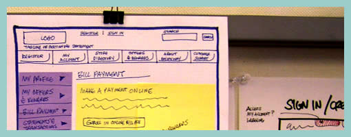
Keith relies on a similar technique to the Stickyframes approach posted earlier. His approach differs in that it mixes a number of techniques together. These hybrid interface representations mix sticky notes with sketching, sketches with flows, and anything else he comes up he just posts up and groups on a wall in a sketchboarding manner. Here is what Keith writes:

I’ve been creating wireframes since the late nineties and in retrospect have always relied on hand sketching and rapid ideation to solve my UI/UX problems.

This example is not unlike the Stickyframes example currently posted on your site. The difference with my approach is that I use color to begin to organize the chuncks of content or functionality. I also attach sticky notes containing mindmaps, flows, or mini sketches of interfaces. The grouping of ideas and sketches stay put until I have sorted out the actual page layouts to be rendered in Visio or AxureRP. The result is a moodboard for ideas which allows me to swap out thoughts until ideas are fully baked. I’ve had success sharing these with clients and collaborative teams early on in the process because they appear to be work in progress.

While I love working at a larger scale on whiteboards, these are a portable alternative for negotiating screens.

Credits: Keith Tatum of Resource

Sticky Note Pulldown Menus

Friday, March 13th, 2009


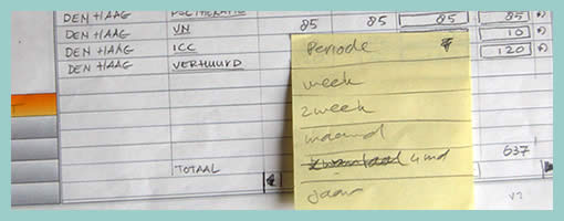
While sketching a user interface with the client, in this example popup overlays or pulldown menus have been drawn up using sticky notes. This technique has been around for a while (as probably seen in a lot of paper prototyping sessions) since it makes perfect common sense. Sticky popups stand out from the background noticeably and also can be easily removed and reattached as desired, which makes them ideal as a solution.

Credits: Hans Nieuwenburg

Sticky Sitemaps

Friday, February 27th, 2009


The need for flexible design documents such as sitemaps has already been noted in the past. In this example however, instead of using the computer, a very similar style of exploring and representing site structure has been accomplished with the use of sticky notes. Indentation has been applied to the stickies in order to suggest multiple levels of structure. Why not just do it on the computer then? Well, I think that such a rough approach invites more collaboration and input from others. Paper, sketching and stickies all invite change and feedback more so than computer based tools. Here is what Dave has to say:

It is an early stage in the development process, and the use of post-its allows quick iterative thinking, and opens collaboration across the project team. Taking photos at different stages meant that versions can be kept. This was the final version, before being drawn up in Illustrator for client sign-off.

Credits: Dave Needham

Stickyframes

Tuesday, January 13th, 2009


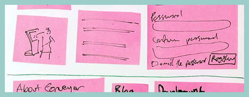
There is a fuzzy line between what constitutes a paper prototype and a wireframe sketch loaded with sticky notes. Although Danny originally tagged them as prototypes (which is perfectly valid in my opinion), I would like to expand the possibility that such design representations may have uses beyond paper prototyping. Instead, sticky paper can also be used in the conceptualization stage in which wireframe generation and sketching fall into. Could this then be called a stickyframe?

Stickyframing, or the idea of using sticky notes combined with sketching can bring great value for a design process. The strength of such a combination is the decreased effort for changes or modifications provided by stickies, while at the same time having the immediacy and flexibility of ideation that sketching allows. Sometimes during paper sketching we’ll draw out an interface element and then we’ll want to reposition it. At other times, we’ll want to redraw an element while the remaining interface parts are perfectly fine. In both of these situations, we’re often forced to redraw the whole page view as we generate more design knowledge. Stickies of course help combat such inefficiencies.

On the same note, an emergent thought comes to mind which further could extend stickyframes – digital photography. Just the same way as Danny Hope took pictures of the various page views and posted them on flickr, the same could be done in a design setting. Photography could not only allow for the various interface states to be frozen as a future reference. More so, photographing sticky wireframes could allow for a reuse of various elements (or their states) across different pages. It’s just a thought, as the fight for increased document agility continues on.

Credits: Danny Hope