Posts Tagged ‘user flow’

Large Canvas Flows + With References

Tuesday, September 4th, 2012


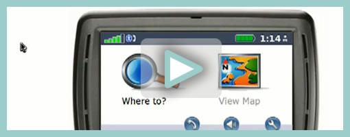
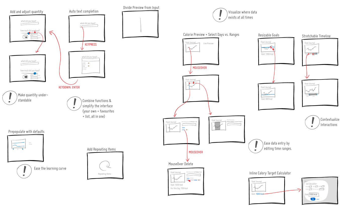
I like spacious canvases with non-linear flows, and here is a work sample from a fellow designer which shows just that. If one can move away from the outdated convention that interaction designers create screens, towards what Bill Buxton calls the stuff “in between the screens”, then it doesn’t take long to realize that larger workspaces are the way to go. In this example of a mobile app, Anton used Omnigraffle and some inspiration from UML to pull off a few interesting things which I thought might be worthy of highlighting:

  • Merging of wireframes with flows. As the above artifact mixes readable screens with flows or user actions, the element of time and narrative begins to emerge. Since the flow diagram is inseparable from the wireframe, it also saves the designer from the extra effort of synchronizing multiple documents.
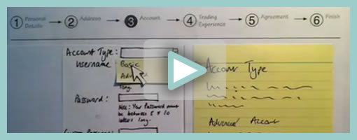
  • Transition references. Although not visible in the sample, the blue circles are actual links to .mov files that show short video demos of the transitions. Wires plus video feels fresh!
  • Screen references. All of the screens have an ID tag, and occasionally actions lead to screen references instead of full screens – a way of reusing and again minimizing duplication efforts. Also each screen links to a folder with source PNG layout files.
  • Action references. Most user actions here also have an ID with a distinct style and can therefore also be referred to.
  • Starting Point. Since the canvas is quite large it has a clear starting point to guide the viewer.
  • Layout structure. In the top right of the canvas, the core structure of the layout along with some popular components are explained.
  • Toggle-able layers. Various information is kept separate on distinct layers and so that it’s possible to toggle it on and off for various audiences.

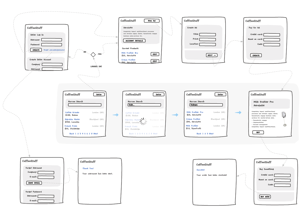
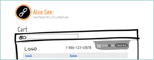
In comparison to the above, I have to say that the way in which I do my work is very similar by relying on cross document references. This hierarchical documentation structure (where wires cover the widest scope and prototypes the narrowest) allows designers to focus on what’s necessary at a particular level of fidelity. Below is how I reference visual design mockups within wireframes or sketches (with an “Also See” + filename tag). Again, keep in mind that in my case, only certain screens need and/or have references to more detailed assets.

Anyhow, thanks Anton for sharing!

Credits: Anton Volkov (main sample) & Jakub Linowski (second sample)

Speech Bubble User Flow

Thursday, March 29th, 2012


The Speech Bubble User Flow by Barnabas, is a hybrid representation that combines a sitemap, persona and user flow all into one. The idea starts off by overlaying simple and short comments made by a persona in the form speech bubbles on top of a structured sitemap. More so, the speech bubbles are ordered chronologically and so flow through one by one. In the built Axure Demo that has been generated, the sitemap pages are also linked to the wireframes which makes it easier to switch from the generic to the specific. Barnabas has been exploring Personas that “could talk” in a few other forms as well, as the Complex Speech Bubble Persona and the Commented Sitemaps show.

My take on this deliverable would be that Personas can sometimes get lost once a project builds momentum. Possibly what Barnabas is doing is helping the Persona to live a little bit longer and inspire the team a bit more as the Persona’s comments pop up throughout the project. One thing I do wonder about is how this would work though if there was a second or third scenario for the same user type, as sometimes I feel that interactive projects are composed of many little separate user stories and not just one. Either way, good stuff and thanks for sharing!

If you would like to tweak the deliverable, the author has been kind enough to share the actual source Axure file as a downloadable template.

Credits: Barnabas Nagy

Grand Narratives & Play Points

Wednesday, April 21st, 2010


We can experience tiny operational interactions and we can experience grand narratives. Perhaps there is room for both of these when we think through and visualize experience, flows and time. Here is a quick idea to support these in an electronic sketch. A thicker line is basically used to denote the bigger story which is more linear, whereas the smaller interactions such as onlicks, hovers and drags are represented in a thiner style. The grand narratives also have starting points denoted by “play points”. These could be used to help guide readers to the important beginnings in a sea of little boxes. Just thinking (uhmm… I mean drawing) out loud. What do you think?

Credits: Jakub Linowski

Blueprint+ (Service Design Visual)

Wednesday, April 14th, 2010


The academic group over at Hochschule Luzern (Competence Center) in Switzerland have recently explored a visual representation that captures the interaction of various people across multiple services or touch points. Done in the context of a service design assignment, the Blueprint project portrays the flow of time horizontally and captures multiple actors vertically. More so, the visualization also layers additional data underneath and contains such things as fail lines, emotions and costs, while at the same time leaving more room for additional variables. In some way, the deliverable shares some resemblance to the Experience Maps posted earlier.

As an additional note, Blueprint+ is still a work in progress and will be turned into a toolkit in the future. Stay tuned. :)

Credits: CC Explanations and Services, Hochschule Luzern (Andy Polaine, Roman Aebersold, Robert Bossart and Andrea Mettler)

Experience Maps

Wednesday, February 24th, 2010


An interesting depiction of user experience has surfaced the other week over at the nForm blog in the form of an experience map. Gene and his team has come up with a way to represent gaming related experiences of three distinct gamers. In a way then this is a merger between a persona and a time based representation. The other interesting thing about this is the visualization and separation of at least three types of experiences: ongoing, exploratory and influenced. Each type of experience has been shown in a standardized and specific way. Furthermore, the diagram also captures and represents a variety of channels which the personas are utilizing at a given point in time. Overall, it’s always interesting to see when designers attempt to convey such comprehensive and unified high level deliverables.

Credits: Gene Smith of nForm

Use Case Maps

Friday, February 19th, 2010


Speaking with Greg the other day I learned about Use Case Maps. This notation which has been initially the work of Raymond Buhr, has its roots in software engineering and perhaps could be an area to draw inspiration from. Use Case Maps intend to convey sequences of events by showing the paths of users over a backdrop of structured system representations. With these flexible scenario-like visualizations, software engineers ensure that the element of time is considered. As part of the notation, Use Case Maps have starting and stopping points and can also branch out. It seems like Daniel Amyot has contributed to this work as well and has published a decent Quick Tutorial with a reference guide at the end. In a nutshell, here is what Daniel writes about the philosophy of UCM:

The Use Case Map notation aims to link behavior and structure in an explicit and visual way. UCM paths are first-class architectural entities that describe causal relationships between responsibilities, which are bound to underlying organizational structures of abstract components. These paths represent scenarios that intend to bridge the gap between requirements (use cases) and detailed design.

Credits: Raymond A. Buhr & Daniel Amyot

Tablet + Illustrator: the Case for Electronic Sketching

Thursday, February 4th, 2010


It’s probably nothing new that the sketch has been gaining quite some attention lately as a powerful design tool. Some UI designers have began to precede wireframing and prototyping with free-form pen and paper approaches that afford exploration and support a wider diversity of ideas. For over a year now, in my design process I’ve started doing just the same right after I picked up a set of markers and sketch pads. Looking back, sketching has been wonderful at giving rise to design representations that naturally act as conversation starters and therefore make sketching more so compatible with agile philosophies. However, traditional pen and paper has a few limitations which over the last few months became noticeable. As a reaction to this, I grabbed an Intuos 3 from Wacom, installed Adobe Illustrator and began sketching electronically using a pen and tablet. Finding the new approach superior, I have doubts I’ll ever go back to paper and wanted to share some of the reasons why.

Scaling

Like it or not, design ideas need to scale over time and good tools provide room for such growth. One thing that I love about Illustrator (which paper lacks of course) is that the art board or workspace can be stretched as needed whenever concepts need the extra room. The flexibility to resize the canvas is a really great feature especially during early ideation when multiple screens need to be shown together to tell a meaningful story. On the same note, another way Illustrator excels is in terms of a scalable fidelity. Whereas early on in a project the amount of detail might be small, over time however, the fidelity of an electronic sketch has the potential to develop. In a vector environment it is super easy to take a small UI sketch, stretch it to a larger size, and inject more detail inside of it.

Ease of Editing

Yes, in the real world we have pencils, erasers and the ability to redraw or correct our sketches to some degree. We can however only correct our paper sketches somewhat before they becomes unreadable. This isn’t the case with anything electronic or digital where cutting, deleting, undoing, redoing, erasing is second nature. A very common scenario is to draw different screens and only learn eventually that it makes sense for the two or three screens to be placed together – something that is very easily done by reorganizing or repositioning on the computer. Another superb thing about Illustrator is the ability to select a line and just redraw it, causing it the take on the new form. This of course can be done an unlimited amount of times in an electronic tool.

Legibility

Although this might not be the case for everyone out there, I personally find that my hand writing is very hard to read. Unless I spent extra care and time to write legibly, I find that on the computer it is way easier and quicker to type out text that can be read by others.

Carelessness

When I am about to sketch on paper, knowingly that it will be harder to undo, I hold myself back and think twice before the ink or lead leaves a mark. This slow down or inefficiency can be easily overcome in the electronic world with a tablet pen. When I sketch electronically, this worry disappears as I know that I don’t have to generate the right ideas, but instead can easily correct myself if something needs adjusting. This careless quality of electronic sketching brings forth immense value by affording greater exploration to occur more freely.

Reuse

Illustrator allows to create symbols of artwork very easily which in turn speeds up exploration ever more. Let’s say you have the same screen or component which you want to use a number of times across your work. Dragging the selection into the symbols palette allows you to reuse or instantiate that artwork and still have the ability to edit it in one location with it updating throughout. This is simply a superiority that paper cannot compete with.

The above are the reasons why I moved in the direction of electronic sketching. Perhaps the use of paper can still be justified in collaborative sketching sessions when there are more than one designer at the table and the design activity happens simultaneously in real time. For the remaining times, I find that the electronic sketch offers advantages over paper that are just too good to pass.

Credits: Jakub Linowski

OmniGraffle Wireflows

Tuesday, December 29th, 2009


Andreas just sent in a sample of a wireflow done in Omnigraffle (here are a few more) which I thought was an interesting show. It contains a sketchy style, conditionals, and groups a set of pages together with a grey background area. Most recently, this way of working is also my personal preferred approach to communicating UI concepts. Not only does a deliverable like this convey activity more clearly, but it also provides a sense of scope in one snapshot. One problem with these wireflows which I’ve seen in the past is when the design proceeds further and more detail is required. Often in this situation I fall back and develop wireframes. This however duplicates the documentation which is undesirable from a maintenance perspective. Come to think of it, perhaps there is a way to reference occasional detailed wires, on demand, from within a wireflow diagram. Anyhow, here is what Andreas has to say:

I’ve got a combination wireframe/sitemap that I thought I’d share with you. Adequately called a WireMap. It’s a tool I started using in an attempt to get an overview of small to mid-sized web projects. (The limit is self-imposed. I like printing my work on paper and hanging it around the office. And there’s only so much information you can fit on Tabloid or A3).

Using the wiremap has been a boon both in talking to the internal team as well as taking to clients. In either case it helps the audience grasp the scope and complexity of the project. I’ve found it very helpful in the formative stage, but I see no reason why it couldn’t also be used later on in the development cycle as well.

My approach to this is the combination of wireframe sketching (for which I use Konigi’s Sketch stencil for OmniGraffle) in combination with J.J.Garrett’s IA templates (another OmniGraffle stencil). The result is very much a WireMap in that sense of the word—a site-wide visualization with some page detail (enough to provide an idea of the page’s purpose) as well as some rudimentary logic.

I’ve attached an example showing a WireMap of a mock website called CoffeeStuff. I’ve tried to keep it simple but could easily elaborate more if you think it worthwhile. Didn’t want to overwhelm the reader, but I’m keen to hear your thoughts as well. The map is by no means bulletproof, but I think it does a good job of introducing the general concept.

Credits: Andreas Holmer

Rigged Stop-Frame Paper Prototype Animations

Thursday, December 10th, 2009


Superb. Very similar to the previous post on Protocasting, here is Chris’ approach to creating quick paper prototype animations which tell stories of rich interaction. This stop-frame animation approach requires a web cam, some video editing software (Quicktime in this case) as well as a desk attached rig to ensure things are visually stable. For showing changing text, Chris uses an erasable pen and overlaid acetate on top of the desk which he calls ‘the stage’. This powerful technique, which portrays interaction seamlessly, is a critical move forward if we are to battle change blindness brought on by shuffling disrupted and disjointed screens. In his own words:

The desk is the stage, and the action is framed inside a print-out of an empty browser to give it context. I wanted it to look so simple and sketchy that nobody could possibly confuse it with a design, so I used paper, card and Post-Its to build up the scene and laid a sheet of acetate on top, which I wrote on with OHP pen. There’s a rather crude cardboard mouse-cursor and a rotating paper ‘in progress’ icon.

There are 8 animations in total, each of which illustrates part of a user journey through the form and highlights complex validation behaviour I’d found tricky to explain. I was a bit worried that the developers might think it was gimmicky, but the novelty wore off quickly and they rapidly moved on to focus on the content. Because the videos illustrated a lot of the main ideas, everyone involved was spared long, tedious meetings talking about display conditions and validation behaviour. This was a big win.

The whole process is really quick and, most importantly, fun – developers and stakeholders engage fully even with dry subject matter. Non-techies can get involved too because the animation software only has about 3 buttons. Unlike with Flex or AJAX, there’s no learning curve.

Animation is famous for taking ages, but doing animations like mine is remarkably quick providing you’re tooled up and organised. It took me about half an hour to set the scene, based on some wireframes we’d already done. Then each animation took about 15 minutes.

Credits: Chris Neale

Protocasting

Tuesday, December 8th, 2009


Here is an interesting description of a protocasting technique brought to you by Theresa Neil (which she credits to Todd Zaki Warfel’s book on Prototyping). Basically a bunch of screens are first exported into PDF, then turned into a clickable prototype, and eventually a happy path is recorded as video and annotated with audio. I think it’s great to see an approach to prototype walk throughs which alleviates the pressure on the viewers to discover the interaction by themselves (a problem present in many prototyping tools these days). Instead, the viewer is guided through time and the designer covers the intended flow as a presentation. If prototyping is partially about leading the viewer to believe that the fake product is a real one, then Theresa’s protocasting approach achieves this perfectly.

Credits: Theresa Neil