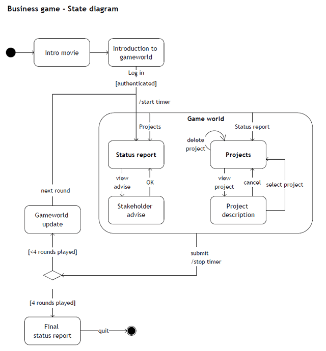
Posts Tagged ‘user flow’

Dwell Time Diagram

Friday, November 27th, 2009


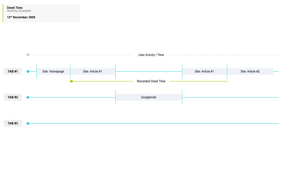
Here is an interesting idea of showing a user’s experience in the context of multiple browser tabs. In the modern browser it’s quite popular that people spend their attention in various modes of activity as they switch back and forth. Nik here tried to capture just that in a diagram which shows the currently selected tab over time. I guess it’s interesting to see a sample which aims to represent multiple potential activities that the a person can engage in, instead of a single over simplified linear one. Even more generally, a diagram such as this perhaps could even step above tabs and represent tasks or activities outside the browser just as well. Nik writes:

I’d like to share a little chart I put together to illustrate the concept of Dwell Time. This has come up more and more recently as clients are asking if the recent trend in tabbed browsers is responsible for an observed upward trend in reported dwell times.

I think one thing we should bear in mind is that a high dwell time can be both good and bad, not just because we may be including time spent on another site (in another tab), but also a high dwell time on an experiential site would be considered a good thing. However similar values on a registration form may suggest usability issues.

Credits: Nik Lazell

Multiuser WireFlows

Tuesday, October 6th, 2009


I enjoy seeing flows which try to capture more complex activities. After all, interfaces are under constant strain from various people which use it in a multitude of ways. Carlos has just shared a sample which represents a flow containing at least three different persons attempting to interact with the same interface. The different coloured paths uniquely indicate how the different users take twists and turns over the same screens. Come to think of it, the various users which start off the flow, could just as well be replaced with various use cases belonging to the same person type.

In his own words:

It shows three different persona on a navigational journey through a cross-linking architecture, that takes them through 2-3 different sections of a site — not including the home page, from which they all start. The “Self Referral” persona goes through three sections or the site: Who We Serve, Outcomes & Case Studies, and Services on their path.

The journey starts with the informational intent of the persona. From there you can follow their journey via a line colored for that persona, which describes action-events in brief notes on the line itself. The page thumbnails are the actual wireframes shrunk down. This document is meant to be read along side the wireframes, casting light on them, and vice versa.

Credits: Carlos Abler

UI Flow Shorthand Notation

Tuesday, September 22nd, 2009


Amongst screens and wireframes, as interaction designers it is always important to consider the time element which binds and glues interface forms with human activity. Ryan Singer of 37signals just wrote an awesome little article about a quick way of noting down one of the common time-based documents we deal with – user interface flows. His shorthand version of a flow relies on making clusters composed of interface states or screens (above a horizontal line) and the actions which users take (below a horizontal line). These interface-action combinations are then transformed into a flow with the help of arrows that show possible sequences.

As basic as the approach sounds, it offers something quite unique in its potential for flexibility. Interestingly, Ryan has figured out a new way of how to represent alternative user actions per each screen (something I haven’t seen done before). These various actions which the users may take, can be separated out using a dotted line. More so, the notation also allows to visualize combined interface results stemming from a single action with the help of forking or branching arrows.

Overall, in an agile fashion, Ryan does not give much weight to these documents. Just like any other light and sketchy work, he hints at these flows being ephemeral and perhaps even a bit self-targeted:

Now don’t forget: all diagrams are destined for the garbage. The meaningful work is work that directly affects our customers as screens they can see or code that functions. But we still need to communicate and manage our work along the way. This shorthand has met a bare minimum for me to get a flow out of my brain in order to move on to other things. I hope it’s useful for you too.

Credits: Ryan Singer

Mixed Scale Wireflow

Thursday, August 13th, 2009


Scott’s sample shares resemblance to the previously shared wireflows posts here and here. One thing it does a bit differently however is that it combines interfaces representation which differ in size or scale. Larger screens are mixed with smaller ones. More so, this example here also represents both interface screens (or what the users see), as well as user activity (or what the user does).

Credits: Scott Dudley

Sketchboarding

Tuesday, May 5th, 2009


A collaborative sketching technique has been emerging from the people over at Adaptive Path, known as sketchboarding. A large sheet of paper is hung on the wall onto which additional pieces of paper are attached with the help of drafting dots, containing sketched ideas of different levels of fidelity. I find at least two things that stand out with this approach. First of all, inspirational material such as personas or requirements are used as a starting point to drive the conceptualization process. These materials are intentionaly placed on the left hand side of the sketchboard in close proximity to the wireframes. Secondly, the defined space where ideas are to be attached is stretched by design which invites exploration and refinement. Overall, this collaborative sketching technique works nicely as it also provides a bigger picture which can also be taken down and physically relocated if necessary.

Brandon has covered the technique quite in depth along with a video. Dan and Leah have also done a presentation about the approach in PPT format. More recently also, the following samples (along with templates) have been presented at the 2008 CanUX conference.

Credits: Leah Buley, Dan Harrelson & Brandon Schauer

UML State Charts

Monday, March 9th, 2009


Here is an interesting way of approaching state changes using UML notation, and more specifically state charting. Perhaps the learning curve of documenting such technical interactions is not the lowest. However, once the team agrees on using such an advanced notation system, the represented interactions and state changes can be explored with greater accuracy and detail. Some interesting symbols include: loops which imply refreshes; brackets which suggest conditionals; forward slashes which suggest system actions; and larger rounded area containers representing nested states which are always accessible.

Yohan also sent me two interesting UML references. One simpler PDF reference explains very well the notation used in the above example, and a second extended reference explains additional UML diagramming notations.

Credits: Yohan Creemers

Sketching Alternative and Social Activities

Friday, February 20th, 2009


Recently as I was thinking about an assignment of designing a new playlist system at work, a number of ideas collided all into one and resulted in this design sample. The desire was to explore alternatives, quickly, of high level activities, which would have to support interactions between a number of actors or people. So I jumped back into pencil, paper and marker mode. As simple or obvious as it may seem, what I think might of worked well worth noting is the use of colours to denote different (or same) people. Another thing that perhaps worked out was the use of one activity as a starting point in the center and then branching out toward alternatives.

I think this little sample was influenced by other’s work as well worthy of noting. First of all, here at TU Delft we were exposed to quite a bit of mind mapping exercises which in a way resemble the interface sketches of Jonas Löwgren. Then again, this sample also shares the high level characteristics of a user journey submitted by Steve Johnson. Finally, as I’ve written in my personal blog I’ve also began questioning the sterility of one path user flows wondering about how to explore the diversity of activities.

The sample isn’t perfect, and as is argued in Pencils before Pixels, the lower the fidelity of the sketch the harder it is to use it to communicate with others. However when I showed the sketch to others, and supported the sample verbally, it enriched the conversations.

Credits: Jakub Linowski

State Level Wireflows and Transitions

Wednesday, February 4th, 2009


How do we document states changes when the page gives way to richer interaction? Here is one sample of my own work where I began to document state changes in a separate document away from the wireframes. Having access to detailed visual samples I cropped parts of the interface and layered flow arrows to represent these interactions. Typically however, these would not be so stylistically detailed and would probably be more wireframe like, or even sketched if speed mattered more.

Now to the meat of this sample. There are at least two things that I find useful which come to mind when documenting such interactivity in detail. First of all, transitions matter. Bill Buxton recently mentioned in his latest book, Sketching User Experiences, that interaction designers have too much focused on the states and not enough about what is in the space between them. To fill the states gap I personally find it interesting to seek inspiration about transition possibilities from JavaScript events such as the ones provided by jQuery. There are quite a bit of these events available and they range from key presses to double clicks, to mouse scrolls. Secondly, I sometimes complement events with conditions. Conditions are basically some form of written logic which applies to the event. For example: sometimes a state does not change on a mouse click alone, the mouse click has to be held down for more than 3 seconds and only then the new state kicks in. To represent these conditions, I put them right under the events in a smaller font. This is just one way of doing it. If you have other ways, please don’t hesitate to submit.

A word of caution. This one can be considered a form of a detailing technique where it’s really up to your best judgement when to perform. I definitely don’t do this for all parts of an interface. As others have mentioned in the past, sometimes things like this are best resolved through dialogue with the developers while the prototype is being built. Sometimes however, when the user experience can really be affected by how these states transition, it really helps to put it on paper.

Here is also an interesting article on the same technique.

Credits: Jakub Linowski

Page Level Wireflows

Tuesday, February 3rd, 2009


Tara has been designing the Mozilla Community Store and did a couple of wireflows at the page level. Having shrunk down the wireframes to thumbnails, this diagram provides a very nice overview of page-to-page link relationships that the user might take. nform Trading Cards however warn us that these documents could be very labour intensive if the design changes (which I also experienced). Now what if this view was automatically generated with our favourite design tools?

Credits: Tara Shahian

Error Handling in Wireframes

Monday, January 19th, 2009


As we begin to think about, sketch and specify multiple interface states, it quickly becomes apparent that error handling is one potential candidate which is rich in state complexity. Looking around for an example of how to document errors I found a very interesting sample of such an error wireframing technique. Minoru Uchida has agreed to showcase and share it here.

The technique is quite simple. Similarly as in the previously described In Page Events example, coloured lines are used to denote user actions. If however there is a conditional error, a red arrow is used to guide the reader to a new page section with the error message in red. The nice thing about this technique is that the page can be further divided horizontally and only a few elements which change are duplicated. The remaining elements such as the header and footer are shared across the full page.

Credits: Minoru Uchida & Mark Hines