Archive for the ‘Inspirations’ Category

BetterUI Videos

Tuesday, August 16th, 2016


I started a GoodUI YouTube Channel which includes a BetterUI video series. The idea for BetterUI is to review popular sites from the perspective of increasing conversions using some of the goodui.org ideas.

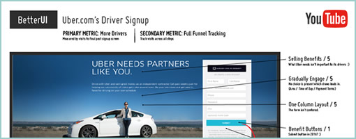
As one example of a BetterUI video, here are 10 ideas for Uber.com’s Driver Signup screens. Additional videos will get added gradually over time. For each video I also try to express my level of certainty to separate the stronger ideas from the weaker ones.

Watch The Sketched Solutions In The BetterUI Course

You can also watch me think/design the solutions for the identified issues in the BetterUI videos. In the 10 part video course I sketch out follow up concepts using Adobe Illustrator.

Subscribe On YouTube For More

Credits: Jakub Linowski

GoodUI Sketches On Instagram

Monday, April 4th, 2016


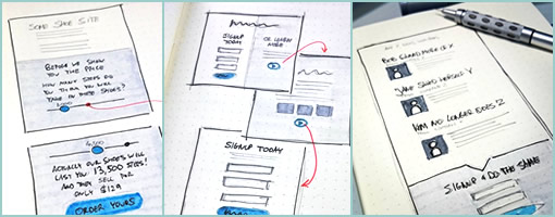
GoodUI has started sketching on Instagram. The sketches, although experimental, are still very much conversion focused. Every now and then I decided to get back to basics with a pencil, pens, paper and markers. Oh and the better sketches will eventually make it back into the GoodUI Fastforward template set. Enjoy.

Follow GoodUI On Instagram

Credits: Jakub Linowski

GoodUI DATASTORIES – Now Live

Friday, May 2nd, 2014


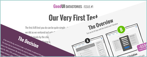
Ok, it’s finally live. We’re proud to announce that the wait is now over and the first issue of Datastories is here! We made sure to have the opening issue also be reflective of the first conversion test we ever did. We hope you’ll like it and can learn from it. What’s inside? Each month we’ll release one issue which will discuss:

  • Repeatable Insights
  • High Quality Results Data
  • Test Setup With Code
  • GoodUI Idea References
  • Key Learnings

Learn from our conversion optimization tests and use our insights on your projects to increase various metrics.

Learn More About The Datastories Subscription

Credits: Jakub Linowski

My Sketchbook Color Coding

Friday, April 11th, 2014


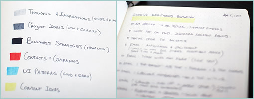
What, it’s been two years already? That’s how long it took me to fill in my dotted Leuchtturm notebook (German engineering at its finest) front to back. Since I’m starting a new one, I thought to devise a bit of a color coding system for my upcoming notes and just share it here. The colors I typically use to underline the very first page title. Here are the colors:

Light Grey For Thoughts & Inspirations

Sometimes I’ll hear or read something of interest from a podcast, article, or book and it gets coded this way. My own free-form personal random thoughts across various disciplines get placed here as well.

Medium Grey For Project Ideas

For the more solid, practical and actionable thoughts or sketches. These are both new project ideas or adjustments to existing ones and are often accompanies by sketched out screens.

Black For Business Strategies

These are the most strict, closest and firm action points which are tied to my business initiatives. They are very high level for the most part and act as strategic todo’s of sorts.

Red For Contacts

If I meet someone or a company of interest, they will get placed here. This section might also be some residue from a conversation with someone over a cup of coffee.

Blue For UI Patterns

Here come the user interface patterns – both good and dark. Be it existing patterns seen somewhere or envisioned ones, they both land here.

Yellow For Content

I write and rely heavily for content marketing for much of my business. Specific content ideas for existing projects get placed here. Oh, and in the example listed you can actually see that I’ve started scribbling down some content points for the GoodUI Datastories promotions. :)

Was this helpful? How do you structure your notebooks or sketchbooks?

Credits: Jakub Linowski

8 Awesome Business & Entrepreneurial Podcasts

Sunday, February 2nd, 2014


Well, this surely is a bit away from traditional wireframing and sketching, but I just needed to share these inspirational business podcasts somehow. Fact is, I’ve been listening to these for quite some time now and they have been driving a big chunk of my thinking recently. They are all very entrepreneurial and startup oriented in nature while highly motivational as well. Personally, I found them as a nice way to complement the morning commute while stirring lots of business thinking. The list goes on starting from my favorite at the top:

The Business of Freelancing Podcast

Brennan Dunn is pretty solid with the content and advice. There are only 10 episodes or so, but they are packed with advice from pricing to qualifying leads and moving prospects along the sales pipeline. Wish there was more.

Eventual Millionaire

Jaime interviews millionaires each week who share tons of advice on their successes and failures. She speaks to a diverse range of business people and while listening to each person’s story, common patterns begin emerging. Great content!

Smart Passive Income Podcast

Pat Flynn shares a ton of goodness each week on blogging, affiliates, content marketing, video, email marketing, and just starting businesses online. Easy going and light weight, but still inspirational.

Email Marketing Podcast

John, “The Autoresponder Guy”, knows a thing or two about copy-writing as well as email marketing. He interviews many others with a lean on how to make the most out email for the purchase of building customer relationships.

Product People

Although at a bit of a standstill, Justin has been interviewing quite a few entrepreneurial minds and start ups. New episodes might appear here and there, but no promises.

Entrepreneur on Fire

John is on fire in this motivational and daily podcasts. The interviews are with all sorts of business owners who have decided to leave their day jobs and pursue their business passions. Sometimes a bit corny or sugary, but still a nice way to learn about what drives people to start their own things.

Giant Robots Smashing into other Giant Robots

Just started listening to this, and it also looks like it has some good content on the business of software development and design.

Startups for the Rest of Us

Mike and Rob discuss software development with a twist on the business side.
Typically they start off with 5-10 minutes or so on some technical problem first though.


Did I miss anything?

One more thing. Typically I find that during or right after listening to an episode from this list, the ideas for courses of action start brewing very rapidly. It’s highly recommended to have an output such as a notebook or sketchbook ready nearby in order to jot down ideas or key insights.

Enjoy.

Credits: Jakub Linowski

UseYourInterface.com

Wednesday, January 15th, 2014


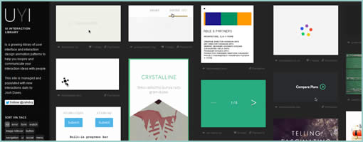
UseYourInterface.com is another collection of interface patterns mostly dealing with animations. Lots of moving parts and inspirational stuff. Definitely liked the submit button + onsubmit progress bar combination.

Credits: Josh Davey

Skeu It!

Thursday, May 23rd, 2013

Skeu It!
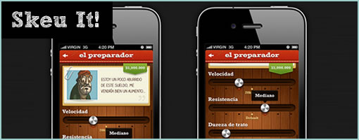
Skeu It! – and perhaps here is the reason why people went flat with their design styles. :) It’s a parody tumblr collection of some weird looking interfaces with coffee switches, jean pockets and lots of wooden clipboards. The site is now closed off, but definitely proved a point of how ridiculous (or skewed) a UI can get when pushed to the other extreme.

Credits: Justin Maxwell (@303)

SIX UX

Monday, May 13th, 2013

SIX UX
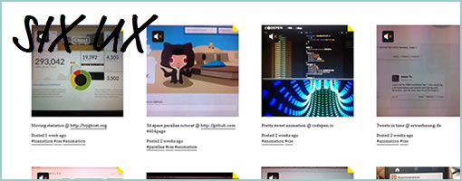
SixUX.com is a collection of six second long Vine snippets of all sorts of transitions and animations (yup recorded by hand). Some inspiring short videos if you’re into moving pixel patterns. :) Overall I think transitions can be great if used wisely. Often they can lower the cognitive strain by helping people to understand what happens between two distinct UI states.

Anyhow, if you’re browser starts choking from so much video running all at once, there is also a tumblr blog as well. Nice work Andreas!

Credits: Andreas (@ThisisSIXUX)

Calling Bull$#!%: On Flat Design

Wednesday, May 1st, 2013

Calling BS
As the flat design trend has been recently surfacing in popularity it made enemies with a few good old friends of mine, some of which include: shadows, gradients, and textures. Taken literally, under the flimsy banner of honesty, flat design has ventured out against interfaces which resemble anything three dimensional or portray depth on a two dimensional screen. I’m calling bullshit on this for a number of reasons.

Please Don’t Steal My Design Elements

Back to basics from the time when I was still a graphic design student, I remember there were some fundamental design elements given to us to make use of. Armed with such primal elements as color, line and shape, we were one step closer on the road to respecting human perception above following ephemeral styles. We were learning how people see so that we could setup good visual hierarchies and differentiate between the more important and less important things on a page or screen. By not making everything look equal, but instead by making things larger or smaller, closer or farther, we could begin to guide the eye while grabbing people’s attention in different degrees.

Come today, two of these elements that are being attacked by flat design are texture and space (or depth). If this new awesome trend is now taking them away, then it’s ripping pages out of my graphic design text book and actually making me poorer as a designer. Not cool. As visual communicators we are stronger with more tools and techniques at our disposal, not less. I therefore respect the fact that human beings can see depth and there is nothing wrong with making a primary call to action large, shiny, and three dimensional. I am placing my bets that an embossed depth loaded button will be noticed more often than some ideologically restricted flat blob. From a business stand point, my clients will also be happier with a stronger conversion rate and a better ROI. From a usability standpoint, people will sweat less while trying to determine what is clickable and what is not (Bokardo seems to agree).

How Memorable is Flat?

One last other undesirable side effect of flat design (and any other minimalist, modernist, reductionist, clean or simple styles which have come and gone) is its potential to undermine human memory. Some time ago, in the context of charts and bar graphs, we were taught that chart junk is bad and we should keep our data-ink ratios in check while not succumbing to evil décor. But is this so? We have been warned that a purely simple and clean approach comes at the cost of making it harder to recall the information later on. Let this be a warning that extreme simplicity might not be the silver bullet after all if we’re striving for higher memory recall rates.

The fundamental thing about flat design is that it is a restrictive trend that ought to be questioned. Perhaps it’s cheaper to develop, design or maintain, but if taken in its literal interpretation it could result in a lower quality user interface. I believe that being respectful of people’s perception, attention, memory and the human ability to register depth, wins at the end of the day over following any stylistic fad. The answer probably lies within a more balanced approach and therefore – I choose not to design with one of my hands tied behind my back.

Credits: Jakub Linowski (@jlinowski)

Since more and more bullshit has been surfacing to the top lately, I’ve created a new bullshit tag to keep track of it. :)
GoodUI.org

Wednesday, April 10th, 2013

GoodUI
Good User Interface is my latest project with the intention of collecting and sharing UI design ideas in the form of a newsletter. It is also a running list of tactical tips for making a UI easier to use as well as increasing conversion rates. The project will reflect that a good UI is nice to both the business side as well as the people using it. As an experimental piece to the GoodUI project, I’ve also setup a Quora tag in case it stirs up any question-answer style discussions (started debating Prompts vs. Undos a few weeks back already).

As always, any feedback is more than welcome. Particularly, if anyone has any conversion ideas which they’d like to share, I’d love to have a look. Please reach out to me. Even better yet, if you could provide any metrics from A/B tests.

So would you like to receive ideas for making your UI better sent directly to your inbox? Sign up for the monthly GoodUI Newsletter today. :)

Credits: Jakub Linowski (Twitter)