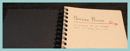
A few weeks ago, I started a personal pattern project which I’m finding useful and thought to share as a potential design activity. After grabbing a blank notebook, I basically began sketching out and writing down various examples of interesting interactions I find all over the web. The idea isn’t completely new as design and interface patterns have been around us for quite a while now. In fact, some really awesome collections have sprung up that are great for designing interactions and interfaces. If you’re seeking inspiration from these publicly available pattern libraries some existing resources include:
- UI Patterns
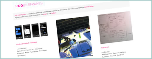
- Pattern Tap
- Patternry
- Little Big Details
- Designing Web Interfaces: Principles and Patterns for Rich Interactions (Book)
- Welie.com – Patterns in Interaction Design
- UIPatterns.net
- Quince
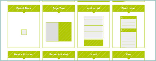
By personalizing these patterns however, there could be a few added benefits beyond just observing other people’s work passively. For one, I’m beginning to notice that after drawing out some selected examples it becomes easier to internalize and remember them later on in the future. When working on projects, these sketched patterns tend to emerge from memory more vividly than ones that were just seen somewhere. Secondly, when recording these patterns personally it is also possible to gain another chance at practising and evolving your own personal sketching style. Patterns are a great source of more complex user-interface interactions which may push the boundaries of your visual communication and sketching abilities.
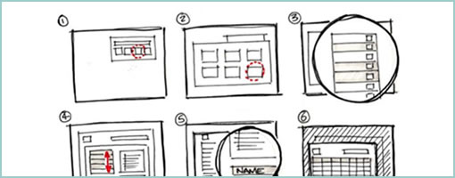
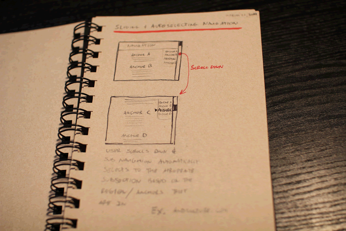
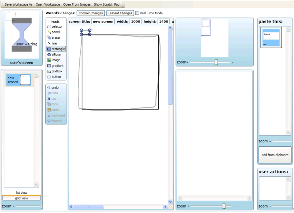
There is no set standard on how to record them. Some things which I thought might be useful to include were elements such as: a title, a few screens (tied together with user actions), a simple description, a date, and an example URL. But really, these being personal, it’s all up to you to come up with your own style. So go ahead and grab that fresh notebook …
Credits: Jakub Linowski