


Graph Paper Layout Sketch
February 25th, 2009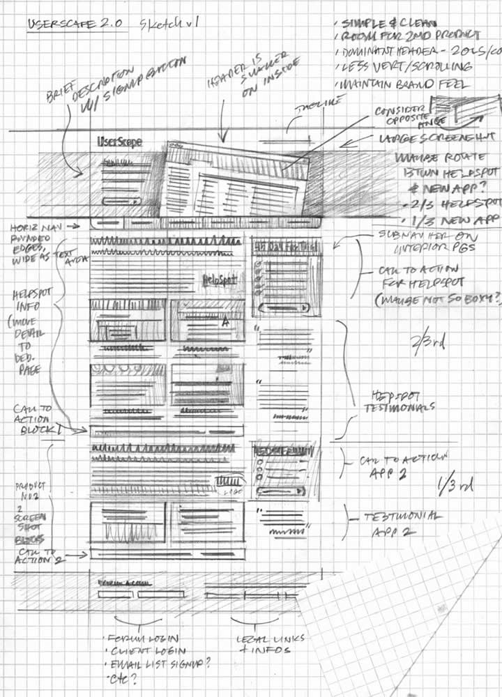
A sketch drawn up by an interaction designer and a sketch drawn up by a visual designer will emphasize slightly different things. An interaction designer likely will focus more on multiple element states, and events (or links) which glue them together. Whereas someone with a more traditional visual or graphic design background will put extra effort on sizing, alignment, positioning and visual priority, which all work together in establishing proper visual relationships between elements. This second case is perhaps visible in a sketch submitted by Mike. The sample here makes use of graph paper, straight lines, and explores block and element relationships.
A sketch like this is just more evidence that the wireframe overlaps greatly with graphic design – a case made earlier. This overlap suggests once again that the wireframe can be grounds for collaboration between information architects, interaction designers and visual designers.
Craving more graph paper? Konigi provides a number of awesome stencils aimed at IA’s and visual designers which can be downloaded. Of course writing about graph paper and wireframing, one could not overlook another awesome blog about a similar subject matter over at graphpaper.com.
Credits: Mike Rohde
3 Responses to “Graph Paper Layout Sketch”


February 28th, 2009 at 1:34 pm
Jakub, thanks for the mention.
I've found graph paper really does help me as I wireframe ideas, whether they're web projects or logos and icons. I know for many the grid gets in the way — so long as the grid isn't too heavy or dark, it works well for me.
I do come from a visual design background, so most of these wireframes are structural to gain approval of proportion/sizing/format with clients.
March 1st, 2009 at 2:52 pm
I didn't know graphpaper.com neither Stencils at Konigi. Nice resources and great article, it show us how to make a great layout sketch with high details information. Congrats Mike Rohde and Jakub to share.
March 2nd, 2009 at 9:26 am
I myself use grids in my designs now, as designs can be majorly improved with realigning and some lovely white space.