


Pixel Dimension Indicators
July 14th, 2009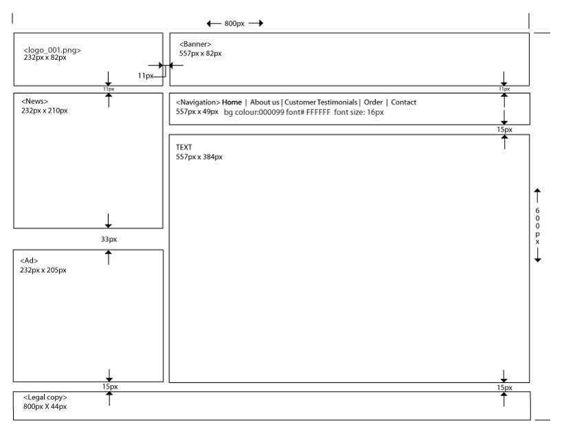
Often while wireframing, we delay considerations for exact sizing till later in the process. However, at other times, the designer may wish to portray some form of pixel dimensions explicitly. Here is one way to accomplish just that and communicate a wireframe’s dimensions, be it margins, widths, heights, or in between spacing. Lukas in his sample did this with the help of a few simple arrows and associated numbering. The nice thing about this approach is that it moves one step closer into putting a wireframe into some form of dimensional perspective.
Credits: Lukas Tomski
6 Responses to “Pixel Dimension Indicators”


July 31st, 2009 at 4:48 pm
I don't agree that this process is necessary or event slightly correct. It really dismisses the wireframing process at its core and layers the document with unnecessary and distracting items. I would be interested in hearing the reasoning behind setting specific pixel dimensions at this point and why explicit numbering aids the process?
Layering what my studio calls "Redlines" on top of a final visual design is the best way to provide necessary dimensions that speak explicitly to developers. These red, pixel width indicators are a lot more specific then the example above shows and speaks to the only real people that need this information: developers. Obviously in a world where interaction designers and visual designers are a. different people and b. are remote locations then a discussion definitely needs to exist between the two parties, but not with a deliverable like this.
August 3rd, 2009 at 5:16 pm
Hi Ben,
I'd argue that such dimensional information still provides some sort of feel for scale which is often lost in wireframes (especially after printing). Yes, this is detailing that perhaps might be detrimental in the early explorative phases of design. Such information might also most likely be irrelevant when sharing these ideas with end users or business people. However, when talking to more technical audience perhaps such data still has some value that aids in the development process.
August 3rd, 2009 at 5:17 pm
Hi Ben,
I'd argue that such dimensional information still provides some sort of feel for scale which is often lost in wireframes (especially after printing). Yes, this is detailing that perhaps might be detrimental in the early explorative phases of design. Such information might also most likely be irrelevant when sharing these ideas with end users or business people. However, when talking to more technical audience perhaps such data still has some value that aids in the development process.
I'd be really curious to see a "Redlines" sample. Could you submit? :)
Cheers,
Jakub
August 26th, 2009 at 6:03 pm
Depending on the audience, this info can help or hinder. I generally prefer to let this info live in the style guide prepared by the visual designers. Ironically, I recently had a developer ask for these specs in the wireframes which was a first.
September 18th, 2009 at 10:23 pm
Guys, this example is by far the way to go and the web dev trend of the last five years. It helps the designer design to spec (which should be included in the requirements doc/phase) and guides the developer in coding to the design. It couldn't get any more process logical than this. Although the image example is a little lacking in detail but good.
The big leagues of web design/dev are completely using this approach to IA, Wireframes and Design as an integrated approach to process management. Web Designers are designing complete sites in Photoshop and putting the wireframes on layers above the design of each page template.
That then get reviewed, approved and handed off to the developer to code against. This is efficient because the designer has complete control over dimension of the site with an in-depth understanding of usability goals of the site.
Ben Mitchell and other seasoned web builders like him simply need to be brought up to speed on this approach and adopt it.
Blackberry.com, HP.com, Apple.com, Quiksilver.com were all done via the process I'm speaking of. Under time, under budget and ahead of the game.
Michael
International Web Gurus
http://getMikeStory.com
February 1st, 2010 at 4:32 am
And the vast majority of all the websites in the world look like total sh*t.