User Journeys
January 7th, 2009
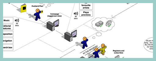
Steve sent me a User Journey sample today and I thought it was pretty interesting. Besides there being an article on Boxes and Arrows on this technique, perhaps I can add my 5 cents on what I am seeing here. Other than the iconographical style, two important ideas become apparent. First, the duration of the interactions in this visual are wider than usual. Typical user flows represent quite narrow time lengths, whereas the deliverable shows interactions spanning out over the weekend, and even a month afterwards. Secondly, the computer screen is represented as only one item in a bigger context of the physical world. The little people here interact with other physical objects such as magazines, MP3 players and PDAs. Taken together I find this sample as an interesting way to think and represent activity beyond the desktop screen within a richer reality.
Here is also what Steve writes:
I have been working on creating these 3D characters for some time now to bring to life some (often boring) User Journeys for our clients.
I have used them several times in pitches and key stakeholder meetings and they seem to be well received, while at the same working as a good platform to get our ideas across. Clients seem to get things more easily when they are illustrated or drawn out in front of them. I have also found people are more likely to contribute in meetings if they see ideas detailed in this way. If I have the library of assets with me, I can easily (using omnigraffle or equivalent) add their idea to the diagram in the meeting, increasing their sense of participation.
And just because you are illustrating your User Journey it doesn’t mean you are trying to dumb the information down. Before I create a diagram like this one I make sure I sketch out my ideas with a pencil and paper before hand to ensure all bases are covered.
Credits: Steve Johnson


January 8th, 2009 at 1:44 am
This is a kind of storyboard I've never seen before – I really like it. The 3d angled perspective is a cool style, and it's so easy to drop Visio / OG prepackaged shapes down that it seems much quicker than hand drawing.
January 8th, 2009 at 4:15 am
I love the fact that these consider the long term and gradual engagement. It's a refreshing difference from the more common 'all in one go' experience that gets diagrammed.
January 9th, 2009 at 7:37 am
I've been using a 2D version of the user journey concept for some time now. I have used the technique both for immediate "single session" experience flows and also for mapping out an entire customer life cycle that lasts several years. Surprisingly the technique scales really well. Have to agree with Loren though, the 3D perspective is rather cool :)
January 23rd, 2009 at 11:40 am
Really cool stuff! Theres a good visio stencil at http://petervandijck.com/iabook/template.htm
May 14th, 2009 at 3:41 pm
The site above seems to have issues! I'm fairly new to this, where else can I find some cool little people to add to Visio?
Thanks
May 14th, 2009 at 6:48 pm
check out the iainstitute. they have a brilliant collection of visio stecils: http://iainstitute.org/tools/
…but i don't know if there are litte people included ;-)
cheers, marcel