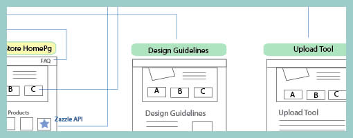
Page Level Wireflows
February 3rd, 2009
Tara has been designing the Mozilla Community Store and did a couple of wireflows at the page level. Having shrunk down the wireframes to thumbnails, this diagram provides a very nice overview of page-to-page link relationships that the user might take. nform Trading Cards however warn us that these documents could be very labour intensive if the design changes (which I also experienced). Now what if this view was automatically generated with our favourite design tools?
Credits: Tara Shahian


February 6th, 2009 at 9:25 pm
Wow… Link relationships is very useful. I'll try do that in my next project.
February 21st, 2009 at 5:31 pm
This is what I do for part of my application and UI design, to show screen flow and a sense of what will be on the screens. I am still looking for a good tool to support this, though and at the moment tend to use Visio.
March 17th, 2009 at 9:28 pm
https://rapidrabb.it/ this tool seems to offer something similar to this
March 18th, 2009 at 1:06 am
That looks cool! Thanks for the link. :)
February 22nd, 2010 at 7:03 am
cool pics
March 16th, 2010 at 5:15 pm
The rapidrabb.it url doesn't seem to be working anymore but judging from the screen cap featured in http://www.unknowndivide.com/web-design/rapidrabb… pidoco seems to be the same thing? – https://pidoco.com/en