Rough Interface Sketching
February 23rd, 2009
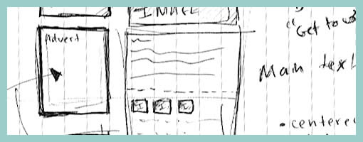
At least two rough sketching tactics can be identified in this submitted drawing which make it lean very much toward the low end on the fidelity scale. First of all a great deal of the text has been represented using simple squiggly lines as opposed to using real words. Secondly, the interface page boundaries have faded as some elements have been drawn floating independently of any screen edges. Such roughness has definitely a place while designing as it provides ever greater speed of generation. This value does come at a price however as hinted in the previous entry. The lower the fidelity, or the rougher the sketch, the more difficult it may be to understand by others and thus it may require support by explanation.
Credits: Darren Azzopardi


February 24th, 2009 at 8:09 pm
Very god point… i rough sketch things initially then take them into a wire-framing software as to communicate my madness to others a bit easier.
~ Aaron I
March 1st, 2009 at 2:45 pm
Really good point. I already saw many sketches very difficult to understand. When I make my sketches I try let them self explanatory.
March 2nd, 2009 at 12:26 am
Interesting comments (the creators post), I feel your over analyzing the "rough sketch" phase of its vital role in early development / design stage. Final ideas are rarely created in such a streamlined manner.
These particular designs are the very first drafts, mainly for the purpose of the creators own calarity. So showing this stage to anyone would ofcourse only invite inept questions.
The next stage would be then to strip the design down, have minimal or no annotation, then possibly move to a clean wireframe, as at this point we have determined what the design will be, what functions, image, text, etc…and maybe at this stage the design is strong enough to be seen by others…or so i would like to think :)
March 1st, 2009 at 10:11 pm
I'm not sure I agree that such a rough sketch should not be shown to others at this point in time. I think it could still inspire conversations with others quite early on, but perhaps more energy is required to convey the meanings. It's your sample though, so you probably know best. :)
March 2nd, 2009 at 9:15 am
If I can take a snippet of your reply, "…energy is required to convey the meanings…" Rough sketches are roughly both I feel.
Some features are drawn out of habbit and are possibly used to help the momentum of the design stage roll on whilst others are thought about cafeully.
If I could take the image used for an example. To let anyone see it would probably, 9 times of 10, require me to correct them as what they are seeing is not what i intended, so their perception is not similar to the designers as its a rough sketch. It probably would inspire conversation, you're right there, but would include the designer repeating what he means, what that is, etc. Thats part of the conversation I would like to take out.
My point is when is a rough sketch not a rough sketch? When more energy is put into conveying the meaning the essence of a "rough sketch" deteriorates.
p.s I havent read your recent articles but they sound very interesting. :)
March 2nd, 2009 at 2:06 pm
True. Sometimes we just sketch for ourselves as well, as the sketches "talk back" and lead to new ideas. Perhaps this is the intention of such roughness more so than the intention to share the sketch with others at this point in time.