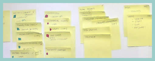
Sticky Sitemaps
February 27th, 2009
The need for flexible design documents such as sitemaps has already been noted in the past. In this example however, instead of using the computer, a very similar style of exploring and representing site structure has been accomplished with the use of sticky notes. Indentation has been applied to the stickies in order to suggest multiple levels of structure. Why not just do it on the computer then? Well, I think that such a rough approach invites more collaboration and input from others. Paper, sketching and stickies all invite change and feedback more so than computer based tools. Here is what Dave has to say:
It is an early stage in the development process, and the use of post-its allows quick iterative thinking, and opens collaboration across the project team. Taking photos at different stages meant that versions can be kept. This was the final version, before being drawn up in Illustrator for client sign-off.
Credits: Dave Needham


February 27th, 2009 at 2:31 pm
This is something that I have come to practice time and time again.
Not only does it make my Information Architecture and web designing life easier, but it also allows the rest of my team to visualize exactly where we are going with a project and why we are approaching it from that angle.
– off topic
This blog is something I wanted to acomplish myself. I am made up you guys have beeten me to it with such helpful advice. I just happened to stumble accross it today and I have already added to my RSS.
February 27th, 2009 at 3:15 pm
Glad you like it. Feel free to submit and share your own ideas, samples and techniques.
February 28th, 2009 at 11:49 pm
I will do Jakub many thanks for the invite :)
March 1st, 2009 at 2:59 pm
Wow… I never thought we could use post-its like this. I'll try put it on my soon projects.
I'll study a little more this kind of thing in Dave Needham's site.
March 2nd, 2009 at 9:22 am
I always feel inspired when I see a thought process like this..This site is quickly showing how much work is done before a computer is even turned on….I love it! :)
April 16th, 2009 at 1:32 am
Why not use Power and mimick an entire site?
Better than that, mimich one site for each persona and allow multiple persona behaviours per person.
The do some more, after all it is PowerPoint and you can let users try it out.
Much faster than building a site to do A/B testing and almost as fast as sticky notes since the site is cleaner and easier to read an no re-work is required for concept testing.
Just a thought.
Cheers,
Nick
http://www.neuropersona.com