Tracing Paper Layers
March 6th, 2009
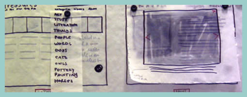
Here is an interesting technique which uses multiple pieces of tracing paper combined with sketching and scanning. It kind of reminds me of Photoshop layers except these exist in the real world. First, Jennifer drew various interface elements separate from each other on tracing paper and overlaid them together to form full page screens. These various combinations were later on also digitized using a scanner and then shared with others.
This technique shares some similarities in terms of flexibility with sticky frames. Just as with stickies, the designer can undo and rearrange elements very flexibly. Also, similarly to the sticky frame example where the designer used photography in order to reuse the various elements (and speed up the design process), here a scanner performed the same function. Tracing paper however has an additional characteristic of allowing to represent interesting transparency effects as is visible in the top right example suggesting an overlaying lightbox image. Tracing paper perhaps also affords a little bit more change and rearranging than sticky notes. All in all, such awesome tactics provide us with more speed and agility.
Jennifer writes:
We’ve also found that sometimes taking your design out of the computer screen forces your audience to focus on the concept rather than the execution, which is very helpful if your audience gets hung up on colors and buttons and the like. Frankly, it’s helpful to everyone involved: good design, I feel, serves the content, and all the flashy Flash/AJAX/JQuery what-have-you won’t save a poor design. I also believe that while good web design does not translate into good book design, etc., every designer should learn to use paper and pencil. Like the codex, it’s worked for 500 years; it’s not going anywhere soon.
Credits: Jennifer L. Anderson


March 6th, 2009 at 9:06 pm
this is something that worked for me in architecture design studio in college. it's so nice to end up with artifacts that you feel proud of–even if they don't have any practical value.
March 9th, 2009 at 4:00 am
I'd question the "practical value" part – sketches such as these are rapid, collaborative, invite feedback, and flexible to change, amongst other things. :)
March 9th, 2009 at 5:15 am
yea, you're right. i wasn't too clear above. at this point in time, those particular sketches have no practical value–i'm not working on those projects anymore. but they do serve as good (somewhat-plesant-looking) reminders of the critical thinking and development that went on through the process. this design strategy, like many of the others you've covered, leave the creator with tangible "snapshots" of hard work. I like that; i've kept those sketches and I still feel proud of 'em. they're sources of inspiration for future projects.
thanks for the site.
March 23rd, 2009 at 6:48 pm
one more thing about tracing paper: i love to use my warm and cool grey Prismacolor artist markers, and tracing paper takes ink really well without bleeding.
thanks for the post, Jakub! i'm flattered!