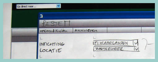
Wireframe-Sketch Hybrid
March 4th, 2009
Sometimes the designer wishes to focus feedback and discussion only to certain areas of the interface. Knowingly that firmer and more defined styles suggest completion, while empty spaces and sketch styles invite discussion, the designer here has utilized this knowledge to channel feedback. This sample is a hybrid between a wireframe and a sketch. It has been started off using the computer and then printed out, while leaving a central area blank for sketching with the stakeholders. This interesting combination suggests to the stakeholders very clearly that the computer based areas are more defined and less open to feedback while the empty and sketchy areas are in need of refinement and more open to input.
Credits: Hans Nieuwenburg


March 5th, 2009 at 3:46 am
An interesting idea would be to do the same in reverse. As parts of a non-function mockup interactive are developed, slowly replace scanned wireframes with actual componentry… I think I'll try that in the near future :)
March 13th, 2009 at 8:53 pm
Hey Josh,
Just a heads up. I'm thinking of supporting this feature of being able to reverse and control the wireframe styling in fluidIA: http://fluidia.org/wp/?p=74 and http://fluidia.org/wp/?p=83 (an open source prototyping tool). Is that what you meant?