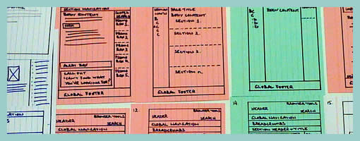
Coloured Paper Templates
April 8th, 2009
Here is an interesting twist on the wireframe by means of using a different coloured background. When Steve has been drawing up templates of existing content for an intranet site, coloured paper has been used to denote the various templates types. In this case the colour suggests the differences in technologies used. However background colour could be just as well used to denote other things such as: user types, page states, stages in a flow, etc. It seems like an interesting approach, as typically the wireframe usually rests on a white background.
Credits: Steve Baty


April 8th, 2009 at 2:10 pm
Creative and beautiful work!
April 8th, 2009 at 2:27 pm
I like the idea, but the colors 'green' and 'red' might suggest something different (good / bad wireframe)
April 8th, 2009 at 10:33 pm
Very cool idea. This is perfect for my work where the user flow extends across multiple platforms.