Cursors As State Indicators
April 15th, 2009
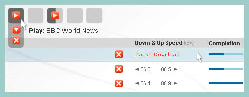
Cursors can be used inside of wireframes, or detailed visual layouts as in this case, to hint at states. Overlaying them on top of existing elements can give the viewer a stronger understanding of the multi state nature of the interface through the visibility of mouse positioning. In its most basic form a cursor can hint at an element’s onMouseOver state. In this sample I’ve used multiple such cursors on one screen to show multiple states all at once. I would assume it would also be possible to help understand other states as well (drags, resizes, etc) using cursors.
Have a look over at Konigi’s Wireframe Icon Set which now also contains cursor icons.
Credits: Jakub Linowski


April 16th, 2009 at 4:13 pm
I show clicks in my wireframes by drawing three concentric circles around the tip of the cursor. Taking a cue from comics, I also represent a gesture or movement with the canonical three lines indicating the direction. Little things like these allow for cursors to represent more states that just "here" or mouse over.
April 16th, 2009 at 5:59 pm
I'm going to use this today. Thanks Jakub.
Sherrod- I like what you're describing. Let's see a sample.
May 28th, 2009 at 10:31 pm
I used it recently in a google-like interface. The wireframes were really telling a usability story. Very effective.
May 28th, 2009 at 11:03 pm
Happy it helped! :) Cheers
June 11th, 2009 at 4:31 pm
Cool- I figured I wasn't the only one doing this :o)
I finally broke down and made a cursor stencil for Omni Graffle after 3 years of having to go hunt down a pointer or busy cursor to paste in.
It is at Graffletopia if you need it:
http://graffletopia.com/stencils/450
June 11th, 2009 at 5:22 pm
Thanks Theresa for sharing. The cursor icons look great!