Page Description Diagrams
April 3rd, 2009
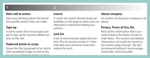
Page Description Diagrams are pretty much wireframes devoid of any layout representation. Page content chunks are described textually and also prioritized on a horizontal axis.
Here is a snippet of what Tom, of Blue Flavor, writes.
One of the main reasons why I love pdd’s is that they effectively remove visual design and layout-based discussions (which should be reserved for the visual design phase of the work) from the IA process. Presenting and discussing only content forces a client to focus on choosing what is and isn’t really important on a given page, helping to communicate their core message.
In addition, a good article on PDD’s exists over at boxesandarrows, and Garrett Dimon has posted a PDD template for Visio.
Credits: Tom Watson


April 3rd, 2009 at 3:22 pm
i've been waiting for an opportunity to use your template for a while. i really like it. just another tool for our box. it's amazing how each project requires such different deliverable. thanks for sharing!
January 12th, 2010 at 10:41 am
Let's not forget to give credit where credit is due – Dan Brown is responsible for first creating Page Description Diagrams and writing about them way back in 2002 in his article "Where the Wireframes Are: Special Deliverable #3" – before that article – there was no such thing as such a UX deliverable :-)
– SW
October 10th, 2010 at 8:39 pm
Very late to this conversation, but I just have to ask: Why don't more information architects use these in 2010? So many wireframes I receive have very specific visual treatments suggested. If I suggest a design outside of these, I have to research and defend the interactions that justify an alternate approach. PDD seems like an ideal approach to keeping both the IA and the visual designer on respectful terms of each others' contribution. I understand that some sites are very complex require the wireframe approach, however, it would be great if we could explore using this more.