Sketchboarding
May 5th, 2009
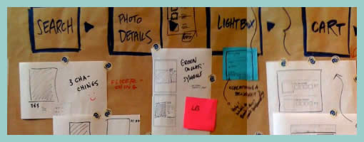
A collaborative sketching technique has been emerging from the people over at Adaptive Path, known as sketchboarding. A large sheet of paper is hung on the wall onto which additional pieces of paper are attached with the help of drafting dots, containing sketched ideas of different levels of fidelity. I find at least two things that stand out with this approach. First of all, inspirational material such as personas or requirements are used as a starting point to drive the conceptualization process. These materials are intentionaly placed on the left hand side of the sketchboard in close proximity to the wireframes. Secondly, the defined space where ideas are to be attached is stretched by design which invites exploration and refinement. Overall, this collaborative sketching technique works nicely as it also provides a bigger picture which can also be taken down and physically relocated if necessary.
Brandon has covered the technique quite in depth along with a video. Dan and Leah have also done a presentation about the approach in PPT format. More recently also, the following samples (along with templates) have been presented at the 2008 CanUX conference.


May 5th, 2009 at 1:54 pm
I like that you can layer all of the different iterations, leaving a record of early ideas. Then all you have to do is move it from the bottom to the top if the idea becomes valid again.
I also think this is just a wonderful artifact. Working in the digital, it is nice to have a physical representation of the work we do. This image holds so much: insights, ideas, collaboration, long days, laughing, challenges, experience, innovation, all of it. Really nice. Thanks for sharing!
May 14th, 2009 at 6:58 am
We did something like this during our redesign of Maybank2u.com. It's a great idea. Sometimes you need to use a whole wall to map things out, especially if you're restructuring a big site.
May 17th, 2009 at 4:59 pm
Agreed. I like how it's possible to see alternatives or iterations on the vertical axis. Perhaps it makes it even a bit similar to /?p=539
May 19th, 2009 at 12:56 am
Exactly. I was thinking about that, that was a good one too.
July 26th, 2011 at 10:01 am
This is remind me of my ex office of Fast Email Sender. I think it's a nice atmosphere when the walls talk to you. This reminds me of my last office where I carried out work for the development http://www.fastemailsender.com
August 7th, 2011 at 2:43 pm
I agree with you my friend.