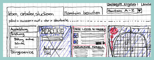
Hatched Colour Overlays
June 30th, 2009
Uwe has recently published his wireframe sketches in which he uses a number of interesting techniques. One of these techniques is the use of rapidly generated hatched colour overlays on top of his sketches. Coloured lines are basically drawn over desired interface sections in a diagonal manner. This fast application of colour has at least two benefits. First attention can be drawn to coloured elements as they stand out more. Secondly, associations between coloured elements spread out over numerous screens can be made more easily when sharing sketches with others.
Credits: Uwe Thimel for kuehlhaus AG


June 30th, 2009 at 6:38 pm
Ideally you would do this with some sort of transparent overlay, to prevent you from ruining the original wireframe on paper… they also give you the opportunity to make several versions, or to apply highlights on several areas of your wireframe in stages.
July 8th, 2009 at 1:38 pm
You could also copy your sketch and apply overlays to various elements on those copies, say to show a sequence
March 8th, 2010 at 7:16 am
Nice work dude! Personally, I am not using such detailed drawn wireframes for my projects. But for sites with a more complex navigation structur, coloured elements and other marking techniques are defentitley very helpful. Best regards!