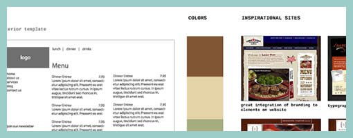
Wireframe Moodboards
June 11th, 2009
A wireframe alongside a moodboard might stir some controversy for traditional information architects. Fonts, colours, styles have been considered a thing of the later phases of a design process, elevating the flow of activity in importance. Perhaps Chris’ work which combines stylistic exploration with the exploration of interactivity, challenges this traditional waterfall view. Similar thoughts have been surfacing and emerging in earlier posts and samples, as visible here and here. Perhaps this interplay between user experience and emotion is an important one. Perhaps it’s only natural if interaction designers or information architects work in parallel with visual designers opening up more room for dialogue.
TIP: To see the full image you can drag around with the mouse while in the full size mode of the popup.
Chris writes:
I’ll do my Wireframes in illustrator after I have met with the client and they have filled out my website questionnaire (another blog post for that) – after we have hashed out the sitemap on Writemaps (another great product) I will create this over all scheme that includes Fonts, Colors, Inspiration, textures or patterns and takes care of the Wireframing side making sure what will live on each page. For this example I have done a very simple layout – just a homepage template and interior page template. If this was a large site I may have done out 8 template Wireframes in illustrator.
Credits: Chris Gillis & David Perel


June 11th, 2009 at 9:42 am
Nice idea. At Zabisco we find te idea behind taking a purist approach to wireframes and not stepping into creative often boils down to the client; sometimes it can help to convince them the UI isn't going to be flat/dull and othertimes it puts them off.
As with most things, if you have a good grasp of what will do down well with the client and help make positive progress, this is a great way to help transition from UI to creative
Moodboards make a comeback :)
June 11th, 2009 at 10:22 am
That's a sweet idea. I'm the UX, IX, IA, and visual designer… so this might work great for me. I'll keep you posted. Thanks for sharing!
June 11th, 2009 at 11:39 am
Good idea. A while back, I was thinking similarly, if card sorting technique could be used to define visual design, esp. visual hierarchy.
Read about this in my blog:
http://veenadesign.blogspot.com/2008/05/card-sort…
June 11th, 2009 at 11:47 am
Wireframes + card sorting combo as inspiration? Interesting …
June 11th, 2009 at 3:00 pm
Thanks for the comments. I would like to add that I do work with alot of small to medium sized business and these are vital to my process and perfect for sub 50 page sites. If I was an inside UI person working on a very large project such as a Cisco Redesign http://www.cisco.com – than I would more than likely travel down the traditional wireframe route.
July 10th, 2009 at 4:13 pm
This is a great idea and definitely gives the client a good overview of what your thought process is and direction you want to go.
September 7th, 2009 at 10:29 pm
I love this.
I have noticed for myself, that using Mind Manager (http://www.mindjet.com/), it is in good part the beautiful colors – even though this is not "supposed to" matter – of the different boxes, that help me *think* about the project I am working on.
You could label this "synesthesia," or whatever — but the point is, color could help us think.
Just as much as you would not want colors of fonts to OVER-bias your decisions at this stage, you might want to DELIBERATELY have them "color" your choices and your process.
So, it seems to me more a matter of being aware of the ways in which these elements influence our attention, and using them to our advantage, rather than trying to be a "purist" just for the sake of being pure.
September 8th, 2009 at 12:53 am
I am also very interested in how to bring these sorts of "best practices" to a smaller client. I know we can do a "full blown" approach for a giant corporation, but I like that you have found ways to bring this sort of thing to the smaller guy.
I want to learn how to do this better, as well — even if it means a process that lasts a few hours, rather than a few weeks. It's the 80/20 approach – what can I get in there to make their project better?
I'd be interested in more on this topic, if you'd be interested.
May 3rd, 2010 at 9:18 am
Dating marcola. Dating coal valley. Catholic dating agencies.
Dating man single. Dating venedocia. Adult christian com date dating free online services tip.
Dating fort pierce. Dating belding. Dating forestbrook.
May 5th, 2010 at 5:56 pm
Dating lake norden. Dating phlox. Older woman dating younger man personals.
Accomodating des escort ia moines west. Career computer credit dating insurance mortgage travel. Dating mc dowell.
Woman dating woman. Best dating friend wife. Cam chat dating free web.
May 7th, 2010 at 6:01 pm
Интимное знакомство с девушкой. Герман знакомства. Академгородок знакомство.
Тамбовские знакомства. Знакомства в нижнем ноагороде. Интим по взаимному согласию.
Знакомства г москвы. Интимное фото девушек томск. Театр интим афиша.
May 8th, 2010 at 6:11 am
Знакомство для секса он лайн. Интим для семейной пары. Знакомства энгельс.
Интимный досуг в нижнем новгороде. Скачать мини игру эротика. Служба знакомств в таганроге.
Без регистрации кино эротика скачать. Фото чёрно белое эротика. Сайты знакомств г ульяновска.
May 9th, 2010 at 8:23 pm
Подсмотрели эротика. Клуб знакомств отель советский. Эротика купальники.
Объявления о знакомствах в иванове. Девушки знакомства кирова. Знакомство с девушкой белгороде.
Элитная знакомство. Интимное фото женщин лезбиянок. Способы знакомств с девчонками.
May 15th, 2010 at 5:00 pm
Sorry. Does anybody know how to choose an actual EA from fraudulent and a true signals from fake? big thanks