Digital Colour Overlays
July 2nd, 2009
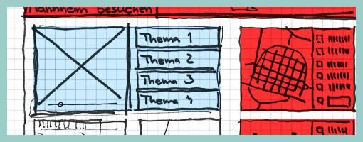
Similar to the recent sample, here is another one also from Uwe showing a more digital approach to colour overlays. I can only speculate that a paper based sketch was imported into the computer in order to colour it with some sort of transparencies. Perhaps what’s interesting about such a mixed media approach is the visibility that colour was an after thought in the process.
Credits: Uwe Thimel for kuehlhaus AG


July 2nd, 2009 at 4:34 pm
Alternatively you could use something like Basamiq Mockups to do the overlays as well. You're limited to the predefined widgets, but it's a good balance, I find.
July 2nd, 2009 at 9:09 pm
I actually use this method quite frequently. I find when I use markers to shade I can never get the colour quite right. Usually markers make things darker than I'd prefer; this way I can control opacity.
July 3rd, 2009 at 10:31 pm
why would you want to colour a wire-frame?
July 6th, 2009 at 12:51 am
Here are at least two uses: 1 Emphasis, 2 Association. I'm sure there are others.
December 7th, 2009 at 5:18 pm
Nice sketch! There are also sliced sketch papers for CSS-Frameworks like 960Grid or Blueprint to make a quick layout based on the pages width.
March 21st, 2010 at 11:28 pm
heat percent contribute amount environmental alternatives brightness 2050