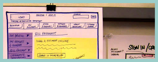
Hybrid Stickyframes
July 21st, 2009
Keith relies on a similar technique to the Stickyframes approach posted earlier. His approach differs in that it mixes a number of techniques together. These hybrid interface representations mix sticky notes with sketching, sketches with flows, and anything else he comes up he just posts up and groups on a wall in a sketchboarding manner. Here is what Keith writes:
I’ve been creating wireframes since the late nineties and in retrospect have always relied on hand sketching and rapid ideation to solve my UI/UX problems.
This example is not unlike the Stickyframes example currently posted on your site. The difference with my approach is that I use color to begin to organize the chuncks of content or functionality. I also attach sticky notes containing mindmaps, flows, or mini sketches of interfaces. The grouping of ideas and sketches stay put until I have sorted out the actual page layouts to be rendered in Visio or AxureRP. The result is a moodboard for ideas which allows me to swap out thoughts until ideas are fully baked. I’ve had success sharing these with clients and collaborative teams early on in the process because they appear to be work in progress.
While I love working at a larger scale on whiteboards, these are a portable alternative for negotiating screens.
Credits: Keith Tatum of Resource


