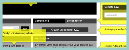
State Annotations
August 18th, 2009
Here is a cool idea by Benoît which combines annotations with interface visuals into one coherent whole. Typically annotation bubbles were reserved for textual information, yet this sample extends it to contain more elaborate visual elements. More so, some of these annotations visible here also contain multiple variations of an interface suggesting some sort of multiple state representation.
Credits: Benoît Meunier


August 18th, 2009 at 12:54 pm
outta this world
which application did he use to build this wireframe?
what paper size does this fit into?
August 19th, 2009 at 1:36 pm
– I'm using Illustrator and I'm using my own symbols libraries built over years.
– I'm not thinking paper, just pixels but it fit perfectly in 11X17
October 9th, 2009 at 8:47 am
Hi Benoit,
Thanks for sharing this idea.
I like it a lot and have tried to use this is the past when I created my IA documents.
The only problem I faced is that when you print the IA document the annotations on top of the wireframe layouts are quite difficult to read because we were printing in B&W. Unless you print in colour (not always feasible) the annotation callouts looked more like someone clicked on something to open an overlay and confused our clients.
So I try to keep the wireframe layouts in the middle of the page and use line-arrows call out to the sides or use number reference annotations.
Thanks
Deepak