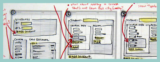
Long Page Sketches
September 10th, 2009
Quite often user interface pages will have to be long and scroll. As obvious as it sounds, here is a sketch which supports this. Jason has simply decreased the size of his frames and made them taller. On the same note, one of his sketches also makes use of a zigzagged line. I would guess that has been done to suggest a continuation of sorts, allowing him to communicate that there is more to the page without having to go into detail. I also like the heavy emphasis used on the title. Nice!
Credits: Jason Robb


September 17th, 2009 at 5:24 pm
Thanks for posting this, Jakub. I appreciate the commentary, too.
The zig zag is exactly that, a hint that the page goes on, but it's not worth elaborating on. The big thick title is a big thick sharpie! :)