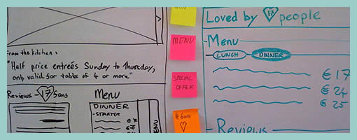
Prioritized Stickynote Requirements
September 17th, 2009
Des just sent me a link to where he describes his early design process with a few whiteboard wireframes. One thing he does is create some sort of inpage requirements with the help of sticky notes which are placed alongside the UI work for inspiration. These rough and abstract textual ideas or requirements guide his thinking during the wireframing process. More so, he goes even further and uses colour coded stickies to denote priority.
In his own words:
They’re colored by importance. For this project it was:
Yellow = super important, site is useless without
Pink = nice to have, but requires restaurant owners to do some work
Orange = social features, relies heavily on people using the site (might not be there at all).
At the same time, I also found it very interesting that Des explores variations or alternatives as not to fall into the pattern trap. There is another interesting article related to this which he wrote about, Thinking in Patterns, on his company blog.
Credits: Des Traynor


September 24th, 2009 at 4:04 am
Our product focus is frequently (and currently) on boosting social interaction and reporting on it. I found this breakdown refreshing and well articulated:
Priority #3: social features, relies heavily on people using the site (might not be there at all).
The first two priorities presumably focus on adding value with the software, followed by the sharing of the experience with others.
But what about Facebookifying it??
Note: I have found 3 "sarcasm" emoticons:
:-! and ^o) and :d