Interactive Sketching Notation 0.1
October 29th, 2009
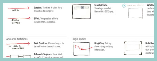
After being inspired by people’s UI sketches for almost a year now, only naturally, my own approach to drawn user interactions with pen and paper began emerging. This personal compilation of the various techniques which I find relevant, is being published as the so called Interactive Sketching Notation. The general idea behind this notation is the desire to visualize user interface states as well as user actions in a clear and rapid manner. This of course, as the version number implies, is an emerging visual language for sketching interactions which I hope to continue to evolve and improve well into the future. Thanks again to all those who made this possible and please let me know if you find it helpful or have any recommendations. If this inspires your own approach to sketching, I would also love to see some samples of how people use this. .
Download the PDF directly.
Credits: Jakub Linowski


October 29th, 2009 at 2:11 pm
I like the interaction, I think I will put in practice for the next projects, and hope that others persons do the same.
October 29th, 2009 at 2:59 pm
I think it's pretty cool from the perspective of understanding one's own sketch interactions. My only concern is that some may want to show this to a client, and expect the client to understand the interactions that are trying to be conveyed through the notation; but of course, you might not want to be showing clients sketches anyway :)
Very cool! Thanks
October 29th, 2009 at 12:34 pm
This is excellent. Thanks for sharing!
October 29th, 2009 at 4:58 pm
Is the red a pen, pencil, marker? Just curious
October 30th, 2009 at 12:10 am
Hey Zaq. The red is a thin sharpie pen.
October 30th, 2009 at 3:51 am
Can you post a sample set of drawings using this notation? Would love to see it in context.
October 30th, 2009 at 9:56 am
Just a pedant suggestion. How about using the abbreviation FX instead of E for effects? It's quite common and probably more understandable.
I think that you might be better off switching to prototype when you get very complex diagrams. Do you make use of prototypes yourself?
November 5th, 2009 at 3:49 am
Liou. I like the FX suggestion. Thanks!
November 5th, 2009 at 7:18 pm
This is awesome. I need to make one of these for myself. Leah Buley has a great sketching pattern library as well: http://www.flickr.com/photos/jasonrobb/4064453154…
November 13th, 2009 at 9:33 pm
i made an omnigraffle stencil of the above notation: http://www.graffletopia.com/stencils/518/
January 19th, 2010 at 7:28 pm
Thanks for making the Omnigraffle version!
January 19th, 2010 at 8:10 pm
Jakub,
These look great. It would be great to have a common IA/UX/UI language.
January 20th, 2010 at 9:06 pm
Funny (as in funny interesting), this reminds me of animation storyboards and x-sheets where similar types of notation is used to indicate actions the camera is making or timing for specific actions.
February 9th, 2010 at 12:05 am
Very cool! I like this a lot.
Question: Shouldn't the notations on your interactions be in read also (since you've set black and grey as elements the user sees)?
February 9th, 2010 at 3:27 am
Hey Roman,
Perhaps. I'd say the ones related to user actions should be in red, and the ones pertaining to the interface should be in black. Of course it's all debatable. Which specific part were you referring to?
Jakub
February 11th, 2010 at 3:43 pm
Here is a drawing which resulted from using this notation: /2010/02/tablet-illu…
August 26th, 2010 at 11:06 am
Cool! I use similar technique, however, I use pencil and gel pens. And a yellow textmarker for emphasizing.
My notation also contains markers and callouts.
April 27th, 2011 at 4:39 am
Excellent article Thanks!