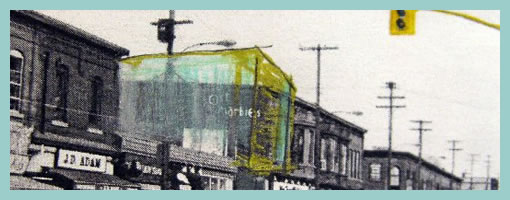
Present-Future Sketching
December 30th, 2009
I just kicked off a new inspirations category intended for samples and techniques from outside the boundaries of the UI/UX/IA profession. I’m looking forward to seek out some inspiration from within other fields in the new year (please continue to send in samples or ideas). For now, here is a first post in this category.
I’ve noticed that my sister who is in her third year of studying architecture does quite a bit of sketching and model prototyping herself. Looking through her work, one thing which caught my attention was the use of a form of sketching which overlays the envisioned building (or neighbourhood) on top of an existing environment. For me, this seems like a superb and smooth way of transitioning from the present into the future. The present in this case is a black and white photograph of the neighbourhood and acts like a clear reference point. The future state of the intended design clearly stands out by means of a coloured pencil sketch on top of the photograph. Occasionally, I’ve also seen her make use of overlaid tracing paper.
To me this seems really interesting and I wonder if the same approach can be used in UI design. When redesigning existing UIs, why not take screenshots of the current present state, import into Illustrator and sketch the future state on top. Eager to try this one day.
Credits: Dominika Linowska


December 30th, 2009 at 1:58 pm
I have used such approach for less complex redesigns, where most of the page stays the same and just some part of the page changes. For more complex redesigns it makes the result looking too messy, even if you make the underlying original very light and black&white. But from my experience most of the redesings are much more complex than just changing some small part of the page or adding something new (keeping the size and position of the rest), and then it is better to present the changes for example with manually made fade-in transition from the old design screenshot to the new design screenshot.
Nevertheless this present-future redesign using overlay can be easily done with a combination of the Firefox plug-in FireShot (to capture the entire page – not limited by the visible area) and Axure RP, where the screenshot is placed in the page template as the "locked" background with some amount of transparency (to make it lighter than the new changes).
January 4th, 2010 at 4:51 pm
Just like Ondrej says, I've done something similar in small redesigns, without even notice or emphasize this effect. First I wireframe the existing website, and with this information I start playing to create the new one.
Maybe a screenshot layer could be a better idea for presenting the work to the client, mainly for those who are'nt fluent with wireframes.
January 10th, 2010 at 1:11 am
Hello I would like to share my experience at work with a similar method to the one you describe.
We have designed some applications for one of the Archos Android device. In order to do it, we did some paper prototyping. When we used an A4, it was very easy to draw new concepts, but it was also very easy to get unreadable elements in the UI. One of our collaborators created a simple mockup of the android interface in the correct measures, so that we could draw in the size of the screen. It has been very useful.
http://twitpic.com/xftzm