WireMolecules
May 19th, 2010
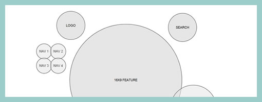
Here is an interesting example of a highly abstracted wireframe, labelled as a WireMolecule. Both the position and size of the represented elements within this example no longer represent what the interface will really look like. Instead, the focus has been shifted to showing relationships between elements as denoted by their proximity to each other. The size I also believe represents the importance of each element and not the actual size either (as also seen here and here). Definitely something a little different from a traditional wireframe. Andreas writes:
Traditional wire frames are misleading as they look too much like finished designs. Clients and designers alike run the risk of taking their direction too literally. And yet, despite all this, wire frames are invaluable tools in the start of any website design project.
And defines a WireMolecule as:
A chart giving an overview of relationships between components and features of a website. Wire molecules are developed during the Website Discovery phase and they provide instructions to designers, developers, and clients for how pages will look and behave.
Credits: Andreas Holmer


May 19th, 2010 at 4:16 pm
Errr… Isn't that what we call a "zoning" ?
May 19th, 2010 at 6:29 pm
I really like this idea. I've been tormented by the "layout" inherent in traditional wireframes. I think that is a necessary step, but it comes after determining order of importance and proximity and that conversation is elusive when people are focused on layout.
May 19th, 2010 at 9:48 pm
For someone concerned w/ Interaction design, I'm surprised at using ctrl to trigger navigation on your site.
I ctrl-click links in new tabs, ctrl-c and ctrl-v interesting bits, etc, and your menu keeps bouncing around when I do.
May 20th, 2010 at 5:31 am
I'm having trouble understanding how this exercise would bring any clarity to the design process. I just recently railed against creating obtuse and confusing design documentation that doesn't explicitly (and briskly) the project forward. This seems like another self-indulgent exercise in search of a useful application. This might be useful as an internal tool to gain alignment across a team, but I would not suggest showing this to a client. More thoughts here:http://www.kaplusa.com/blog/2010/05/a-prototype-i…
May 20th, 2010 at 3:47 am
I really like this idea. I've been tormented by the "layout" inherent in traditional wireframes. I think that is a necessary step, but it comes after determining order of importance and proximity and that conversation is elusive when people are focused on layout.
+1