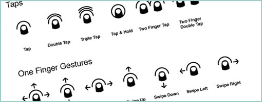
Cue – Gesture Icons
November 23rd, 2011
PJ recently took another stab at making gesture icons more comprehensible and released Cue under Creative Commons. It’s a proposed system for representing gestures more clearly that makes use of thumb like icons. He explains his motivation for the project in a blog post as well. The icons come in PNG (4 sizes), SVG, Omnigraffle and InDesign formats. Awesome. It’s always great to see explorations in visual language. Thanks PJ!
Here is how he puts it:
These gesture icons act as roadsigns to an app for interaction way-finding. As expected, there has been a significant collection of gesture icon sets that have been made available to fill this need. The current crop of icons succeed in clarity, but they lack the iconic qualities necessary to act as a standard representation of gestures. My goal is to help create a foundational set of icons that are flexible, clear and distilled to a point where they could become a standard visual system to build from – ultimately to be used within apps for when explicit communication is needed.
Credits: PJ Onori


November 24th, 2011 at 5:19 am
Hi
Well done for taking the time to do that work, and thanks for releasing it under CC. Very generous.
I probably shouldn't comment based on only looking at the screen shot in the article, but I felt driven to say that I found the "swipe" icons very confusing until I'd read they were swipe actions. The reason for the confusion is that they all include the "tap" partial. I imagine the "tap" was considered the "first part of the swipe", but a tap is definitely not the same as a swipe. A tap is a rapid down-up motion. A swipe is a much longer down-move-up motion. "beginning a swipe with a tap" doesn't work (for me, at least). Furthermore, the tap partial appears in almost every icon, sorta making it redundant (although even I'll admit this is a vague statement).
Thanks for listening and keep up the good work.