Meaningful Transitions
November 7th, 2011
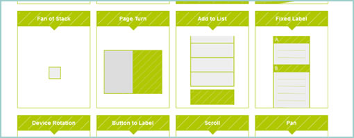
Johannes Tonollo’s thesis project explores a number of interesting user interface transitions, and how they can be used to create meaning by complementing static UIs. They have been segmented into six categories: Orientation, Spatial Extension, Awaking Controls, Highlight, Feedback and Feedforward. The site has a large number of examples or patterns for each category that are pure inspiration. Interesting stuff! Traditionally, UI designers have been reinforcing meaning by relying on gestalt principles using proximity, alignment, positioning and contrasts. Johannes shows that these could be extended with transitions and the element of time. With CSS animations getting more and more powerful, these transitions don’t seem so far fetched any longer. Thanks Michael (@konigi) for finding this!
Credits: Johannes Tonollo


