UXToolbox
June 14th, 2012
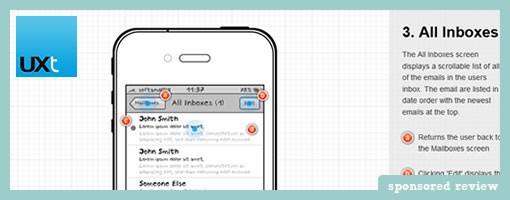
Andrew, an enthusiastic, passionate and friendly developer, asked me the other day to share his excitement and write up a quick mention of his latest accomplishment – UXToolbox. This simple, easy to use product is another alternative wireframing and prototyping tool packed with features and worthwhile of consideration. How is this one any different you might ask? Well, off the top at least two things do stand out which are the Fingertip Emulator and Interaction Cues. The Fingertip Emulator turns the cursor into a larger circular overlay with the size of a typical finger. This becomes an interesting way to evaluate a mobile or touch-based UI quickly and see if the elements are possibly too small (never seen something like that before). The Interaction Cues feature on the other hand is an option that can be enabled and turns any hotspot into a visibly pulsating animation – as seen on the many sample prototypes. This way, viewers of an interactive prototype no longer have to blindly search out where to click.
UXToolbox comes ready to use out of the box, but can be customized when needed. The large number of screen templates (ranging from iPads, Nintendo, Phones, iPods, and other Tablets) packed with a wide range of standard UI widgets and elements, can be used to start generating wireframes straight away. For those that prefer a degree of customization however, new backdrop screens for other devices and different working resolutions can all be added.
Another aspect of the tool I like is its capability to switch between a simple sketchy, more traditional wireframe view and a high resolution, pixel-perfect view which looks just like the real thing. This works great if you want to start refining your screens or to get a feel for the finished design.
For sharing and collaborating, the design tool also has a customizable commenting and annotation system in place. As seen before, comments take the form of post-it like notes, however what’s new is UXToolbox has 6 different color options. Andrew tells me the idea being that different color notes can be used to capture different types of information e.g. User Steps, Questions, Ideas, Assumptions, Requirements, etc. There is also a wide range of exporting options available. Users can export to PNG, Word, HTML, XML or three different types of print out styles. The Word export also boasts the ability to include the coordinates of the UI elements placed on a screen in a nice little layout table.
A good bit of work for such a young startup! Thanks for sharing Andrew. Want to give it a try? There is a 14 day trial download available for the Windows platform (which apparently has also been successfully emulated on MAC with VMware or Parallels). A little bird tells me there may also be a MAC version available later in the year.
Two Thumbs up! :)
Credits: Andrew – SoftandGUI


June 15th, 2012 at 4:59 am
Wow, looks great but I have a Mac (this is the first time, when I have to say "sadly" :)). What is the best prototyping app for Mac in your opinion?
June 29th, 2012 at 10:31 am
The 'Interaction Cues' feature is definitely something I miss in Axure. Manually setting these is cumbersome. Great idea!