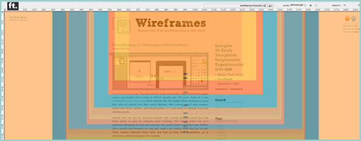
FoldTester & Scrolling
November 13th, 2012
FoldTester is a free tool that allows you to enter a URL and see numerous viewable areas as percentages based on world internet users. It’s a simple testing tool for determining viewport areas (minus the tabs, window borders, scroll bars, etc.) as well as determining where the fold might fall. I’m not sure if the tool uses up to date numbers considering the common pattern is that screens are getting bigger.
The fold, beware! Looking at this tool one might quickly fall into the trap of trying to squeeze everything above the fold. It should be noted however, that the fear of users not scrolling is an old fashioned myth. To prove the point, Paddy (the author of FoldTester) also created Life Below 600px, which shows that scrolling should be looked up to as a fundamental UI interaction and basic user behavior. The fold then gives way to scrolling as an immense opportunity for building up a story which leads to a powerful call to action.
One term which I heard being thrown around at work was the notion of a “False Bottom”, that I think is still relevant. The idea is simple. If scrolling is to be relied on, designers should always give the impression that more content is present further. This can be achieved by repetition (showing multiple repeating elements) or continuity (cutting an element in half with the fold). In other words, if there is scrollable content, one should try to avoid showing closure near the fold (ex: lots of white space that suggests completion).
Anyhow, enjoy …
Credits: Paddy Donnelly


