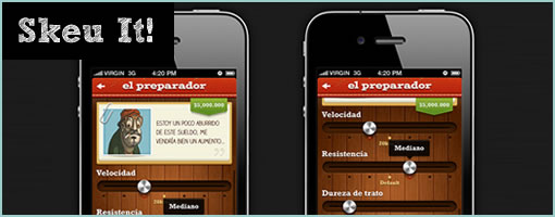
Skeu It!
May 23rd, 2013
Skeu It! – and perhaps here is the reason why people went flat with their design styles. :) It’s a parody tumblr collection of some weird looking interfaces with coffee switches, jean pockets and lots of wooden clipboards. The site is now closed off, but definitely proved a point of how ridiculous (or skewed) a UI can get when pushed to the other extreme.
Credits: Justin Maxwell (@303)


June 5th, 2013 at 5:41 am
Jakub! I thought I should warn you that when the browser window is less than 1200 pixels wide the menu starts covering up your content!
June 9th, 2013 at 9:15 pm
Thanks Sandra. Fixed :)