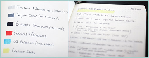
My Sketchbook Color Coding
April 11th, 2014
What, it’s been two years already? That’s how long it took me to fill in my dotted Leuchtturm notebook (German engineering at its finest) front to back. Since I’m starting a new one, I thought to devise a bit of a color coding system for my upcoming notes and just share it here. The colors I typically use to underline the very first page title. Here are the colors:
Light Grey For Thoughts & Inspirations
Sometimes I’ll hear or read something of interest from a podcast, article, or book and it gets coded this way. My own free-form personal random thoughts across various disciplines get placed here as well.
Medium Grey For Project Ideas
For the more solid, practical and actionable thoughts or sketches. These are both new project ideas or adjustments to existing ones and are often accompanies by sketched out screens.
Black For Business Strategies
These are the most strict, closest and firm action points which are tied to my business initiatives. They are very high level for the most part and act as strategic todo’s of sorts.
Red For Contacts
If I meet someone or a company of interest, they will get placed here. This section might also be some residue from a conversation with someone over a cup of coffee.
Blue For UI Patterns
Here come the user interface patterns – both good and dark. Be it existing patterns seen somewhere or envisioned ones, they both land here.
Yellow For Content
I write and rely heavily for content marketing for much of my business. Specific content ideas for existing projects get placed here. Oh, and in the example listed you can actually see that I’ve started scribbling down some content points for the GoodUI Datastories promotions. :)
Was this helpful? How do you structure your notebooks or sketchbooks?
Credits: Jakub Linowski


