Posts Tagged ‘content’

Greeked Text

Tuesday, June 2nd, 2009
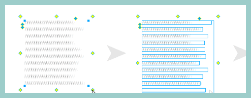

John has recently released publicly a Fireworks extension that allows designers to create a rough looking text placeholder – or “greeked” text. The extension works with the help of auto shapes and generates random line lengths of the text for a particular area. The size of the leading (or line spacing) and line height can be controlled easily as well. When rotating the text block by 90 degrees, it is also possible to use it for a quick graph like looking symbol.

This plugin is a nice addition in the rising popularity of low fidelity representations. It allows anyone to create text quickly which is very undefined and provides a nice alternative to the standard lorem ipsum approach.

Credits: John Dunning

Page Description Diagrams

Friday, April 3rd, 2009


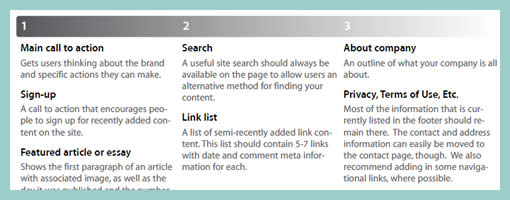
Page Description Diagrams are pretty much wireframes devoid of any layout representation. Page content chunks are described textually and also prioritized on a horizontal axis.

Here is a snippet of what Tom, of Blue Flavor, writes.

One of the main reasons why I love pdd’s is that they effectively remove visual design and layout-based discussions (which should be reserved for the visual design phase of the work) from the IA process. Presenting and discussing only content forces a client to focus on choosing what is and isn’t really important on a given page, helping to communicate their core message.

In addition, a good article on PDD’s exists over at boxesandarrows, and Garrett Dimon has posted a PDD template for Visio.

Credits: Tom Watson

Content Sitemaps

Wednesday, March 11th, 2009


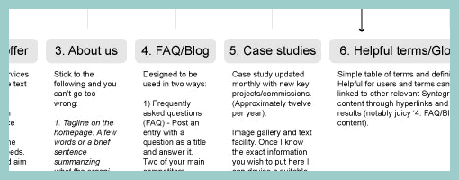
While still in a highly conceptual mode of thought during site mapping, already rough ideas begin to emerge as to how particular pages will look like or what they might contain. Often these ideas go beyond a simple one word page label. Here is an example which captures such ideas textually in more detail. This interesting view combines structural page representations with textual content descriptions – a merger of sorts between a site map and a content inventory.

Credits: Lewis Litanzios

Generic Content and Section Labels

Friday, February 6th, 2009


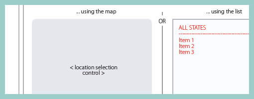
While designing, it’s not rare that at times detailing is avoided and more rapid exploration is favoured. This very much applies to wireframing as well and in particular content or section areas. When wanting to document such an area or content reference quickly, I fell into the habit of using the less than and greater than signs to suggest generic labels or variables. Using these signs allows to visually distinguish real content from the labels. In addition, this technique also allows for more granular fidelity in design documentation as some things are more detailed while others are left undefined. In a way then, using such generic labels moves wireframing one step closer toward sketching by allowing for such incompleteness.

A couple of years ago Dan Brown has also written about such different content representation techniques and also created a nice summary poster. It would be interesting however to see some stronger visual language or styling to help distinguish all of Dan’s different content representation types: actual, dummy, labelled, symbolic, and lipsum.

Credits: Jakub Linowski