In Page Conditions
Tuesday, May 19th, 2009
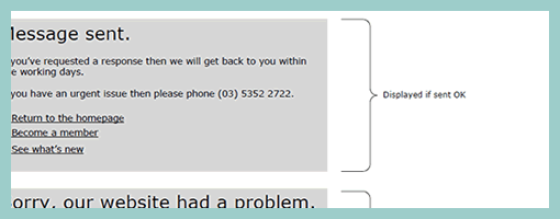
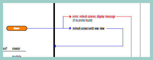
Zef just pointed me to a number of UX templates he published (along with their story), and one particular thing caught my attention. That is, his way of handling display logic based on a few “if” statements in the actual page itself (similarly to a post on in page events). The visual language used is a simple bracket with a conditional statement beside it, which is related to a grey block representing some state. This way of visualizing multiple states compared to an approach where the states are elaborated on a separate page, has the added benefit of being easier and quicker to comprehend as they are contextualized in the page. However, something also tells me that this way of documenting multiple states might work best for simpler conditionals than for more complex ones. The component or object-oriented approaches perhaps still offer more agility and flexibility even if they require more effort to imagine the full picture from elements spread out on numerous pages.
Credits: Zef Fugaz


