Posts Tagged ‘events’

State Level Wireflows and Transitions

Wednesday, February 4th, 2009
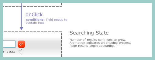

How do we document states changes when the page gives way to richer interaction? Here is one sample of my own work where I began to document state changes in a separate document away from the wireframes. Having access to detailed visual samples I cropped parts of the interface and layered flow arrows to represent these interactions. Typically however, these would not be so stylistically detailed and would probably be more wireframe like, or even sketched if speed mattered more.

Now to the meat of this sample. There are at least two things that I find useful which come to mind when documenting such interactivity in detail. First of all, transitions matter. Bill Buxton recently mentioned in his latest book, Sketching User Experiences, that interaction designers have too much focused on the states and not enough about what is in the space between them. To fill the states gap I personally find it interesting to seek inspiration about transition possibilities from JavaScript events such as the ones provided by jQuery. There are quite a bit of these events available and they range from key presses to double clicks, to mouse scrolls. Secondly, I sometimes complement events with conditions. Conditions are basically some form of written logic which applies to the event. For example: sometimes a state does not change on a mouse click alone, the mouse click has to be held down for more than 3 seconds and only then the new state kicks in. To represent these conditions, I put them right under the events in a smaller font. This is just one way of doing it. If you have other ways, please don’t hesitate to submit.

A word of caution. This one can be considered a form of a detailing technique where it’s really up to your best judgement when to perform. I definitely don’t do this for all parts of an interface. As others have mentioned in the past, sometimes things like this are best resolved through dialogue with the developers while the prototype is being built. Sometimes however, when the user experience can really be affected by how these states transition, it really helps to put it on paper.

Here is also an interesting article on the same technique.

Credits: Jakub Linowski

Error Handling in Wireframes

Monday, January 19th, 2009


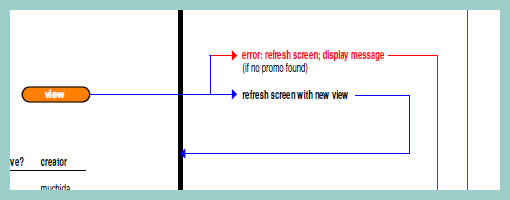
As we begin to think about, sketch and specify multiple interface states, it quickly becomes apparent that error handling is one potential candidate which is rich in state complexity. Looking around for an example of how to document errors I found a very interesting sample of such an error wireframing technique. Minoru Uchida has agreed to showcase and share it here.

The technique is quite simple. Similarly as in the previously described In Page Events example, coloured lines are used to denote user actions. If however there is a conditional error, a red arrow is used to guide the reader to a new page section with the error message in red. The nice thing about this technique is that the page can be further divided horizontally and only a few elements which change are duplicated. The remaining elements such as the header and footer are shared across the full page.

Credits: Minoru Uchida & Mark Hines

Push & Shove Rules

Thursday, January 15th, 2009


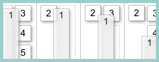
Changing elements on a page can be forceful. Traditionally, the popup or the dialogue box is an example of a rather unforceful behaviour where the overlaying element does not affect the underlying interface. It appears on top and nothing underneath changes other than a drop shadow or a grey out. This does not have to be the case however. One example of such more forceful push and shove behaviours can be seen during dragging operations. Bill documented this nicely in such a diagram. As an item is dragged and its position changes, the surrounding items are affected as they are pushed around. Using key frames, one can imagine the underlying rules during such an operation.

Finally, these push and shove rules do not have to be limited to dragging alone. As RIA elements become more flexible to resizing, dragging, animating or any other positional and size changes, such behaviours could be considered.

I found this example on Bill Scott’s superb companion flickr page for his upcoming
Designing Web Interfaces book.

Credits: Bill Scott

In Page Events

Monday, January 5th, 2009


Events such as mouse clicks, mouse overs, key presses, and focuses according to John Resig are the “glue which holds all user interaction”. Traditionally IA’s have documented these interactions with numbered annotations referenced on the side margin. However finding and reading such text based annotations can be a relatively slower process compared to the immediacy of contextualized visual symbols. Here I found a nice example on documenting an event within the page, which challenges the numbered annotation technique. Simply put, it’s just a red arrow within the page suggesting a cause and effect. Perhaps it’s not completely clear whether it is a mouse click or mouse over, but still it makes me wonder what if a new visual language emerged for more diverse in page interactions.
Credits: Vivi Zhang