Posts Tagged ‘HTML’

RWD Wireframes

Thursday, March 14th, 2013

RWD Wireframe
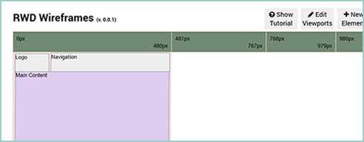
RWD Wireframes (github) is a small scale, browser based wireframing tool for responsive layouts. The tool allows you to define a few containers and then determine their size, placement, layer order, and visibility for various screen widths (which of course may also be manipulated). Apparently once an account is created you may also share your work in the form of links. Oh and it’s open source as well so you may fork it and tweak it github style. Thanks Hao for sharing this innovative project and pushing some boundaries on version 0.0.1!

Credits: Hao Luo

Form Follows Function

Monday, February 25th, 2013

FFF
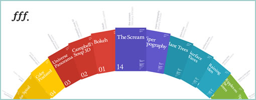
If you haven’t already heard of the Form Follows Function site, it’s definitely worth a peak at. The site showcases a bunch of interesting CSS and HTML5 experiments by Jongmin Kim, that stretch our understanding of what is possible with modern browsers. As an example, here is a CSS transform Flip Clock. The project has quite a few examples that somewhat remind me of what Joshua Davis was doing back in the early days of Flash. So if you’re tired of those bland boxes and arrows, here is how one individual has pushed HTML to its limits. Definitely inspirational.

Credits: Jongmin Kim

Framer – Modern Prototyping

Wednesday, January 30th, 2013

Framer
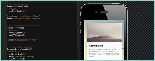
Framer (github) is a modern prototyping tool. More concretely, it’s a lightweight Javacript based framework for creating and prototyping complex interactions (with animations) on various mobile devices. I haven’t tried it on a mobile device yet, but in Chrome at least (doesn’t work in the Firefox browser), the transition and animations do look pretty smooth as the author claims to rely on the GPU directly. So if performance matters to you and you’re up for some transition prototyping fun, why not give this opensource tool a try.

In Koen’s own words:

Many people already prototype in the browser. It’s simple and quick. But while html/js/css/jquery gets a lot done it has some downsides:

  • It can get pretty complicated mixing all the different technologies
  • It can be hard to get the pixel perfect control you want
  • It’s not always performant, especially on mobile
  • It’s pretty far from how it will be actually implemented if you prototype for native

Framer tries to solve some of these problems by providing a very lightweight framework modeled after larger application frameworks. The basic idea is that you only need a few simple building blocks like images, animation and events to build and test complex interactions.

Credits: Koen Bok

jKit – jQuery based UI Toolkit

Monday, January 14th, 2013

jKit
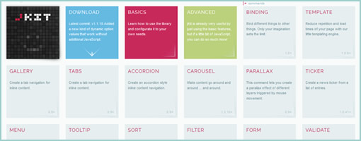
jKit is a new toolkit for jQuery, built by Fredi Bach from Switzerland, that I think has much to offer for those with HTML prototyping needs (the way prototyping is ought to be done I believe). :) The toolkit contains quite a few widgets, interactions and behaviors that help to enhance the UI while at the same time lowering the programming barrier to entry. Some of the many things that the toolkit allows for includes: a carousel, tooltips, form validation, zooming interactions on images, list cycling for styling, auto scrolling, etc, etc, etc. Anyhow, there is a lot more to it so have a look at the awesome examples and see if you it fits your needs for the next prototype you decide to build. Thanks Fredi for releasing it under an MIT license! Rock on!

In Fredi’s own words:

jKit was born in the summer of 2012. After developing almost two dozen jQuery plugins over the past years, some for myself and some for client projects at the company I work (deep AG), it was time to create something bigger and better, especially as we needed a frontend library at our company that was easy to use for our publishers and had the features we needed. But only after implementing the first few features, I started to see the real potential for this toolkit. With only about 1k per command, the plugin could add quite a lot of useful features without getting to big in size. It would meen for us that we could add this toolkit together with jQuery onto all our new client projects and easily have all the features we needed in 95% of all cases, with the benefit, that the API was easy to use and consistent. And now we’re here, with a really feature rich UI toolkit that meets our needs and gets better almost every day, mainly because we actually use it and hopefully because of the input you can give is for perfecting it more and more. I really hope you like jKit as much as I do, because at the end of the day we can all benefit from the knowledge and experiences of each others, getting this baby somewhere not even I imagine right now.

Credits: Fredi Bach (Twitter)
User Type Views & Annotations with Polypage

Friday, February 13th, 2009


Here is another very good Polypage HTML wireframe submitted by Joey Marchy from nGen Works. Two interesting uses of Polypage make themselves visible in this sample. First, on the upper left hand side, all of the various user types have been defined. Toggling them gives a good sense of what all of the various wireframes will look like for that particular user. Secondly, Polypage has also been used to annotate the wireframes and this is accessible through the upper right corner by means of such tags as “user roles” and “hash marks”. The really nice thing about this annotation technique is that no longer are the actual annotations separated somewhere in the right hand side from the main wireframe, but instead are contextualized right in the wireframe itself. This allows people reviewing the wireframe to read the annotations quicker as opposed to having to translate number references into actual notes, as it is done traditionally.

Joey writes:

We created a functional HTML prototype to accomplish two goals: get client signoff on all application interaction and provide a roadmap for the development team building the application. We used a combination of PHP and the awesome Polypage jQuery plugin to show the myriad of states between differing user levels and application states.

Credits: nGen Works

960.gs Grid Based Prototypes

Monday, February 9th, 2009

Just found a nice HTML prototype sample using the CSS 960 Grid System. The CSS grid allows to align elements more easily across pages. Although it can be said that the technique is perhaps more useful for developers, some people also use it to create wireframe prototypes. In addition, Mushabar Iqbal also ported the fluid grid to a jQuery template allowing for smoother template interactions. Adam Hawkins explains how to use the 960 CSS Grid System for interactive prototyping, but at the same time warns of the inflexibility and rigidness of such an approach. Apparently, once the grid foundations are laid down and multiple pages start making use of it, it becomes more difficult to adjust the grid. Finally, a Twitter follower (wrenbjor) also provided me with a nice and elaborate list of even more tutorials on the 960 grid.

Credits: Lachy Groom

Interactive Axure Prototype

Sunday, February 1st, 2009


Jim just sent me a very nice and developed sample of an interactive HTML prototype done in Axure. The prototype is clickable and provides a richer understanding of what happens from screen to screen. As a standalone document however, in order for someone to understand this sample they are left alone with exploration as the means to do so. So for user testing and walk through situations this works out nicely, but what about if we wanted to send this to someone else for review and have the sample communicate use on its own without the designer being present? I am now wondering if it would be useful to overlay some sort of scenarios to guide first time viewers of the sample about the most important flows. Just a thought. Jim also sent me a link to a comparison between the prototype and the final product.

He writes:

We used Axure RP for creating these interactive wireframes which we tested volunteers on, to see whether they understood the ‘flow’ of the intended site. Using Axure made it clear for the client to understand what they were getting delivered, and also to see whether we had interpreted the ‘mental model’ correctly from earlier card sorting excercises:

Credits: Jim Callender

State Based HTML Wireframes with Polypage

Saturday, January 17th, 2009


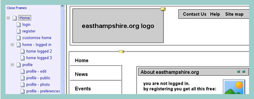
Ben pointed me to an interesting set of HTML wireframes which use Polypage. Polypage expands HTML wireframes or mock-ups and allows for the creation of page states. Furthermore, the various states are independent of each other and can be toggled on a small top menu to affect the page view. Say for example you want to show your wireframes to your client in the “logged out” and “first time visit” states. Polypage allows you to click through all your wireframes to demonstrate such a case. Later on when you decide to demonstrate the “logged in” state, all you do is toggle it in the top menu and continue your presentation.

The technique was initially developed at Clearleft, and Richard Rutter explains how to use it better. Here are two more sets of wireframes using this technique which contain more page states to explore.

As a side note, here is also an interesting debate as to whether these things are wireframes or prototypes.

Credits: Ben Sauer