Posts Tagged ‘persona’

MicroPersonas

Wednesday, January 23rd, 2013
MicroPersonas
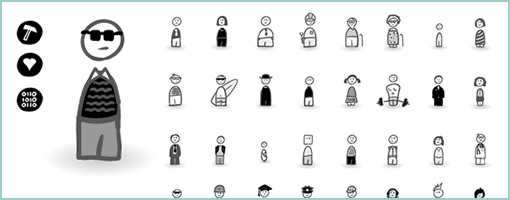
MicroPersonas is a new icon set that I just came up with for building and using quick persona like characters in your interaction design deliverables. The set is founded on the belief that personas should be generated rapidly with only those characteristics that can be used to influence or inspire design action. If personas are to be leaner, more concise and live closer with interface sketches (without being lost in separate documents) then this is a materialization of that type of thinking and a step toward lighter documentation.

The set comes with 40 sketched style characters and 9 characteristics (beliefs, habits, comments, triggers, tools, needs, problems, data, and artifacts) setup in .AI (Illustrator) and .PNG (Fireworks) formats.

Purchase and download it at www.linowski.ca/micropersonas for $29. Enjoy …

Credits: Jakub Linowski (Twitter)

Speech Bubble User Flow

Thursday, March 29th, 2012


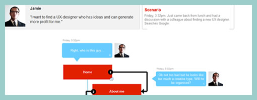
The Speech Bubble User Flow by Barnabas, is a hybrid representation that combines a sitemap, persona and user flow all into one. The idea starts off by overlaying simple and short comments made by a persona in the form speech bubbles on top of a structured sitemap. More so, the speech bubbles are ordered chronologically and so flow through one by one. In the built Axure Demo that has been generated, the sitemap pages are also linked to the wireframes which makes it easier to switch from the generic to the specific. Barnabas has been exploring Personas that “could talk” in a few other forms as well, as the Complex Speech Bubble Persona and the Commented Sitemaps show.

My take on this deliverable would be that Personas can sometimes get lost once a project builds momentum. Possibly what Barnabas is doing is helping the Persona to live a little bit longer and inspire the team a bit more as the Persona’s comments pop up throughout the project. One thing I do wonder about is how this would work though if there was a second or third scenario for the same user type, as sometimes I feel that interactive projects are composed of many little separate user stories and not just one. Either way, good stuff and thanks for sharing!

If you would like to tweak the deliverable, the author has been kind enough to share the actual source Axure file as a downloadable template.

Credits: Barnabas Nagy

Persona Template

Tuesday, March 1st, 2011


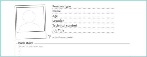
A persona template has just been shared by the folks over at Orange Bus. Perhaps what might be interesting about this particular one is that it invites quick and dirty hand drawing or writing. A lot of the other personas out there, from what I’ve seen in the past, look pretty well polished. This one on the other hand is a lot more doodle compatible. It comes with fill in the blank spaces for basic naming, portrait, a back story, motivations, frustrations, their ideal experience, and a summary quote. Nice!

Credits: Joanne Richardson

Usability Test Snapshots

Wednesday, April 7th, 2010


Usability testing is a pretty standard practice and I assume most of us here have done or might do a few of these evaluations in their design careers. Last month, I had the chance to spend some time with end users on a software project and I thought of sharing some of the documentation which resulted from the activity.

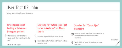
Right after doing such a test, we’re often faced with the challenge on how to capture and convey some of the interesting findings to others on the team or even ourselves. Some people try video, while others overlay the identified problems on top of screen captured images. In this round of testing I was aiming for something slightly different. Essentially, I wanted to a capture the core notes per each user on a single piece of 8.5×11 paper (perhaps in a persona like fashion?). Each page would have starting points of what the user has initially done with the use of red text, followed by dark grey notes as the actions unfolded. The findings were then tagged accordingly as: ideas (light bulb symbol), confusions (question mark) or positive remarks (happy face). Further more, the sample also makes use of subtle informal sketches through out the page to help convey the issues somewhat visually.

Perhaps to someone who lacks context of the project or products being tested, a deliverable such as this might not be adequate enough at conveying the issues. On the other hand, for those who have participated in the test as observers, the following usability test snapshot might act as an inspiration piece for the design work ahead.

Please post as a comment (or submit) ideas of your own on how to best convey, remember or prioritize findings from design research.

Credits: Jakub Linowski

Experience Maps

Wednesday, February 24th, 2010


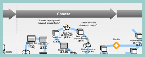
An interesting depiction of user experience has surfaced the other week over at the nForm blog in the form of an experience map. Gene and his team has come up with a way to represent gaming related experiences of three distinct gamers. In a way then this is a merger between a persona and a time based representation. The other interesting thing about this is the visualization and separation of at least three types of experiences: ongoing, exploratory and influenced. Each type of experience has been shown in a standardized and specific way. Furthermore, the diagram also captures and represents a variety of channels which the personas are utilizing at a given point in time. Overall, it’s always interesting to see when designers attempt to convey such comprehensive and unified high level deliverables.

Credits: Gene Smith of nForm

Agile People

Monday, April 6th, 2009


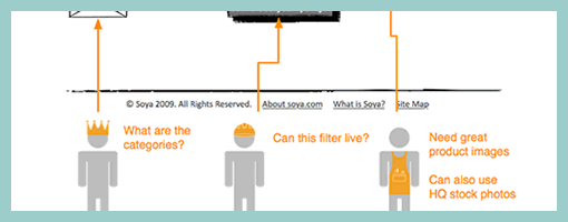
Personas inside of wireframes? Sherrod began combining little people figures with actual interface representations. It’s interesting to see these miniature persona like icons along with their basic user stories or simplified needs trying to provide an additional layer of information about the context of use. The icons also come available as a downloadable PSD file and contain a number of unique roles.

Credits: Sherrod Faulks

Personal Card Set

Wednesday, March 25th, 2009


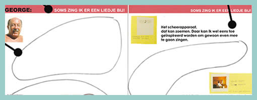
The people over at TU Delft, have come up with a persona deliverable which makes use of white space and invites interpretation in order to involve the team in the findings more closely. This is an example of participatory communication where designers begin to own the data through active co-creation as opposed to just passive reading. Similarly Johnny Holland recently wrote about personas being more about the process which immerses designers in the findings, than just being about the outcome.

Froukje in Sharing User Experiences in the Product Innovation Process writes:

Each card is laminated and the set comes in a box together with a set of non-permanent markers and a sponge. The cards invite designers to interactively structure and analyse them: they can create overview, re-arrange, select and compare the cards. The design of the cards invites designers to add their interpretations and react on the leads suggested by the researcher. Each card has plenty of white space for annotations of ideas/insights/conclusions, which can be made with the non-permanent markers, and can be wiped off with the sponge. This way, designers are stimulated to become active partners in the communication.

Credits: Froukje Sleeswijk Visser