Posts Tagged ‘powerpoint’

Blackberry 10 Templates for Keynote and PowerPoint

Wednesday, April 17th, 2013
Blackberry 10 Templates
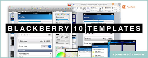
Blackberry 10 Templates has recently gone live as a sibling product to Windows 8 Templates by Jordan Gurrieri. As the name suggests, the templates contain some high quality customizable vector components themed in the new BlackBerry 10 UI style. The template is loaded with: a home screen, 80 royalty free icons, menus, forms, grids, activity bars, progress indicators, media player controls, sliders, drop downs, and the new BlackBerry 10 keyboard … you get the picture.

Why choose the BlackBerry 10 Templates? Jordan writes:

Quality and Attention to Detail.

BlackBerry 10 Templates was built by Jordan Gurrieri, lead designer and front-end developer at Blue Label Labs, as a tool to help our team quickly and easily mockup high quality app designs for client proposals, user demos, and developer requirements.

At Blue Label Labs we live and breathe app development, so you can be sure our templates are designed to detail specifications of the UI guidelines set out by BlackBerry. Your developers will love you when it is time to turn your mockup into design resources for development!

Finally, as this new platform evolves, we will be adding more commonly used design patterns and components which you get as part of the life-time free updates.

Grab them right here.

Credits: Jordan Gurrieri (Twitter)

PowerStory 2.0: Wireframe Storyboards Using PowerPoint

Tuesday, March 19th, 2013


PowerStory 2.0 for Powerpoint has just come out. For those of you not familiar with PowerStory, it is a plugin for PowerPoint that merges use cases, wireframes and storyboards into what is called a “Use Case Storyboard”. The interesting approach to the tool is its intent to bring agility to these traditional deliverables by combining them into one integrated deliverable, which also looks like it improves requirements communication and collaboration. Oh and one cool feature is that it also generates test cases which not only saves you some testing budget, but would support iterative and agile development teams.

The main advancement with PowerStory 2.0 over 1.0 (which I reviewed here) is the addition of a UI Library of 250 standard controls that cover the web, mobile and desktop applications. This new library is also extendible allowing you to create your own custom controls along with import and exporting sharing capabilities. This means you are not limited in the UI/UX look and feel you are after, and could also create a standard library of UI Controls for your project if needed. The move should now make it a much easier for UI designers when making Wireframes using PowerPoint. The nice thing about using PowerPoint is that everyone knows how to use it and it is good for walkthroughs. There are some nice features within PowerStory that make it easier to walkthrough your storyboards by giving you context of where you are. You could use this tool to create traditional linear presentations or take advantage of its “use case” based storyboards which essentially allow you to create alternate flows. This should help reduce the duplication of UI Wireframes across storyboards.

In terms of the test case generation, this is rather unique and a great time saver. The test cases generated can be exported into MS Word, MS Excel and MS Team Foundation Server.

Are you a BA, UI, or UX designer? Give PowerStory 2.0 a try.

Get It Now

Credits: Martin Crisp

PowerMockup v3: Wireframe with PowerPoint

Tuesday, October 30th, 2012


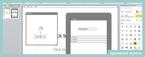
PowerMockup v3 is out. The new version of this awesomely simple PowerPoint plugin comes now loaded with a total of 100 UI stencils and 140 icons. Aside of a nice introductory video screencast which Andreas did, the update allows designers a great deal more of control over their stencil libraries. With custom stencil item creation, export and import options, and categorization, it is now easier to manage and reuse interface assets.

Stencils now can also be searched instantly with a handy keyword search box that limits assets as soon as someone types anything. This search makes use of a synonyms thesaurus of sorts and improves the overall search experience even further. Some stencils and elements are now also made a bit smarter when they are resized. These smarter elements know when and how to keep their proportions, as in stretching a tabbed navigation for example.

Some additional containers have been also expanded to contain such screens as windows, tablets, and iPhones. The plugin works with PowerPoint 2007, 2010 and 2013 and so is ready for the next release of MS Office. Nice!

Try out the 30 Day Free Trial.

Credits: Andreas Wulf

Windows 8 Templates for PowerPoint

Monday, September 24th, 2012

Windows 8 Templates
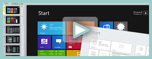
Windows 8 Templates has recently gone live as the new operating system is just around the corner. The site features a number of Metro UI themed kits and templates for PowerPoint users. The most comprehensive grouping (Windows 8 All-in-One Bundle Pro) contains a wireframing kit, a prototyping kit, an icon pack and storyboarding shapes (requires Visual Studio 2012). The main difference between the prototyping and wireframing kits is that the former has a bit more color. All of the work within each kit is also vector based and so makes it easier to edit and stretch the assets appropriately as needed. So if using a low barrier to entry tool such as PPT is important in your process, then give this template kit a try.

A couple of words on the use of PowerPoint by Jordan (the Author):

While I am adept in professional design tools like Photoshop, 99% of the time my tool of choice for mocking up an app is PowerPoint. PowerPoint is incredibly productive and simple, and yet powerful enough to help me develop even the most custom of designs quickly and efficiently. Better still is that everyone knows PowerPoint, and that means my clients can easily contribute to the design with their own edits and ideas. Another +1 from clients when they feel truly involved with the design of their product. It doesn’t stop at static mockups, I can use PowerPoint animations and slide transitions to turn any mockup into a functional prototype that clients can click through as though they were using a real app.

Credits: Jordan Gurrieri (Twitter)

PowerStory

Monday, July 23rd, 2012


PowerStory is a PowerPoint UI requirements tool that Martin has been closely working on and recently released as a plugin for Windows 7, MS Office 2010. The main goal here is to save project time/budget and also improve the accuracy of your requirements and test cases, which is applicable to both small and larger teams.

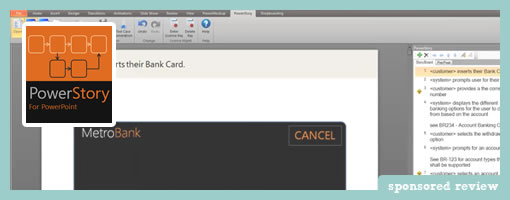
First of all, it combines written use cases with visual storyboards all within PowerPoint. It does this by associating a PowerPoint slide with each use case step in the main flow and alternate flows defined using PowerStory’s step editor (see the right hand side of the image above).

This more flexible approach enables you to define realistic user interaction behavior, making your requirements more accurate. In addition you will save time because a lot of use case steps and therefor UI mockups will be reused, when compared to traditional linear storyboards.

Secondly, PowerStory also can be used to auto-generate test cases into TFS (Team Foundation Server – Microsoft’s software lifecycle system) directly from the Storyboards. What are test cases? You know, those things which tell you if your big and complex software is on track. The uses cases which are written inside of PowerStory are also tagged as “system” or “user” which then translate into either a UI event or a user action inside of TFS’s as test cases.

PowerStory is a unique approach that can work in both small agile teams and larger enterprise teams, because it combines traditionally separate deliverables into one saving time and increasing agility, but also has the ability to generate test cases for formal testing teams or small agile cross functional ones. And after all it is based on PowerPoint, which is already on most desktops, so it is easy to share your work.

So if you write requirements, wear the Business Analyst or UI/UX hat then give this fresh approach a try.

Here is the five day trial download.

Credits: Martin Crisp

Minicons

Tuesday, June 26th, 2012

Minicons
Some time ago, Vincent released Minicons (after his Vectorian release) which I thought might be worth a mention for the UI folks out here. It’s a set of 1500 icons in many many different forms ranging from EPS, to Photoshop CSH, to PNG, PDF, Omnigraffle, Keynote and Powerpoint. The icon packs are sold in flexible plans ranging from 100, to 750 to the ultimate 1500 icon sets and priced accordingly. Cheers.

Credits: Vincent Le Moign

PowerMockup

Tuesday, April 26th, 2011


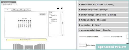
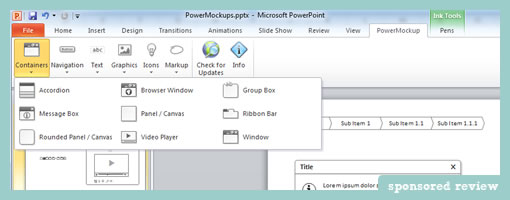
PowerMockup is a simple UI design plugin for Microsoft PowerPoint that makes it easy to create low fidelity wireframes. Perhaps one of its core strengths is that it has a low barrier to entry, since many people out there already have access to PowerPoint. The plugin speeds up the design process by letting users insert fully editable UI elements (containers, navigation items, icons, and text elements) onto the canvas.

The merits of PowerPoint as a prototyping tool have been discussed in the past and are definitely worth to consider. For one, PowerPoint supports basic interactivity and nonlinear page linking. Personally however, I still like to think of a the page-by-page linear narrative nature of PowerPoint as an equally strong alternative presentation style to interactive prototypes. With a defined beginning and an end, a PowerPoint deck ensures that viewers don’t have to discover interactivity, but instead can be guided across flows.

Would I personally use this tool as an interaction/interface designer? I’m not sure. I’ve come to love Illustrator, endless canvases, and free-form electronic sketching as a technique. So moving away from that style of working would require something more than a set of pre-canned elements. I’d still recommend it to others on a more multidisciplinary team – especially if there were people with less of a design background, but still a desire to express their ideas quickly.

Overall, a great little product. Thanks Andreas!

Credits: Andreas Wulf