Posts Tagged ‘prototyping’

pentotype

Tuesday, July 15th, 2014
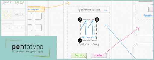

pentotype is a new drawing software that lets you create clickable wireframes on your iPad or on your desktop with a graphics tablet. Since drawing sets virtually no limits, you can create any interface that you want, be it a website, a game, or a regular application with a custom UI. You can quickly share ideas with your team and see how the user will walk through your app.

Drawing

When you start a new project in pentotype, you’ll get an empty, infinite canvas. After inserting a new screen, either by selecting it from the side bar or just by drawing a rectangle, you can go ahead and draw your design. The features are simple so as to keep it low-fidelity: 5 colors for the pen, 3 font sizes for text. All elements of your drawing can be moved, deleted, copied, or saved as a stencil, so pentotype makes it very easy to create wireframes and apply changes. Available wireframe types are phone, tablet, and website.

Screenflows

By inserting more screens to the document, you can create a whole screenflow. Along with drawing the UI of the screens, you also draw the interaction between them: Just draw a line between an element and another screen, and you have immediately created a link. The kind of transition is automatically recognized (e.g. a slide transition between neighboring screens) but can also be changed.

Simulations

After you have drawn your wireframe, it can immediately be tested with functional links, transitions, and scrolling (in website wireframes) – just hit the “simulate” button. In order to send the simulation to your phone and view it there, just scan the QR-code. To get an idea of what this can look like, try out the example appointment app.

Collaboration and Feedback

By adding team members to your account, you can work on projects together. By sharing the link of a project with people (even without a pentotype account), they can immediately give you feedback by writing comments directly in the wireframe.

Try it for 30 days

Credits: Johannes Dörr

Axure Flat UI Kit

Friday, June 13th, 2014


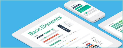
Although I don’t use Axure for prototyping, and I might have some particular views on flat design, this new Axure Flat UI Kit does look pretty slick at first glance. The controls within the template definitely seem to behave a lot smoother since I last remember how Axure looked over a year ago. Nice work.

The UI Kit includes over 310+ interactive and beautifully crafted page elements, modules and complete templates. The UI Kit uses Axure’s powerful widget library. Create complex and interactive wire frames with a snap. Icons included.

Have a look inside

Credits: Marc-Oliver Gern

Introducing Proto.io 5

Monday, October 7th, 2013

Proto.io
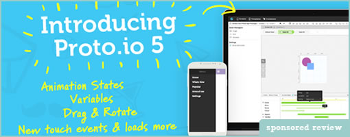
Less than two years ago Proto.io introduced to the public the first release of its popular mobile app protyping platform. Today, Proto.io introduces the 5th and most powerful release Proto.io 5.

The new release promises to help designers and developers to unleash their creative freedom and create unique user experiences even faster than before. Among various enhancements, Proto.io 5 takes prototyping a step further by adding animation states, timelines, draggable functionality and variables. Check out the new features and demos.

Proto.io continues its full HTML5 and cross ­device, cross ­browser support that allows prototyping for virtually any device including smartphones, tables, Smart TVs, game consoles and more. Prototypes can run in any web and mobile browser (on the actual device) making the testing experience as realistic as possible.

Proto.io 5 Highlights

As listed on their website the most important new features in version 5 include:

Animation States + Timelines

Proto.io 5 introduces Animation States and Timelines, a fast and intuitive way to build HTML5 interactive animations. Easily create different states of the same screen and intuitively define the tween transitions, animations and interactions between each state using the powerful new timelines to create animations in a better, faster and easier way.

Drag & Rotate

Making any item on the screen draggable or rotatable is now just a checkbox away. You can now enable drag functionality for any UI element on the canvas, set various properties to define how drag behaves, and interact with various drag callback events to do sophisticated interactions.

Variables and Item property interactions

Start capturing user input, record user events and calculate data from interaction callbacks. Variables can be used to set and get values to and from UI elements, do math calculations, and modify text and other properties on the fly. You can easily combine variables with any touch events and interactions to create interactive content that changes based on user input.

New touch events

More mobile events like touch, release and pinch have been added to the long list of touch and mouse events to enhance user interaction. All events are compatible with mobile and web, thus
allowing the development of multi platform experience with no hustle.

Sign up for free or Try it for 15 days


InVisionApp: Now With Sketch Commenting

Tuesday, June 11th, 2013

InVisionApp Sketching
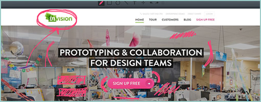
What do you get when you merge a pretty cool web based prototyping tool with some sketching capability? You got it – InVisionApp. These guys from NY have just launched a Sketch Commenting feature in their latest build. This now allows designers to express themselves more easily as words and pictures are more powerful together. They’re already awesome so no need to write anything else … “design on my friends” as they say. :)

Sign up for an account and give this tool a try (1 project always free).

Fries

Monday, June 10th, 2013

Fries
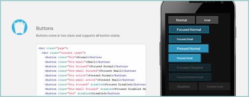
Fries (github) is a prototyping tool for Android devices. I think it allows you to spit out Android styled UIs just using HTML, JavaScript and CSS. Yes, it apparently plays nice with PhoneGap …

Description pulled from Github:

Fries is an awesome mobile development framework (yes, not just for prototyping!) for Android apps using just HTML, CSS, and Javascript and was inspired by Ratchet. We all know that you can find loads of iOS development tools out there, so this time let’s give some love to Android.

Credits: Jaune Sarmiento

InVision 2.0 – Present. Engage. Collaborate. Iterate.

Wednesday, April 3rd, 2013


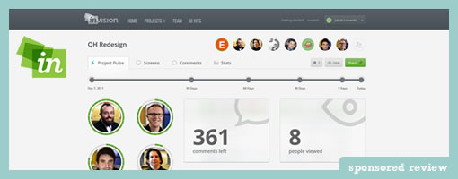
InVision 2.0 is now out. Clark and his team have been hard at work redesigning and redeveloping the next iteration of this awesome web based prototyping tool. At the time of writing, this smooth thing has 77k active projects going on strong and some good reasons for picking up on its popularity recently.

Very Strong Team Focus

With 4.4 million comments left since its beginning, InVision takes design collaboration pretty seriously. This is definitely seen in version 2.0 and the team really understands that no one designs in a vacuum. Take the new project pulse view for example. This project dashboard so to say, gives collaborators a way to understand who has commented, what new screens were changed, what screens were added, and who viewed what recently. This awesome project glimpse can be contextualized in a flexible time scale of today, the recent 7 days, 30 days, 90 days or since the beginning. For those who prefer to understand when a project has been the most active, the same data can be viewed as a time graph under the project stats tab. The visibility of team behavior here, definitely helps to build a collaborative feel.

Each project also very clearly shows its team members in the top right. The faces of the people you are working with on a given project are now visible which humanizes the sometimes distant remote design process. Each person also has a dedicated profile view with their project and a corresponding activity stream. Score!

Care about comments? The new comments tab lists a chronological discussion view of all the things that have been discussed, with the comments contextualized nearby little visual snippets – context is king and a picture is worth a thousand words. What’s more is that these comments are also keyword searchable and actionable. The comment-email integration is thought through giving users the ability to reply to them (and interact with the team) directly from within their email clients.

Smooth Performance

Although I haven’t noticed a difference, the InVision team claims that everything on the front end has been rewritten with the intention of speeding things up. I always thought it was pretty quick anyways and never had any delays with it. 2.0 is smooth as smooth can be.

Other 2.0 Goodies

The change-log of the latest version also indicates that a few extra hot things have made it through as well. These new features include: bulk actions, device staging, anonymous sharing, user testing mode, dev notes for hand off, and real time pushing. Overall a solid release in my view!

Have some work that needs to be shared with a team, or need to build an awesome web prototype mockup? Then give InVision 2.0 a shot. Yup, the first project is always free!

Get It Now

RWD Wireframes

Thursday, March 14th, 2013

RWD Wireframe
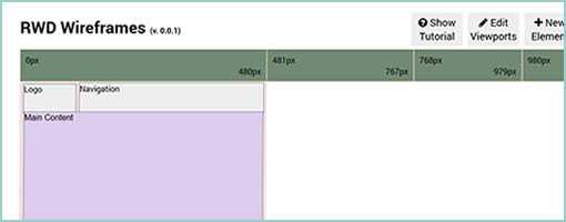
RWD Wireframes (github) is a small scale, browser based wireframing tool for responsive layouts. The tool allows you to define a few containers and then determine their size, placement, layer order, and visibility for various screen widths (which of course may also be manipulated). Apparently once an account is created you may also share your work in the form of links. Oh and it’s open source as well so you may fork it and tweak it github style. Thanks Hao for sharing this innovative project and pushing some boundaries on version 0.0.1!

Credits: Hao Luo