Posts Tagged ‘sketching’

GoodUI Sketches On Instagram

Monday, April 4th, 2016


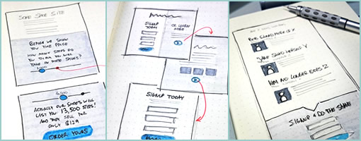
GoodUI has started sketching on Instagram. The sketches, although experimental, are still very much conversion focused. Every now and then I decided to get back to basics with a pencil, pens, paper and markers. Oh and the better sketches will eventually make it back into the GoodUI Fastforward template set. Enjoy.

Follow GoodUI On Instagram

Credits: Jakub Linowski

pentotype

Tuesday, July 15th, 2014


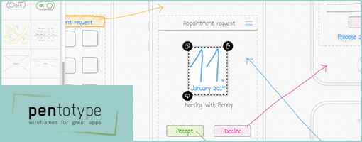
pentotype is a new drawing software that lets you create clickable wireframes on your iPad or on your desktop with a graphics tablet. Since drawing sets virtually no limits, you can create any interface that you want, be it a website, a game, or a regular application with a custom UI. You can quickly share ideas with your team and see how the user will walk through your app.

Drawing

When you start a new project in pentotype, you’ll get an empty, infinite canvas. After inserting a new screen, either by selecting it from the side bar or just by drawing a rectangle, you can go ahead and draw your design. The features are simple so as to keep it low-fidelity: 5 colors for the pen, 3 font sizes for text. All elements of your drawing can be moved, deleted, copied, or saved as a stencil, so pentotype makes it very easy to create wireframes and apply changes. Available wireframe types are phone, tablet, and website.

Screenflows

By inserting more screens to the document, you can create a whole screenflow. Along with drawing the UI of the screens, you also draw the interaction between them: Just draw a line between an element and another screen, and you have immediately created a link. The kind of transition is automatically recognized (e.g. a slide transition between neighboring screens) but can also be changed.

Simulations

After you have drawn your wireframe, it can immediately be tested with functional links, transitions, and scrolling (in website wireframes) – just hit the “simulate” button. In order to send the simulation to your phone and view it there, just scan the QR-code. To get an idea of what this can look like, try out the example appointment app.

Collaboration and Feedback

By adding team members to your account, you can work on projects together. By sharing the link of a project with people (even without a pentotype account), they can immediately give you feedback by writing comments directly in the wireframe.

Try it for 30 days

Credits: Johannes Dörr

My Sketchbook Color Coding

Friday, April 11th, 2014


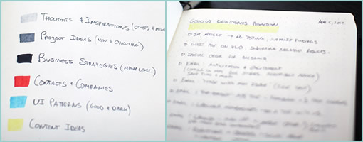
What, it’s been two years already? That’s how long it took me to fill in my dotted Leuchtturm notebook (German engineering at its finest) front to back. Since I’m starting a new one, I thought to devise a bit of a color coding system for my upcoming notes and just share it here. The colors I typically use to underline the very first page title. Here are the colors:

Light Grey For Thoughts & Inspirations

Sometimes I’ll hear or read something of interest from a podcast, article, or book and it gets coded this way. My own free-form personal random thoughts across various disciplines get placed here as well.

Medium Grey For Project Ideas

For the more solid, practical and actionable thoughts or sketches. These are both new project ideas or adjustments to existing ones and are often accompanies by sketched out screens.

Black For Business Strategies

These are the most strict, closest and firm action points which are tied to my business initiatives. They are very high level for the most part and act as strategic todo’s of sorts.

Red For Contacts

If I meet someone or a company of interest, they will get placed here. This section might also be some residue from a conversation with someone over a cup of coffee.

Blue For UI Patterns

Here come the user interface patterns – both good and dark. Be it existing patterns seen somewhere or envisioned ones, they both land here.

Yellow For Content

I write and rely heavily for content marketing for much of my business. Specific content ideas for existing projects get placed here. Oh, and in the example listed you can actually see that I’ve started scribbling down some content points for the GoodUI Datastories promotions. :)

Was this helpful? How do you structure your notebooks or sketchbooks?

Credits: Jakub Linowski

AppSeed – KickStartIt!

Monday, September 23rd, 2013

AppSeed
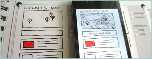
AppSeed is a KickStarter project that intends to blur the lines between sketching and prototyping. Actually, that’s real world sketching and digital prototyping we’re talking about here. Imagine pencils merging with pixels. Anyhow, it’s a few more weeks till it can get funded and probably still needs a nudge to make it happen. Hence sharing it here for those interested in backing this interesting project. It’s from Toronto as well and I like sketching, so here it is. :)

Credits: Greg Goralski

Basiliq

Thursday, September 5th, 2013

Basiliq
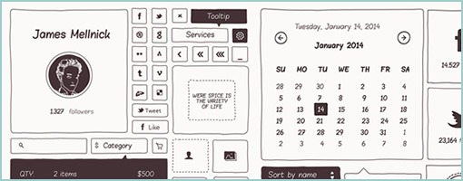
I am not sure that Photoshop and sketching mix well together. If you do end up sketching in this beast of a tool, please also consider eating soup with a fork and let me know how it tastes. Nevertheless, the awesome team over at Cloud Castle has recently released Basiliq – a handcrafted set of mockup elements for Adobe Photoshop. I think it comes with 300 or so UI elements and icons – maybe even a free cake or something.

Ok joking aside, I think this hip template is more geared at printing bits and pieces for the purposes of paper prototyping. If you do sketch in Photoshop, do let me know how it goes. :)

Credits: Cloud Castle

Sketchnote Typeface

Monday, July 15th, 2013

Sketchnote Typeface
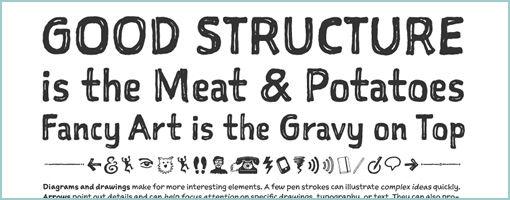
Just learned that there is a cool new sketching font out there. It’s called Sketchnote designed by Mike Rhode. He has used it extensively in his sketchnoting book as well. Looks pretty solid to me and could be beneficial alongside any electronic sketches. Enjoy. Cheers.
Credits: Mike Rohde

Sketchplanations

Monday, July 1st, 2013

Sketchplanations
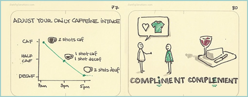
So it turns that Jono, a UX designer at Nutmeg, has picked up some Moleskin Storyboarding Sketchbooks and set himself a goal of explaining something in sketch form each day. Hence Sketchplanations was born. Oh and beware, as these are all first time sketches, 100% authentic, with no corrections whatsoever. A great little inspirational project. Thanks Jon!

Credits: Jono Hey (@jonohey)

InVisionApp: Now With Sketch Commenting

Tuesday, June 11th, 2013

InVisionApp Sketching
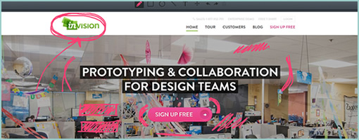
What do you get when you merge a pretty cool web based prototyping tool with some sketching capability? You got it – InVisionApp. These guys from NY have just launched a Sketch Commenting feature in their latest build. This now allows designers to express themselves more easily as words and pictures are more powerful together. They’re already awesome so no need to write anything else … “design on my friends” as they say. :)

Sign up for an account and give this tool a try (1 project always free).

Lean Sketching Tips: Flexible Fidelity & Cutting Corners

Friday, March 8th, 2013

Lean Mean Sketching 101
Here is some lean UI sketching advice – let the level of detail be a variable in your design process that which you control. Staying conscious of and knowing when to cut a corner or when to spend additional time detailing an interaction, screen or flow is a healthy thing. All sorts of design tools impose certain fidelities on to us the second we pick them up. Take on Axure RP for example and before you know it you’re sucked into aligning stuff at a pixel level whether you like it or not. Load up Adobe Fireworks too quickly and subconsciously you begin writing actual copy, comparing pixels, and choosing RGB color values. The tools which we use, just as Donald Norman said of the artifacts we design, also come with affordances – do stay aware of how much detail they ask of us.

Surely everyone by now knows that sketching tends to be low fidelity in nature as it’s often quick and dirty. However when it comes to its fidelity I think there is more to it. Sketching in particular is a lot more flexible than we think comparatively to other tools out there. I believe that sketching allows designers to work at a wider and therefore more flexible range of detail. On one hand it may be super quick, yet at the same time it also allows us to slow down and elaborate. Here are a couple of examples of what I mean:

Scribbles vs. Real Text

Scribble Text
Consider the text we show and indicate in our work. Sometimes it’s rightfully fine to just ignore detail and save time by showing it as a bunch of scribbled lines. At other times of course we may imbue our concepts with more detail and show the actual text. After all, copy has a clear connection to experience, usability, and understanding. Nevertheless, choose wisely.

Outlines vs. Depth with Contrasts

Outlines
What about outlines – they are a quick way of suggesting an area. These of course can be elaborated with depth or contrast in order to convey element priority. Lighter backgrounds can give way to darker ones when it comes to showing importance.

Partials vs. Full Screens

Partials
I love how useful partial screen sketches can be! They cut through time and effort like a knife through butter (and also save you additional time when you later have to update your working documents). Why design a full screen if all that matters is the top navigation? Sketching in this way allows the designer to emphasize by leaving other elements out, literally. Of course, at other times full screens are the way to go. Be in control!

Placeholders vs. Detailed Components

Placeholders
Placeholders abstract a component by describing what it contains with the byproduct of spare time. It’s a good way of cutting a corner. Alternatively spend additional design time on the same component and turn it into a higher fidelity object.

Approximate vs. Precise Alignment

Approximate
As mentioned previously, aligning elements to the pixel can be a time sink. Sometimes an approximate position is just as fine. Similarly, the same rule applies to how straight or crooked we draw our lines. Decide what works for you and when.

Taken together, being in greater control of a design process does matter with the level of detail being one such variable. When corners are decidedly cut however, some clear benefits do arise. The additional spare time which is brought on can then be allocated to other and more important areas instead. One beneficial use of effort early on in a process is on widening the scope for example and thinking through broader interactions as opposed to just a few screens. Another valuable benefit of cutting corners is for designing alternatives and generating more ideas for the same screen, interaction or user story. Of course as a project unfolds and more knowledge along with deeper consensus is generated, don’t forget to start raising your level of fidelity. After all, the devil is in the details. The important thing here is that you (and not the tool which you use) are in charge when the detailing begins to happen.

Credits: Jakub Linowski
Iterations: Concepting Cards

Friday, December 21st, 2012

Iterations
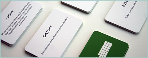
Design inspiration cards have been around for a while in various shapes and sizes with the intention to challenge and help us break out of our routines. Duncan, a product designer in the Netherlands, made a concepting card deck called Iterations which he released under a Creative Commons license. He also describes his process of building them in a blog post.

Iterations is interesting in that it focuses on the early ideation phase when designers are “concept sketching”. The cards have small tactical actions that inject some randomness into a design process, which might say “SHUFFLE Disorder components”, “LOOP Repeat last Iteration”, or “COMPRESS Remove excessive space” as an example. Most cards are clear and understandable, even if some are a bit abstract, such as “POSSESS Imbibe iteration with the spirit of a personal hero.” :)

Either way, a pretty interesting project I think even though it cannot be bought. You can still make it yourself if you read and respect the CC license.

Updated: Duncan informed me that there is also a free online version. :)

Credits: Duncan McKean