BetterUI Videos

August 16th, 2016


I started a GoodUI YouTube Channel which includes a BetterUI video series. The idea for BetterUI is to review popular sites from the perspective of increasing conversions using some of the goodui.org ideas.

As one example of a BetterUI video, here are 10 ideas for Uber.com’s Driver Signup screens. Additional videos will get added gradually over time. For each video I also try to express my level of certainty to separate the stronger ideas from the weaker ones.

Watch The Sketched Solutions In The BetterUI Course

You can also watch me think/design the solutions for the identified issues in the BetterUI videos. In the 10 part video course I sketch out follow up concepts using Adobe Illustrator.

Subscribe On YouTube For More

Credits: Jakub Linowski

GoodUI Sketches On Instagram

April 4th, 2016


GoodUI has started sketching on Instagram. The sketches, although experimental, are still very much conversion focused. Every now and then I decided to get back to basics with a pencil, pens, paper and markers. Oh and the better sketches will eventually make it back into the GoodUI Fastforward template set. Enjoy.

Follow GoodUI On Instagram

Credits: Jakub Linowski

Kameleon Flat Icons

December 1st, 2014


Kameleon, by Vincent, is a new ultra flexible icons set of 1,500 unique vector icons, each in 5 different color palettes and 2 style variations. That’s 15,000 different combinations from the off. There is also a 52% discount deal until this Thursday, Dec the 4. Here is what it contains:

58 Collections

It took our 2 designers over 7 months to carefully design and create this monumental collection. All the icons you need are conveniently organized into 58 collections for a total of 1,500 flat icons.

5 Color Palletes

Each icon comes in 5 different color variations and provided as .AI, .SKETCH, .SVG and more… Even better, you can easily adapt the whole collection’s colors to your needs in seconds!

Also See

Other great products by the same author with a solid track record on delivering quality work, include: Minicons and Streamline. Hope they are useful. :)

Purchase & Download

Credits: Vincent Le Moign

2086 Icons From Icons Mind

November 26th, 2014


More icons. Lots of icons. Android icons. iOS icons. :) They come with perfect grids, flexible customization, line vs. glyph styles and support a wide range of formats such as: AI, Sketch and SVG, EPS, PNG and PSD. All that is available from within the amazing icon package from Icons Mind. It has 2,086 icons and 53 different categories. Good stuff. :) Enjoy.

Get Your Perfect Set From Icons Mind

GoodUI FASTFORWARD

August 21st, 2014


Do you find you’re sometimes designing or building out pages and wish you could start off with a template that has a proven conversion track record? Here is something for you. GoodUI Fastforward is a set of our best performing UI page templates with a sharp focus on conversion.

Now keep in mind that we’re continuously striving towards making the templates better as we learn from running a/b tests on an ongoing basis. When it comes to conversion, we continuously tweak and improve and therefore the pages within contain a change history on the second page of the PDF.

Of course we also understand that one size does not fit all and so we also offer each page type in flexible and editable formats such as: Balsamiq, Illustrator and Axure.

Speed up your design process and get GoodUI Fastforward where you’ll receive a full year’s worth of updates to all current and future page types. We have coherent pages which help you raise metrics such as: sales, trials, quotes, etc.

Get GoodUI Fastforward

Credits: Jakub Linowski

Pidoco Special Offer: 50% Off Until August 15th

July 29th, 2014

Pidoco
What if you could create a complete set of amazing wireframes in just a few hours? What if you could make these wireframes behave like an actual app so that users can click through them? And what if you could not only click through them, but also simulate touch and swipe gestures, page transitions and test how a mobile app reacts when the user tilts or turns their phone or changes their location?

Berlin-based Pidoco has just released a set of new features which allow designers, analysts and UX folk to prototype a vast range of interactions in their wireframes in order to simulate realistic interactive behavior of future applications. Pidoco’s “Extended Interactions” work on both stationary PCs and mobile devices like tablets and smartphones and thus allow designers and developers to test drive applications in a realistic setting at an early stage.

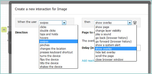
Wireframes are built in the web browser, but can be simulated on iOS and Android devices using the Pidoco App. Users need no programming knowledge to use Extended Interactions, since you can define them easily via a convenient “Interaction Dialog”. All you need to do is select from a variety of options a trigger (e.g. swipe, pinch, click, hover, device flip) and the corresponding reaction (e.g. show a new page, display a pop-up, slide in a new screen, play a sound or even place a call).

Pidoco’s Interaction Dialog allows users to easily define advanced interactions

A screen section called “My Interactions” allows users to manage interactions, which makes it easy to copy an interaction to other elements or find elements that share the same interaction.

Simulation of an interactive Pidoco prototype in scribble mode

In addition, Pidoco offers a number of other features which make it a great tool to work with, such as real-time collaboration à la Google Docs, a commenting and discussion feature, different types of templates including so-called “global layers” that work like layers in Photoshop, an automatic specification document generator, various export options, a wide selection of UI elements and icons that you can expand by uploading your own images, versioning, an issue tracker, an API against which you can write your own code, and much more.

In light of its latest release, Pidoco is offering a special deal to all Wireframes Magazine readers. You can now sign up for a free trial and get 50% off on all annual Pidoco plans purchased before August 15, 2014, using the promotion code wm2014.

Get It Now

pentotype

July 15th, 2014


pentotype is a new drawing software that lets you create clickable wireframes on your iPad or on your desktop with a graphics tablet. Since drawing sets virtually no limits, you can create any interface that you want, be it a website, a game, or a regular application with a custom UI. You can quickly share ideas with your team and see how the user will walk through your app.

Drawing

When you start a new project in pentotype, you’ll get an empty, infinite canvas. After inserting a new screen, either by selecting it from the side bar or just by drawing a rectangle, you can go ahead and draw your design. The features are simple so as to keep it low-fidelity: 5 colors for the pen, 3 font sizes for text. All elements of your drawing can be moved, deleted, copied, or saved as a stencil, so pentotype makes it very easy to create wireframes and apply changes. Available wireframe types are phone, tablet, and website.

Screenflows

By inserting more screens to the document, you can create a whole screenflow. Along with drawing the UI of the screens, you also draw the interaction between them: Just draw a line between an element and another screen, and you have immediately created a link. The kind of transition is automatically recognized (e.g. a slide transition between neighboring screens) but can also be changed.

Simulations

After you have drawn your wireframe, it can immediately be tested with functional links, transitions, and scrolling (in website wireframes) – just hit the “simulate” button. In order to send the simulation to your phone and view it there, just scan the QR-code. To get an idea of what this can look like, try out the example appointment app.

Collaboration and Feedback

By adding team members to your account, you can work on projects together. By sharing the link of a project with people (even without a pentotype account), they can immediately give you feedback by writing comments directly in the wireframe.

Try it for 30 days

Credits: Johannes Dörr

Axure Flat UI Kit

June 13th, 2014


Although I don’t use Axure for prototyping, and I might have some particular views on flat design, this new Axure Flat UI Kit does look pretty slick at first glance. The controls within the template definitely seem to behave a lot smoother since I last remember how Axure looked over a year ago. Nice work.

The UI Kit includes over 310+ interactive and beautifully crafted page elements, modules and complete templates. The UI Kit uses Axure’s powerful widget library. Create complex and interactive wire frames with a snap. Icons included.

Have a look inside

Credits: Marc-Oliver Gern

GoodUI DATASTORIES – Now Live

May 2nd, 2014


Ok, it’s finally live. We’re proud to announce that the wait is now over and the first issue of Datastories is here! We made sure to have the opening issue also be reflective of the first conversion test we ever did. We hope you’ll like it and can learn from it. What’s inside? Each month we’ll release one issue which will discuss:

  • Repeatable Insights
  • High Quality Results Data
  • Test Setup With Code
  • GoodUI Idea References
  • Key Learnings

Learn from our conversion optimization tests and use our insights on your projects to increase various metrics.

Learn More About The Datastories Subscription

Credits: Jakub Linowski

My Sketchbook Color Coding

April 11th, 2014


What, it’s been two years already? That’s how long it took me to fill in my dotted Leuchtturm notebook (German engineering at its finest) front to back. Since I’m starting a new one, I thought to devise a bit of a color coding system for my upcoming notes and just share it here. The colors I typically use to underline the very first page title. Here are the colors:

Light Grey For Thoughts & Inspirations

Sometimes I’ll hear or read something of interest from a podcast, article, or book and it gets coded this way. My own free-form personal random thoughts across various disciplines get placed here as well.

Medium Grey For Project Ideas

For the more solid, practical and actionable thoughts or sketches. These are both new project ideas or adjustments to existing ones and are often accompanies by sketched out screens.

Black For Business Strategies

These are the most strict, closest and firm action points which are tied to my business initiatives. They are very high level for the most part and act as strategic todo’s of sorts.

Red For Contacts

If I meet someone or a company of interest, they will get placed here. This section might also be some residue from a conversation with someone over a cup of coffee.

Blue For UI Patterns

Here come the user interface patterns – both good and dark. Be it existing patterns seen somewhere or envisioned ones, they both land here.

Yellow For Content

I write and rely heavily for content marketing for much of my business. Specific content ideas for existing projects get placed here. Oh, and in the example listed you can actually see that I’ve started scribbling down some content points for the GoodUI Datastories promotions. :)

Was this helpful? How do you structure your notebooks or sketchbooks?

Credits: Jakub Linowski