InVision 2.0 – Present. Engage. Collaborate. Iterate.

April 3rd, 2013


InVision 2.0 is now out. Clark and his team have been hard at work redesigning and redeveloping the next iteration of this awesome web based prototyping tool. At the time of writing, this smooth thing has 77k active projects going on strong and some good reasons for picking up on its popularity recently.

Very Strong Team Focus

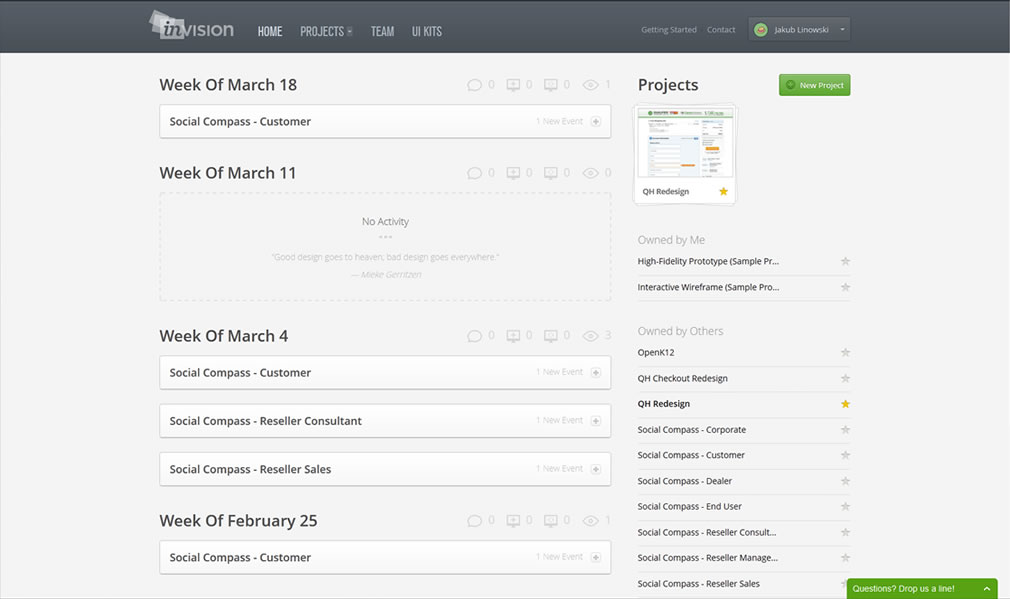
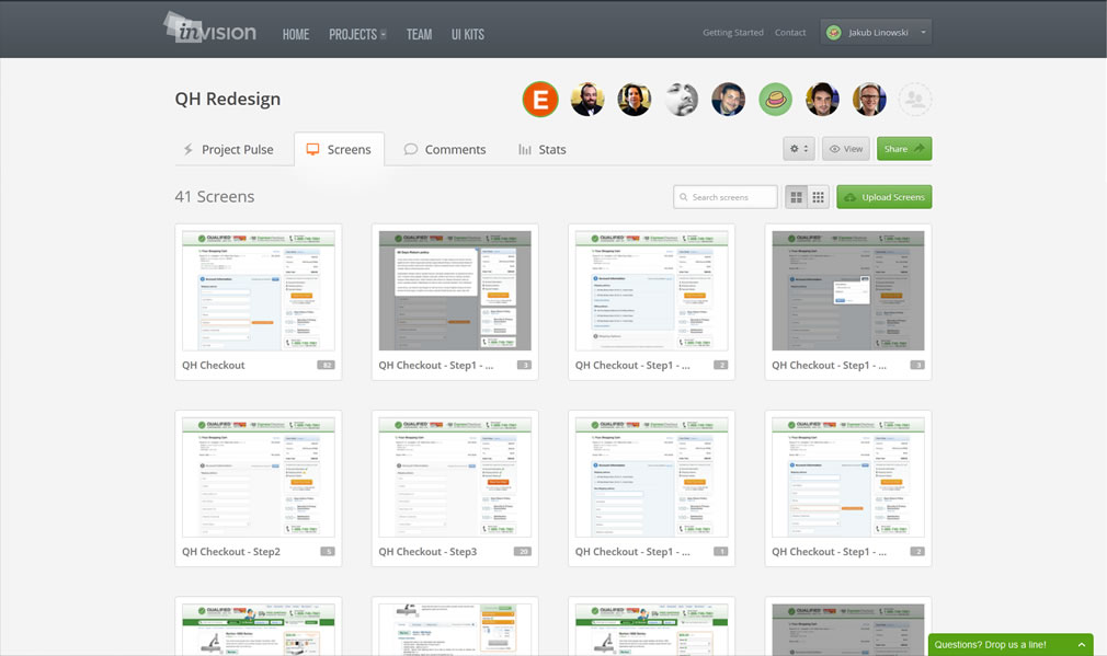
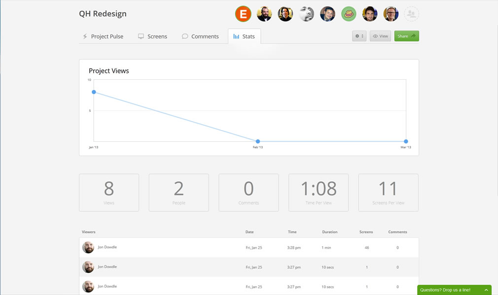
With 4.4 million comments left since its beginning, InVision takes design collaboration pretty seriously. This is definitely seen in version 2.0 and the team really understands that no one designs in a vacuum. Take the new project pulse view for example. This project dashboard so to say, gives collaborators a way to understand who has commented, what new screens were changed, what screens were added, and who viewed what recently. This awesome project glimpse can be contextualized in a flexible time scale of today, the recent 7 days, 30 days, 90 days or since the beginning. For those who prefer to understand when a project has been the most active, the same data can be viewed as a time graph under the project stats tab. The visibility of team behavior here, definitely helps to build a collaborative feel.

Each project also very clearly shows its team members in the top right. The faces of the people you are working with on a given project are now visible which humanizes the sometimes distant remote design process. Each person also has a dedicated profile view with their project and a corresponding activity stream. Score!

Care about comments? The new comments tab lists a chronological discussion view of all the things that have been discussed, with the comments contextualized nearby little visual snippets – context is king and a picture is worth a thousand words. What’s more is that these comments are also keyword searchable and actionable. The comment-email integration is thought through giving users the ability to reply to them (and interact with the team) directly from within their email clients.

Smooth Performance

Although I haven’t noticed a difference, the InVision team claims that everything on the front end has been rewritten with the intention of speeding things up. I always thought it was pretty quick anyways and never had any delays with it. 2.0 is smooth as smooth can be.

Other 2.0 Goodies

The change-log of the latest version also indicates that a few extra hot things have made it through as well. These new features include: bulk actions, device staging, anonymous sharing, user testing mode, dev notes for hand off, and real time pushing. Overall a solid release in my view!

Have some work that needs to be shared with a team, or need to build an awesome web prototype mockup? Then give InVision 2.0 a shot. Yup, the first project is always free!

Get It Now

PowerStory 2.0: Wireframe Storyboards Using PowerPoint

March 19th, 2013


PowerStory 2.0 for Powerpoint has just come out. For those of you not familiar with PowerStory, it is a plugin for PowerPoint that merges use cases, wireframes and storyboards into what is called a “Use Case Storyboard”. The interesting approach to the tool is its intent to bring agility to these traditional deliverables by combining them into one integrated deliverable, which also looks like it improves requirements communication and collaboration. Oh and one cool feature is that it also generates test cases which not only saves you some testing budget, but would support iterative and agile development teams.

The main advancement with PowerStory 2.0 over 1.0 (which I reviewed here) is the addition of a UI Library of 250 standard controls that cover the web, mobile and desktop applications. This new library is also extendible allowing you to create your own custom controls along with import and exporting sharing capabilities. This means you are not limited in the UI/UX look and feel you are after, and could also create a standard library of UI Controls for your project if needed. The move should now make it a much easier for UI designers when making Wireframes using PowerPoint. The nice thing about using PowerPoint is that everyone knows how to use it and it is good for walkthroughs. There are some nice features within PowerStory that make it easier to walkthrough your storyboards by giving you context of where you are. You could use this tool to create traditional linear presentations or take advantage of its “use case” based storyboards which essentially allow you to create alternate flows. This should help reduce the duplication of UI Wireframes across storyboards.

In terms of the test case generation, this is rather unique and a great time saver. The test cases generated can be exported into MS Word, MS Excel and MS Team Foundation Server.

Are you a BA, UI, or UX designer? Give PowerStory 2.0 a try.

Get It Now

Credits: Martin Crisp

RWD Wireframes

March 14th, 2013

RWD Wireframe
RWD Wireframes (github) is a small scale, browser based wireframing tool for responsive layouts. The tool allows you to define a few containers and then determine their size, placement, layer order, and visibility for various screen widths (which of course may also be manipulated). Apparently once an account is created you may also share your work in the form of links. Oh and it’s open source as well so you may fork it and tweak it github style. Thanks Hao for sharing this innovative project and pushing some boundaries on version 0.0.1!

Credits: Hao Luo

Lean Sketching Tips: Flexible Fidelity & Cutting Corners

March 8th, 2013

Lean Mean Sketching 101
Here is some lean UI sketching advice – let the level of detail be a variable in your design process that which you control. Staying conscious of and knowing when to cut a corner or when to spend additional time detailing an interaction, screen or flow is a healthy thing. All sorts of design tools impose certain fidelities on to us the second we pick them up. Take on Axure RP for example and before you know it you’re sucked into aligning stuff at a pixel level whether you like it or not. Load up Adobe Fireworks too quickly and subconsciously you begin writing actual copy, comparing pixels, and choosing RGB color values. The tools which we use, just as Donald Norman said of the artifacts we design, also come with affordances – do stay aware of how much detail they ask of us.

Surely everyone by now knows that sketching tends to be low fidelity in nature as it’s often quick and dirty. However when it comes to its fidelity I think there is more to it. Sketching in particular is a lot more flexible than we think comparatively to other tools out there. I believe that sketching allows designers to work at a wider and therefore more flexible range of detail. On one hand it may be super quick, yet at the same time it also allows us to slow down and elaborate. Here are a couple of examples of what I mean:

Scribbles vs. Real Text

Scribble Text
Consider the text we show and indicate in our work. Sometimes it’s rightfully fine to just ignore detail and save time by showing it as a bunch of scribbled lines. At other times of course we may imbue our concepts with more detail and show the actual text. After all, copy has a clear connection to experience, usability, and understanding. Nevertheless, choose wisely.

Outlines vs. Depth with Contrasts

Outlines
What about outlines – they are a quick way of suggesting an area. These of course can be elaborated with depth or contrast in order to convey element priority. Lighter backgrounds can give way to darker ones when it comes to showing importance.

Partials vs. Full Screens

Partials
I love how useful partial screen sketches can be! They cut through time and effort like a knife through butter (and also save you additional time when you later have to update your working documents). Why design a full screen if all that matters is the top navigation? Sketching in this way allows the designer to emphasize by leaving other elements out, literally. Of course, at other times full screens are the way to go. Be in control!

Placeholders vs. Detailed Components

Placeholders
Placeholders abstract a component by describing what it contains with the byproduct of spare time. It’s a good way of cutting a corner. Alternatively spend additional design time on the same component and turn it into a higher fidelity object.

Approximate vs. Precise Alignment

Approximate
As mentioned previously, aligning elements to the pixel can be a time sink. Sometimes an approximate position is just as fine. Similarly, the same rule applies to how straight or crooked we draw our lines. Decide what works for you and when.

Taken together, being in greater control of a design process does matter with the level of detail being one such variable. When corners are decidedly cut however, some clear benefits do arise. The additional spare time which is brought on can then be allocated to other and more important areas instead. One beneficial use of effort early on in a process is on widening the scope for example and thinking through broader interactions as opposed to just a few screens. Another valuable benefit of cutting corners is for designing alternatives and generating more ideas for the same screen, interaction or user story. Of course as a project unfolds and more knowledge along with deeper consensus is generated, don’t forget to start raising your level of fidelity. After all, the devil is in the details. The important thing here is that you (and not the tool which you use) are in charge when the detailing begins to happen.

Credits: Jakub Linowski

Form Follows Function

February 25th, 2013

FFF
If you haven’t already heard of the Form Follows Function site, it’s definitely worth a peak at. The site showcases a bunch of interesting CSS and HTML5 experiments by Jongmin Kim, that stretch our understanding of what is possible with modern browsers. As an example, here is a CSS transform Flip Clock. The project has quite a few examples that somewhat remind me of what Joshua Davis was doing back in the early days of Flash. So if you’re tired of those bland boxes and arrows, here is how one individual has pushed HTML to its limits. Definitely inspirational.

Credits: Jongmin Kim

BLOKK Font

February 22nd, 2013

BLOKK Font
Tired of Lorem Ipsum content phrases? Here comes BLOKK font to help you out. It replaces all text with blocks to suggest generic text. Designed in Norway by Tom. Simply awesome. Available in TTF and web fonts.

BLOKK is a font for quick mock-ups and wireframing for clients who do not understand latin.

Update: also check out the related Redacted Font project by Christian Naths.

Credits: Tom Arne Bakkemoen

Sketch Map

February 12th, 2013


What do you get when you mix mind maps and sketches together? Well, Sketch Maps, of course. Catriona of InspireUX just shared an interesting approach to organizing your sketches around a central idea. Awesome big canvas sketching! I’m a firm believer that your workspace affects the way you think. How you structure your screens will affect what you end up with. In the case of these Sketch Maps, it’s clear that the structure guides the designer to maximize the number of alternative ideas. It forces the designer to explore more alternatives in a playful way as opposed to thinking about a concrete unified solution. Two thumbs up. Thanks for sharing.

Credits: Catriona Cornett

Wireframes Magazine + Facebook

February 7th, 2013

Quick update. It’s 2013, and I finally got around to hooking up a Facebook Page for Wireframes Magazine. So for anyone who now wishes to follow the posts as an alternative to RSS and/or Twitter, you can now also use FB. :) Cheers. Enjoy.

GUI Toolkits

February 6th, 2013


GUI Toolkits is the next major UI template release by Amir Khella, who brought to you Keynotopia and Axutopia. The toolkit is apparently “the largest collection of user interface components on the planet!”. It’s loaded with UI components of various platforms (iPhone, iPad, Android, Blackberry, Windows Mobile, Mac OS X, + etc) and for various tools (Illustrator, Axure, Fireworks, Omnigraffle, Keynote, Powerpoint and Visio). Amir has packed everything into a bundle, but also allows to purchase these toolkits individually. Great job!

Fully Editable Vector Shapes

All UI components and icons are vector shapes created from scratch in each tool, and can be easily edited and customized.

From Wireframes to Hi-Fi

Create wireframes and turn them into high fidelity pixel-perfect prototypes by switching the UI component style.

100% Royalty Free

3,000+ pixel perfect UI components and 200+ icons that can be used directly and freely in your commercial apps.

Get It Now

Framer – Modern Prototyping

January 30th, 2013

Framer
Framer (github) is a modern prototyping tool. More concretely, it’s a lightweight Javacript based framework for creating and prototyping complex interactions (with animations) on various mobile devices. I haven’t tried it on a mobile device yet, but in Chrome at least (doesn’t work in the Firefox browser), the transition and animations do look pretty smooth as the author claims to rely on the GPU directly. So if performance matters to you and you’re up for some transition prototyping fun, why not give this opensource tool a try.

In Koen’s own words:

Many people already prototype in the browser. It’s simple and quick. But while html/js/css/jquery gets a lot done it has some downsides:

  • It can get pretty complicated mixing all the different technologies
  • It can be hard to get the pixel perfect control you want
  • It’s not always performant, especially on mobile
  • It’s pretty far from how it will be actually implemented if you prototype for native

Framer tries to solve some of these problems by providing a very lightweight framework modeled after larger application frameworks. The basic idea is that you only need a few simple building blocks like images, animation and events to build and test complex interactions.

Credits: Koen Bok