March 1st, 2011

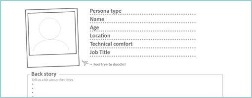
A persona template has just been shared by the folks over at Orange Bus. Perhaps what might be interesting about this particular one is that it invites quick and dirty hand drawing or writing. A lot of the other personas out there, from what I’ve seen in the past, look pretty well polished. This one on the other hand is a lot more doodle compatible. It comes with fill in the blank spaces for basic naming, portrait, a back story, motivations, frustrations, their ideal experience, and a summary quote. Nice!
Credits: Joanne Richardson
Tags: persona, sketch
Posted in Samples, Templates | 6 Comments »
February 23rd, 2011

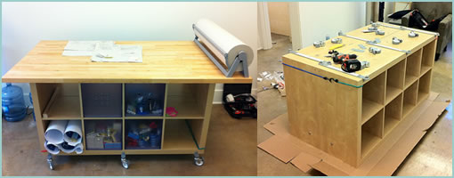
The guys over at nForm recently shared their home brewed sketching table composed of IKEA bits and pieces. It has the ability to store past sketches in a number of compartments right underneath, and an awesome kraft paper roller on top (possibly for saving large canvases of related sketches). More importantly, it looks like it’s inviting collaboration as Gene Smith suggests:
The total cost was about $500, and we’re seeing two benefits: it’s much easier for us to incorporate sketching into our daily workflow, and we’re having lots of quick feedback sessions since the table makes it easy for us to share and sketch ideas.
Thanks for sharing.
Credits: nForm
Tags: sketching
Posted in Tools | Comments Off on nForm Sketching Table
February 7th, 2011

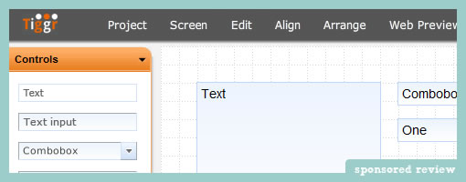
Tiggr has recently surfaced as an additional tool to choose from for people interested in building interactive UI prototypes. It is currently in beta phase and is being developed by a team over at Exadel. It comes loaded with a set of typical features you would expect from an online prototyping tool. Among these there are: a snapping grid to place work on, multiple project/screen support, and the option to drag and drop existing controls. At a high level, controls here have been organized into two sets belonging to web based and mobile ones. The mobile components are based on the jQuery Mobile framework (pretty cool?). And yes, the tool also allows you to link up pages in order to inject a greater degree of interactivity in the preview mode.
Tiggr prototypes are also very easily shared with a team. Since the tool is hosted online, when previewing the prototype in a browser, the link can simply be sent off to others for review. With a comment and chat system in place, the tool invites users to provide feedback. Additionally, the prototype can also be exported as a standalone HTML bundle that can further be worked on locally and separately from the web based interface.
As far as I know today, these guys will always have a free version and there might be some paid plans in the future. I believe they are also planning to extend the components library and provide more ready to use elements.
Jump in and give it a try to see if it’s for you.
Posted in Tools | 1 Comment »
February 2nd, 2011

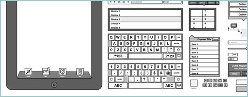
Adding this iPad Omnigraffle Stencil to the list for all those MAC users out there (thanks Ivana for finding it). The set looks pretty decent with a great deal of popovers, buttons, bars, icons, keyboards, alerts, and so on. As an added bonus the set also comes with a few blank and printable PDF sketchsheets – handy for all those times when you don’t feel like drawing out hundreds of screen outlines over and over again. Enjoy.
Credits: ZURB
Tags: sketching
Posted in Templates | Comments Off on ZURB iPad Omnigraffle Stencils & Sketchsheets
January 27th, 2011

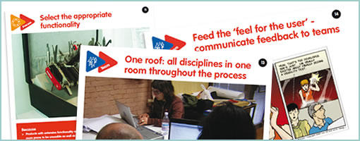
Here comes another awesome design related card set. This time it’s from Jasper who has recently been doing a PhD thesis over at TU Delft on the topic of Managing Product Usability. As a side effect of his time spent dug up in the subject, he has summarized some of his key ideas as recommendations in a card set format (PDF download link at the bottom of that post). The set is composed of 25 recommendations which are organized by themes pertaining to: Usability, Process, Team, Project, Company and Market. It’s an inspiring piece of work that might be of use to all those thinking of usability in the larger context of an organization or business. Thanks Jasper!
Here is how he explains it himself:
Based on learnings from the case studies as well as on existing literature on usability in practice, I wrote 25 recommendations for industry that describe how I would organize product development if the goal is to make usable electronic consumer products. The recommendations were ‘user tested’ by product development researchers and practitioners.
Credits: Jasper van Kuijk
Posted in Inspirations, Tools | Comments Off on Recommendations for Usability in Practice – Card Set
January 10th, 2011

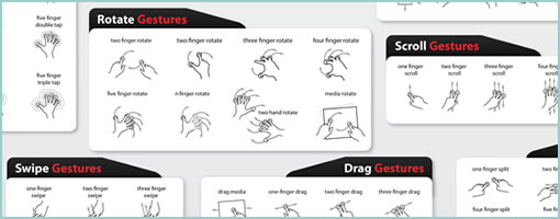
The gesture library from gestureworks has been recently expanded to contain a total of 200 illustrations. The library now contains multi-touch as well as stroke gestures in a variety of bitmap and scalable formats. It’s loaded with swipes, drags, flicks, holds, scrolls, taps, and even 3D gestures. For showing stroke direction, they’ve come up with an interesting way of starting off each stroke with a blue circle and ending with a red one. Pretty cool and inspirational ways of showing off user actions.
Credits: gestureworks
Tags: gestures
Posted in Samples, Templates | Comments Off on GestureWorks Open Source Gesture Library – Update
January 6th, 2011

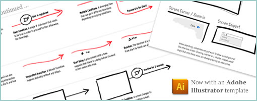
The time has finally come to update the Interactive Sketching Notation for the new year. This time around it now comes with an Adobe Illustrator template that’s loaded with swatches, character styles, and symbols ready for use. The whole sketching system has also been elaborated to also include such things as: variation, notes, scenarios, and multiple user types. The notation can be applied for use with traditional pen and paper media but has advantages when using a computer and a tablet.
Please let me know how you use it or if you have recommendations. Enjoy.
Updated: to work with Illustrator CS4 and CS5
Credits: Jakub Linowski
Tags: sketching
Posted in Templates, Tools | Comments Off on Interactive Sketching Notation v1.0
December 20th, 2010

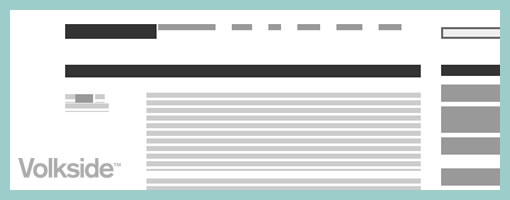
Here comes Wirify (or here). It’s a great little bookmarklet tool brought to you by Volkside that renders wireframes from any web page with a click of a button. Typically we’re accustomed to moving from wireframe to visual design to finished product. The wirify script however flips this around enabling the movement from finished HTML back to wireframe. I think it’s just awesome when people upset the linearity of design processes. Great work! So, why would anyone want to do this? Jussi writes:
There are some compelling reasons for viewing a live web page as a wireframe:
1. The wireframe allows you to step back and see the big picture. By tuning out the detail it lets you study the building blocks of the page and their relationships.
2. The wireframe is a great learning and teaching tool. Many of the design concepts that underpin page layouts become easier to identify and analyse in a wireframe. Think visual hierarchy, whitespace, symmetry, chunking, grid systems, golden ratio, rule of thirds, etc. etc.
3. The wireframe is a useful redesign tool that stops you getting bogged down in detail in the very early stage of a website redesign project.
4. The wireframe looks cool. You can now turn all the live sites in your portfolio into large wireframes and plaster them on your studio walls ;)
By the way, have a read through the terms of use at the bottom of the page. Wirify is freeware and there is also some basic analytics logging going on. Thanks Jussi!
Credits: Jussi Pasanen
Posted in Tools | 1 Comment »
December 10th, 2010

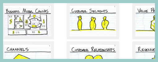
Jason does quite a lot of collaborative sketching, business modelling and multidisciplinary design workshops. Recently he shared a set of downloadable cards in PDF form that are aimed at helping to facilitate such sessions. The cards help move the conversation away from the tactical nature of interface design to more high level business strategy with keywords such as: customers, channels, cost structure and value proposition. Additionally, he also wrote up an awesome blog post about facilitating a collaborative process, which sheds more context into how these cards could be used. It’s always interesting to see design intersect with other disciplines (such as business in this case). Thanks Jason!
Credits: Jason Furnell
Tags: process, sketch, user journey
Posted in Templates, Tools | 1 Comment »
December 1st, 2010

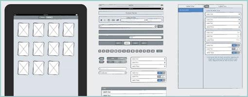
Teehan+lax just released the iPad Sketch Elements for Adobe Illustrator to complement the existing iPhone counterpart. The downloadable file contains a number of useful sketch style UI components (such as the keyboard, browser bars, system bars, etc) that can used to speed up an exploration process. Thanks!
Credits: Chris Tanner – teehan+lax
Tags: sketch
Posted in Templates | 1 Comment »
