April 21st, 2010
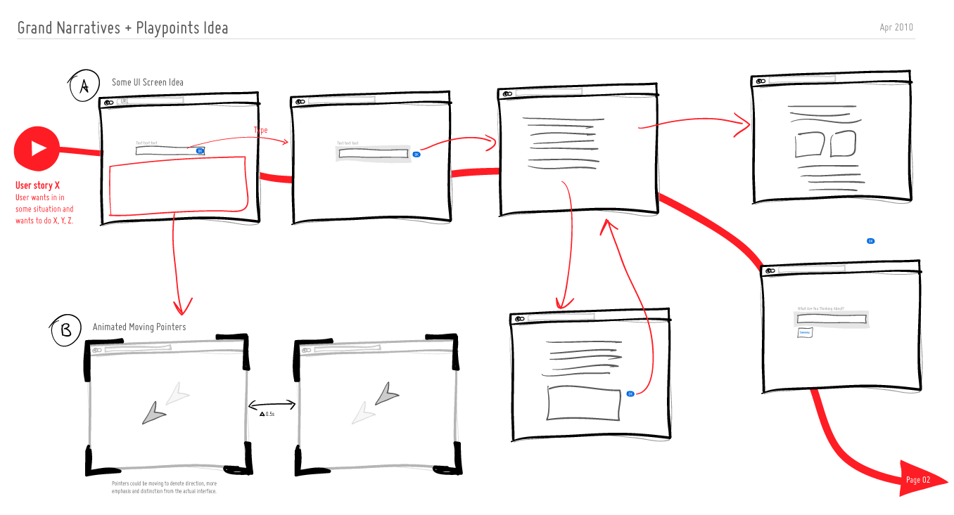
We can experience tiny operational interactions and we can experience grand narratives. Perhaps there is room for both of these when we think through and visualize experience, flows and time. Here is a quick idea to support these in an electronic sketch. A thicker line is basically used to denote the bigger story which is more linear, whereas the smaller interactions such as onlicks, hovers and drags are represented in a thiner style. The grand narratives also have starting points denoted by “play points”. These could be used to help guide readers to the important beginnings in a sea of little boxes. Just thinking (uhmm… I mean drawing) out loud. What do you think?
Credits: Jakub Linowski
Tags: linowski, sketch, user flow, user journey
Posted in Experimental | 4 Comments »
April 19th, 2010
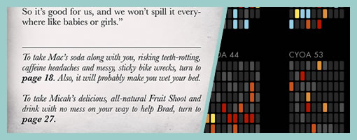
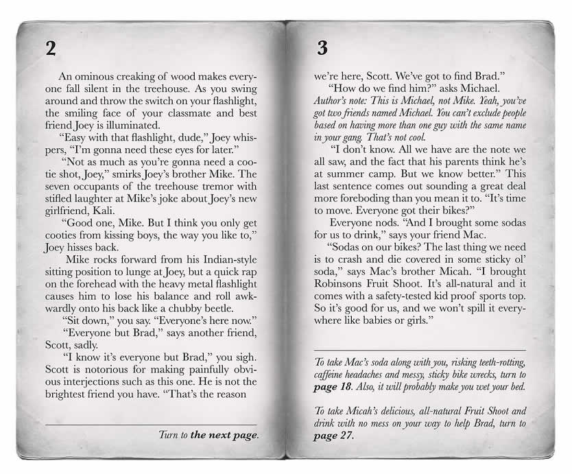
The other week while discussing the idea of narrative with Bob, he reminded me of the Choose Your Own Adventure books from the 80-90s. These types of books basically are written in a second-person point of view and readers are given choices requiring to flip back and forth throughout the book. As the plot unfolds, readers also may find themselves finishing with various types of endings, with some being less desirable than others. Looking for examples of CYOA books I also came across a superb narrative visualization project by Christian Swinehart. Christian analyzed a couple of these books and began comparing which pages are composed of pure story, decisions and endings.
What does all of this have to do with the remaining design artifacts scattered throughout this blog? I think books like these through their combined use of nonlinearity, choice and guidance raise a few interesting points around how our time based (flow) deliverables could potentially look like and behave. What if readers of our deliverables were guided through a set of predefined flows? What if the flows we design required readers to make choices in order to achieve multiple endings? On one end of the extreme spectrum we have passive documents such as wireframe decks where there is often a single thread of experience. Here we have guidance, but no choice as we flip from the first page till the end. On the other hand of the spectrum, we might have a fully interactive prototype. Here we have zero guidance and tons of choice (perhaps even too much). Could this more balanced combination of guidance and choice then be a more powerful means of conveying interaction and narrative in our field? I’d think so.
Credits: mewrite (flickr image), and Christian Swinehart (visualizations)
Posted in Inspirations | 1 Comment »
April 14th, 2010
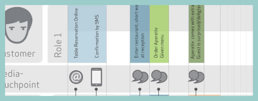
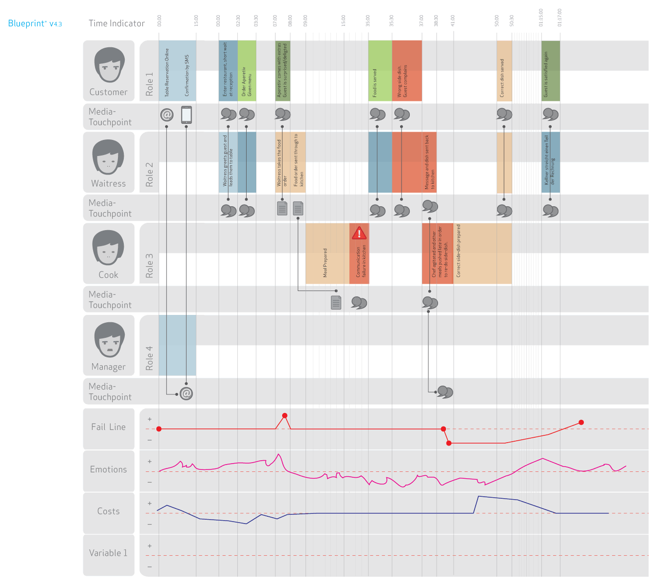
The academic group over at Hochschule Luzern (Competence Center) in Switzerland have recently explored a visual representation that captures the interaction of various people across multiple services or touch points. Done in the context of a service design assignment, the Blueprint project portrays the flow of time horizontally and captures multiple actors vertically. More so, the visualization also layers additional data underneath and contains such things as fail lines, emotions and costs, while at the same time leaving more room for additional variables. In some way, the deliverable shares some resemblance to the Experience Maps posted earlier.
As an additional note, Blueprint+ is still a work in progress and will be turned into a toolkit in the future. Stay tuned. :)
Credits: CC Explanations and Services, Hochschule Luzern (Andy Polaine, Roman Aebersold, Robert Bossart and Andrea Mettler)
Tags: activity, user flow, user journey
Posted in Samples | 2 Comments »
April 7th, 2010
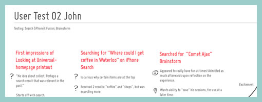
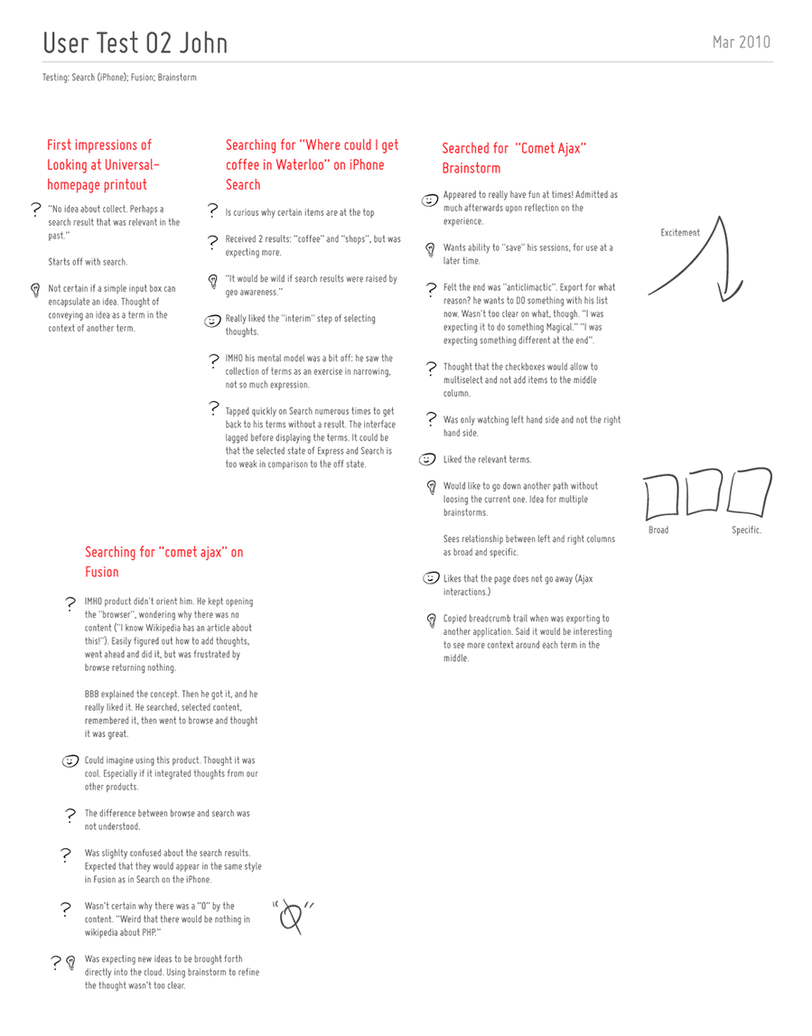
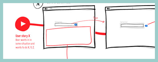
Usability testing is a pretty standard practice and I assume most of us here have done or might do a few of these evaluations in their design careers. Last month, I had the chance to spend some time with end users on a software project and I thought of sharing some of the documentation which resulted from the activity.
Right after doing such a test, we’re often faced with the challenge on how to capture and convey some of the interesting findings to others on the team or even ourselves. Some people try video, while others overlay the identified problems on top of screen captured images. In this round of testing I was aiming for something slightly different. Essentially, I wanted to a capture the core notes per each user on a single piece of 8.5×11 paper (perhaps in a persona like fashion?). Each page would have starting points of what the user has initially done with the use of red text, followed by dark grey notes as the actions unfolded. The findings were then tagged accordingly as: ideas (light bulb symbol), confusions (question mark) or positive remarks (happy face). Further more, the sample also makes use of subtle informal sketches through out the page to help convey the issues somewhat visually.
Perhaps to someone who lacks context of the project or products being tested, a deliverable such as this might not be adequate enough at conveying the issues. On the other hand, for those who have participated in the test as observers, the following usability test snapshot might act as an inspiration piece for the design work ahead.
Please post as a comment (or submit) ideas of your own on how to best convey, remember or prioritize findings from design research.
Credits: Jakub Linowski
Tags: linowski, persona
Posted in Samples | 3 Comments »
March 31st, 2010
Just thought I’d stir up the readers in here and see if I can get some interesting submissions in. Although I’m always on the look out for any type of design deliverables or tools to write about, I thought perhaps I’d throw out a concrete request for example visualizations of usability testing results. Perhaps you came up with a cool way of conveying findings to your team, or you invented a new way of prioritizing issues? If so, and eager to share, please send me an email (visible on the right) and I’d love to post it up in here. Cheers. Jakub
Posted in Announcements | 3 Comments »
March 30th, 2010
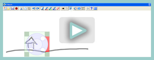
K-Sketch, The Kinetic Sketch Pad is a pretty cool piece of software that came out of the Human-Computer Interaction and Design group from the University of Washington and is lead by Prof. Richard Davis. As the name indicates, the software allows to create quick sketches in time with a pretty simple and lightweight interface. Users can draw free form shapes and then transform those objects in a recording mode. The result is an animation composed of various objects that have their own animating paths.
I still haven’t tried out this tool on a real UI design project, but the concept is definitely inspirational and so I thought to share it. The K-Sketch project opens up the possibility and idea of sketching in the context of a timeline, which I think is quite novel in itself. If the desire of designers to express interactions seamlessly with the use of animation is strong enough (which I think it is), my guess is that we’ll be seeing more and more of functionality such as this in our prototyping tools of the future.
Download it and try it out yourself.
Here is another explanation straight off from their website:
K-Sketch allows ordinary computer users to create informal animations from sketches. Current tools for creating animation are extremely complex. This makes it difficult for designers to prototype animations and nearly impossible for novices to create them at all. Simple animation systems exist but severely restrict the types of motion that can be represented. To guide the design K-Sketch, we have conducted field studies into the needs of professional and novice animators. These studies showed the wide variety of motions that users desire in informal animations and indicate how to prioritize these types of motion. Our design allows the most important types of motion to be defined with pen gestures, and gives visual feedback for coordination of events.
Credits: Prof. Richard Davis
Tags: opensource, video
Posted in Tools | 2 Comments »
March 22nd, 2010
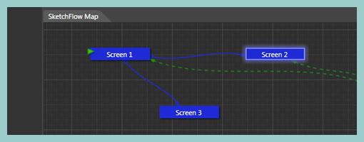
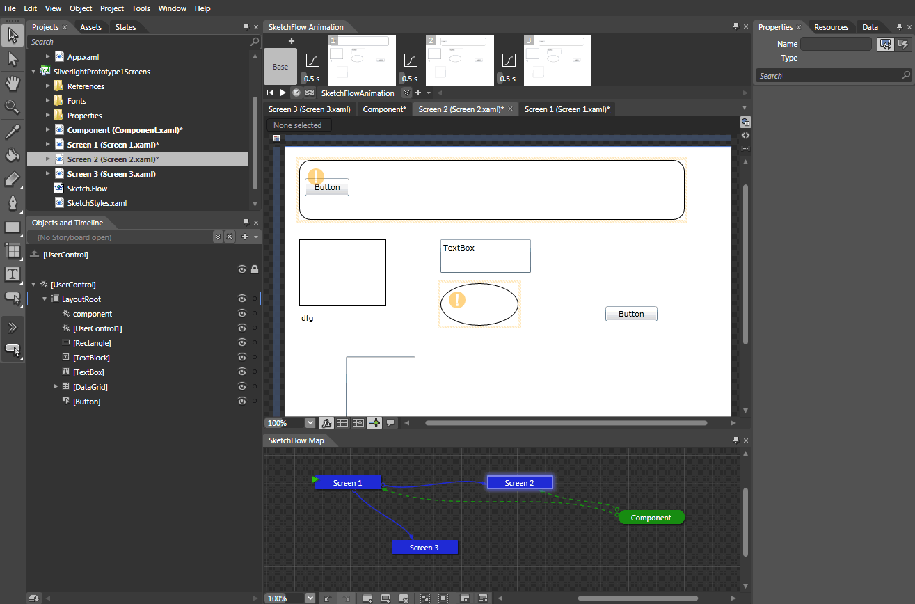
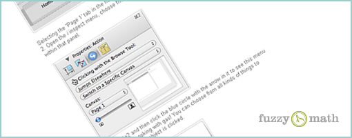
Microsoft Expression Studio 3 now comes with SketchFlow which is a powerful new tool that helps designers to move from sketches to interactive prototypes. It’s loaded with features which you’d expect such as support for multiple states, a sketchy style, reusable components, automatic document generation and the ability to share and gather feedback from clients. SketchFlow also allows to inject rich interactivity into your work by means of attachable behaviours (such as changing properties dynamically, states or navigating to various screens). More so, the software allows designers to prerecord animatios and bind them with a wider range of transitional effects. Once you’re ready to share you’re work, you can export as a Word document or more interestingly as a Silverlight prototype.
SketchFlow I’d say is a bit more of an advanced prototyping tool. It comes with a lot of menus, options and tool bars. At the same time this opens up more flexibility for creating more interactive prototypes supported by various rules. One of the really interesting thing in this software is the juxtaposition of the canvas along side a site map view. In the SketchFlow Map view, users basically can manage their pages and components, create a flow between them, and rearrange them in a two dimensional space in whichever way they see fit. This provides a quicker way to access the items being worked on and at the same time gives a good overview of the flow in between screens.
To see for yourself, jump right in and try out the demo.
Posted in Tools | 4 Comments »
March 16th, 2010
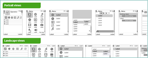
Here is a downloadable stencil straight from Nokia for wireframing within their S60 touch devices. The stencil includes workable source files for Adobe Illustrator CS4 and Fireworks CS4 loaded with useful components, portrait and canvas interface views. (Thanks Ivana!)
Posted in Templates | 10 Comments »
March 10th, 2010
Love em or hate em, we still annotate our work be it for ourselves or others during a design process. Jason has just released some quick tips on how to setup annotations in Omnigraffle as to make them optionally disappear when exporting to an interactive prototype. The use case being, at times it makes sense to have annotations visible (documentation), whereas at other times it makes sense to hide them (prototype). The technique involves the creation of a few canvases and layers as well as running of an AppleScript. An example graffle file with the working script is also offered. I haven’t actually tried this one, but I hope it’s useful to some of you knowing that there are quite a few Omnigraffle users out there in the UX community. Thanks Jason! Enjoy.
Credits: Jason Kunesh of Fuzzy Math
Tags: annotation
Posted in Templates | 5 Comments »
March 5th, 2010
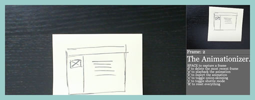
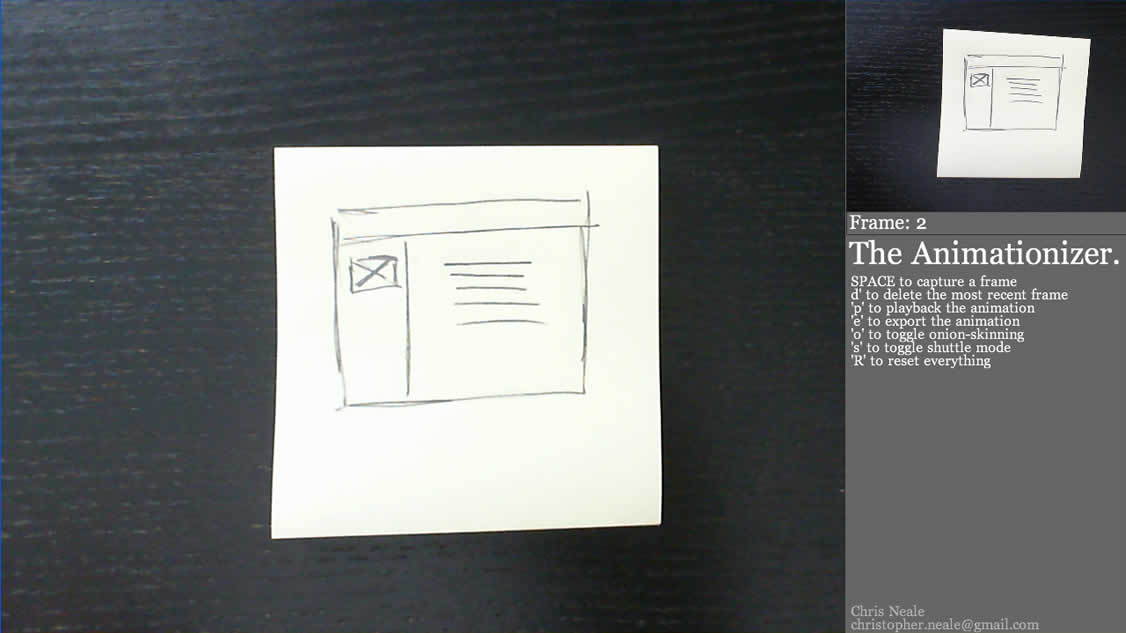
Some time ago, Chris Neale showed off an awesome video of his stop motion animation prototypes. More recently, he has now published a software tool he built in Processing to create such videos. The tool is quite simple and basically allows users to capture screens with a webcam and export them to a folder. The Animationizer also supports a playback feature at 12 frames per second. Chris’ approach is to playback the animations and re-record them with a separate tool such as Screenflow or Silverback. (I also found CamStudio as an open source alternative). The tool is free of charge and comes with a Creative Commons Share Alike license. Thanks Chris! In his own words:
The Animationizer makes stop-frame animations quickly and easily using a webcam. I put it together to help make early prototypes for user experience design projects I’ve been working on. It might also be useful for art projects or science experiments – or maybe just to keep the kids occupied on a rainy afternoon.
For installation, basically you need to install Processing first and then download the code from his website. For those users on Windows, you might also need the WinVDIG for QT driver.
Tags: opensource
Posted in Tools | 2 Comments »