March 2nd, 2010
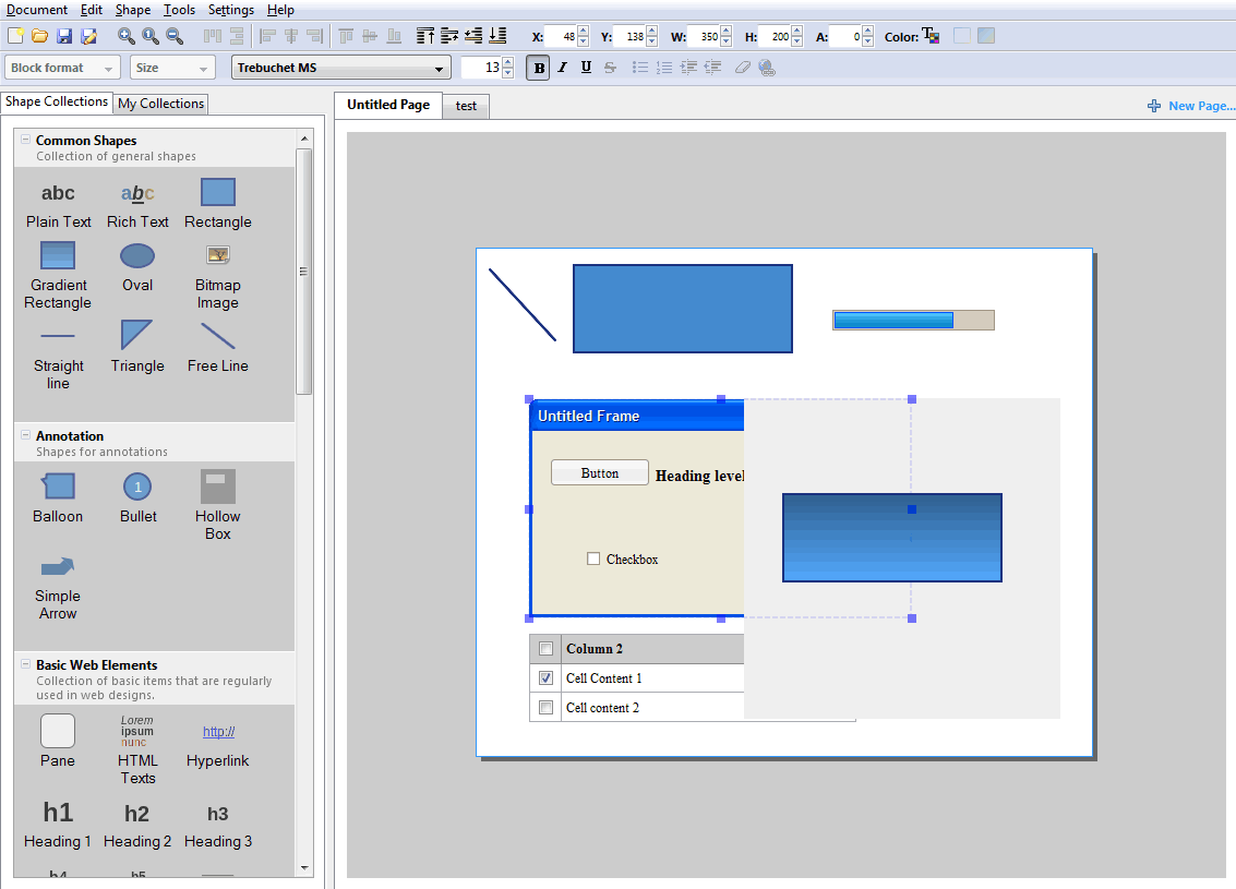
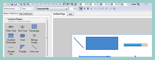
Quick product update. Last month ForeUI 2.0 has been released and came out with a set of new features. The prototyping tool now supports the sharing of resources on a hosted web site from which users could download or publish custom elements. Other new features include the ability to change themes (Windows 7 style has been added), hierarchical page management, and full customization of all draggable elements being displayed on the left hand navigation.
Visit: www.foreui.com
Tags: video
Posted in Tools | 2 Comments »
February 26th, 2010
Peldi of Balsamiq is opening up the floor to a design discussion around how the upcoming “components” feature might work. Reusing objects or items across a UI program is quite important and so it will finally be making it’s way into an implementation plan. There are a couple of use cases on this feature already publicly available but he’s looking for more ideas from the community of course. So if designing in the open or giving feedback is your cup of tea, feel free to jump right in. :)
Posted in Announcements | Comments Off on Help Design Balsamiq’s “Components” Feature
February 24th, 2010
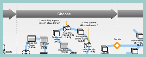
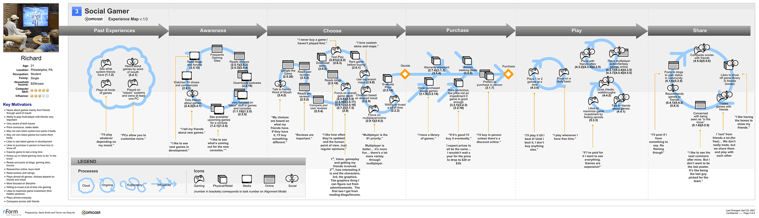
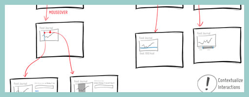
An interesting depiction of user experience has surfaced the other week over at the nForm blog in the form of an experience map. Gene and his team has come up with a way to represent gaming related experiences of three distinct gamers. In a way then this is a merger between a persona and a time based representation. The other interesting thing about this is the visualization and separation of at least three types of experiences: ongoing, exploratory and influenced. Each type of experience has been shown in a standardized and specific way. Furthermore, the diagram also captures and represents a variety of channels which the personas are utilizing at a given point in time. Overall, it’s always interesting to see when designers attempt to convey such comprehensive and unified high level deliverables.
Credits: Gene Smith of nForm
Tags: activity, persona, user flow, user journey
Posted in Samples | 7 Comments »
February 22nd, 2010
Thinking about improving the user interface of this site, I did a couple of minor adjustments over the weekend which I thought I’d share. Basically I focused on how the left menu with all the posts works (accessible by pressing CTRL). The improvement is that an open left menu navigation is now persistent across pages, which allows for easier browsing of posts. The left menu now also focuses to the selected post when opening. Finally, the menu does not come into view when pressing CTRL while typing inside a textbox or input box (users can still press CTRL twice to force the menu to open in such a situation).
I also visually brought out the two ways to subscribe to the site in the top right hand corner by means of stronger Twitter and RSS icons. Oh right, and also added an easier way to retweet directly by means of the TweetMeme WP plugin.
Just thought to share and perhaps hear out what other ideas for improving this site readers might have. Feel free to comment here or add ideas to the uservoice page.
Cheers,
Jakub
Posted in Announcements | 8 Comments »
February 19th, 2010
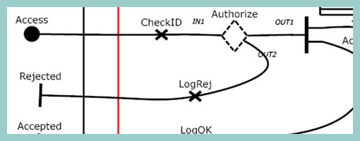
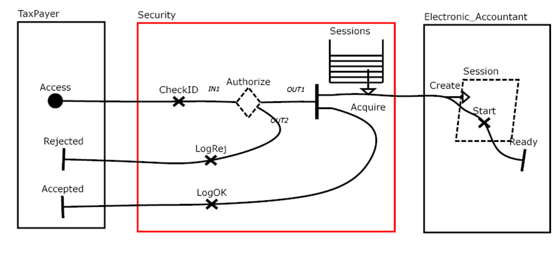
Speaking with Greg the other day I learned about Use Case Maps. This notation which has been initially the work of Raymond Buhr, has its roots in software engineering and perhaps could be an area to draw inspiration from. Use Case Maps intend to convey sequences of events by showing the paths of users over a backdrop of structured system representations. With these flexible scenario-like visualizations, software engineers ensure that the element of time is considered. As part of the notation, Use Case Maps have starting and stopping points and can also branch out. It seems like Daniel Amyot has contributed to this work as well and has published a decent Quick Tutorial with a reference guide at the end. In a nutshell, here is what Daniel writes about the philosophy of UCM:
The Use Case Map notation aims to link behavior and structure in an explicit and visual way. UCM paths are first-class architectural entities that describe causal relationships between responsibilities, which are bound to underlying organizational structures of abstract components. These paths represent scenarios that intend to bridge the gap between requirements (use cases) and detailed design.
Credits: Raymond A. Buhr & Daniel Amyot
Tags: activity, states, user flow
Posted in Inspirations, Samples | 3 Comments »
February 16th, 2010

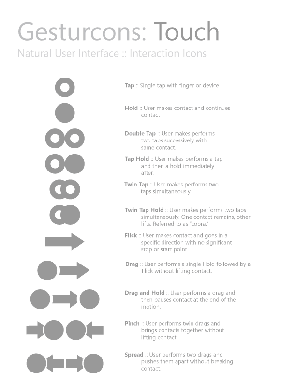
Ron has recently initiated a project with the intention of creating a visual language for representing gesture based user actions. He shares the belief of “gain[ing] common grounds when discussing interactions” and has just released the Gesturcon Touch Pack under a Creative Commons Attribution-Noncommercial-No Derivative Works 3.0 United States License. The zipped file contains EPS, PNG and Illustrator files for your use. His approach supports such interactions as taps, holds, double taps, flicks and is achieved with circular shapes. @vitorious also threw the idea of combining this with my own notation. Hmm, pretty cool.
Credits: Ron George
Tags: activity, draggable, gestures
Posted in Samples, Templates | 8 Comments »
February 11th, 2010
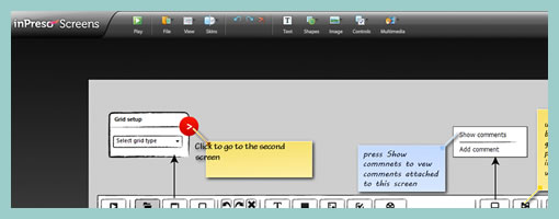
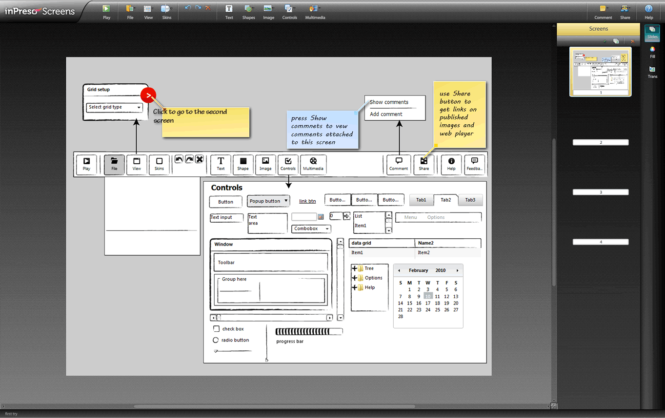
InPreso Screens is another web based wireframing application in the making to keep an eye out for. The company offers a hosted app as well as a downloadable stand alone version. One interesting feature which is being highlighted on their site includes the ability to embed inPreso files into other project collaboration tools such as Basecamp or Confluence. Being hosted, the web player tool also allows users to share their projects as a link and have the readers preview the work on a page by page basis. Heading in the direction of sharing, inPreso only naturally allows for multi user commenting and feedback features. As it stands today, the hosted application comes at around $79 per year. Have a look.
Try out the online version.
Posted in Tools | Comments Off on inPreso Screens Beta
February 6th, 2010
Justinmind has recently kicked off the beta phase of their next version of the Prototyper application. These guys are also running a contest for testers which will last up until February 26 and are giving away free licenses. Have a look, as the 3.0 version brings forth a new “Expression Editor” which allows to specify interactions by means of drag and drop. The instructions for downloading the beta apps for either MAC or Windows are available on their blog.
Posted in Announcements | 1 Comment »
February 4th, 2010
It’s probably nothing new that the sketch has been gaining quite some attention lately as a powerful design tool. Some UI designers have began to precede wireframing and prototyping with free-form pen and paper approaches that afford exploration and support a wider diversity of ideas. For over a year now, in my design process I’ve started doing just the same right after I picked up a set of markers and sketch pads. Looking back, sketching has been wonderful at giving rise to design representations that naturally act as conversation starters and therefore make sketching more so compatible with agile philosophies. However, traditional pen and paper has a few limitations which 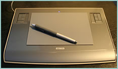 over the last few months became noticeable. As a reaction to this, I grabbed an Intuos 3 from Wacom, installed Adobe Illustrator and began sketching electronically using a pen and tablet. Finding the new approach superior, I have doubts I’ll ever go back to paper and wanted to share some of the reasons why.
Scaling
Like it or not, design ideas need to scale over time and good tools provide room for such growth. One thing that I love about Illustrator (which paper lacks of course) is that the art board or workspace can be stretched as needed whenever concepts need the extra room. The flexibility to resize the canvas is a really great feature especially during early ideation when multiple screens need to be shown together to tell a meaningful story. On the same note, another way Illustrator excels is in terms of a scalable fidelity. Whereas early on in a project the amount of detail might be small, over time however, the fidelity of an electronic sketch has the potential to develop. In a vector environment it is super easy to take a small UI sketch, stretch it to a larger size, and inject more detail inside of it.
Ease of Editing
Yes, in the real world we have pencils, erasers and the ability to redraw or correct our sketches to some degree. We can however only correct our paper sketches somewhat before they becomes unreadable. This isn’t the case with anything electronic or digital where cutting, deleting, undoing, redoing, erasing is second nature. A very common scenario is to draw different screens and only learn eventually that it makes sense for the two or three screens to be placed together – something that is very easily done by reorganizing or repositioning on the computer. Another superb thing about Illustrator is the ability to select a line and just redraw it, causing it the take on the new form. This of course can be done an unlimited amount of times in an electronic tool.
Legibility
Although this might not be the case for everyone out there, I personally find that my hand writing is very hard to read. Unless I spent extra care and time to write legibly, I find that on the computer it is way easier and quicker to type out text that can be read by others.
Carelessness
When I am about to sketch on paper, knowingly that it will be harder to undo, I hold myself back and think twice before the ink or lead leaves a mark. This slow down or inefficiency can be easily overcome in the electronic world with a tablet pen. When I sketch electronically, this worry disappears as I know that I don’t have to generate the right ideas, but instead can easily correct myself if something needs adjusting. This careless quality of electronic sketching brings forth immense value by affording greater exploration to occur more freely.
Reuse
Illustrator allows to create symbols of artwork very easily which in turn speeds up exploration ever more. Let’s say you have the same screen or component which you want to use a number of times across your work. Dragging the selection into the symbols palette allows you to reuse or instantiate that artwork and still have the ability to edit it in one location with it updating throughout. This is simply a superiority that paper cannot compete with.
The above are the reasons why I moved in the direction of electronic sketching. Perhaps the use of paper can still be justified in collaborative sketching sessions when there are more than one designer at the table and the design activity happens simultaneously in real time. For the remaining times, I find that the electronic sketch offers advantages over paper that are just too good to pass.
Credits: Jakub Linowski
Tags: activity, agility, article, linowski, sketch, sketching, user flow
Posted in Inspirations, Samples, Tools | 18 Comments »
January 29th, 2010
Recently a new version of the Pencil Project has come out which brings forth a set of new features. For those who don’t know the Pencil is an open source and community driven, UI design tool which originated as a Firefox extension (best extension of 2008). This new version however has stepped out of the browser and people can install this as a stand alone application. Other new features include the ability to interlink pages, export to various file formats, as well the creation of a Personal Collection (a library of sorts).
Another pretty cool feature is the Clipart Browser. The Pencil allows you to search the open directory over at clipart.org and insert SVG graphics straight into your mockup. Love it. :) Other than that, one minor area which could use some improvement is the handling of a group of items or reusing them across screens. Quite often UI tools either come with some sort of grouping or master functionality which seems to be missing here.
Give it a spin right here.
Tags: opensource
Posted in Tools | 3 Comments »