October 27th, 2009
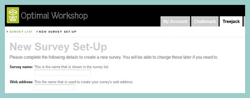
Treejack, is an interesting online tool for testing site structures brought to you by OptimalWorkshop. Simply, a site map composed of categories and subcategories can be presented to users in conjunction with a number of tasks. The individual tasks which are given to participants, force them to select a particular category or subcategory to satisfy the task. Once a number of tests from separate participants have been collected, a results overview page is also available to the researcher. Treejack, then could be a useful tool for the information architect types who wish to test a categorization quickly independent of user interface details.
Be sure to check out the 30 day free trial.
Posted in Tools | 1 Comment »
October 22nd, 2009
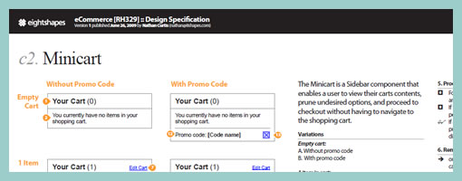
Although I recently made a reference to the EightShapes Unify framework, I think it deserves a separate mention in the templates category. Their approach to UX documentation is a powerful one which emphasizes scalability and reuse. The extensive framework rests on Adobe InDesign templates and supports documents like wirefames, components, flows, page types and library assets. Download the templates straight from their web site.
I’ll be honest however. I’m trying Unify currently at work, and I have to say that InDesign lacks proper sharable objects (or symbols) that can be easily updated. I really miss the symbols which Fireworks is equipped with that allows to edit a group of elements all in one place, and have the remaining instances auto update. Other than that, if you can get used to externalizing reusable page objects as components, then the need for this feature diminishes.
Credits: Nathan Curtis – EightShapes
Posted in Templates | 3 Comments »
October 20th, 2009
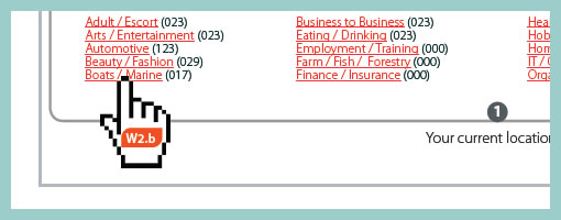
Here is an idea for representing narrative or user actions inside a wireframe. As an alternative to flows I wanted to showcase what the user is doing right in the context of the interface. For this, a simple clickable hand symbol was used with a wireframe reference inside of it. This was meant as to suggest that a click causes a new wireframe to appear. The value of such an approach to flows, can be that the readers of this documentation do not have to flip through pages to refer to flows to understand what the user is doing. Flows can be said to diverge away from the concreteness of a wireframe into abstraction. Here, instead, the flow of user activity is coming closer in on the interface.
Credits: Jakub Linowski
Tags: activity, linowski, wireframe
Posted in Samples | Comments Off on Clickpaths
October 15th, 2009
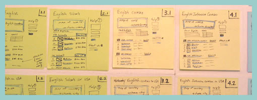
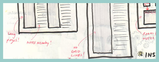
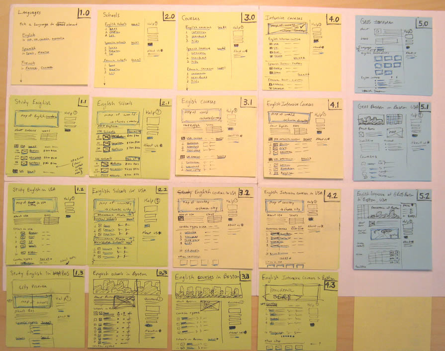
Combine wireframes and sitemaps together and you get something like this following sample from Jason. Wiremaps or siteframes? :) In the man’s own words:
First, the colors aren’t so significant. I just ran out of yellow. :) Underneath each sticky is a few other stickies from previous revisions. As time went on, things changed and so did the stickies on this page.
This document started off as ideas scribbled on a whiteboard. We devised an info architecture that involved controlling the user path by allowing them to drill down (vertically on the sheet) and across ( horizontally) but not diagonally. It’s not super clear, but everyone who needs to know understands the user flow through these pages.
There are 12 new pages that need to be created, as well as revising another half dozen or so. These sticky-frames also act as a site map, or at the least, a site map of templates.
Credits: Jason Robb
Tags: sitemap, sketch, wireframe
Posted in Samples | 3 Comments »
October 13th, 2009
According to Jason, sketches are never complete but only refined. They exist with the intention to pose questions and ask to be scribbled over on top. And that’s exactly how Jason uses them. He will make adjustments and modification straight over them with a red coloured marker. Thus in a way, all on the same drawing, the sketches become a layered representation of the initial idea along with the revisions. Although I personally prefer to use red to represent action items on my sketches, I still find this interesting approach in its power to visualize a history of changes. This makes me wonder though if there would be a systemic way to separate out all future sketch revisions from each other. Could there also be possibly a way to tag which sketched changes belong to which person (should there be multiple authors?) … ahh, just thinking out loud.
Enough of my thoughts. Here is what Jason really thinks:
I was sketching some designs for wireframe templates. The red is my way of calling attention to changes, questions, or comments about the design.
The neat thing about sketches is that what you see there is black and red. The black is my initial guess. The red is the correction to my initial guess. From there, I implement the changes in the live product. So, for instance, I opened my PSD and made the changes in there.
So the sketches are never really “done.” They’re done in the sense that I’m done using them. But they’re not done in the finished sense, they don’t reflect the final changes, other than by what I’ve written in red.
Credits: Jason Robb
Tags: annotation, colour, sketch
Posted in Samples | 4 Comments »
October 8th, 2009
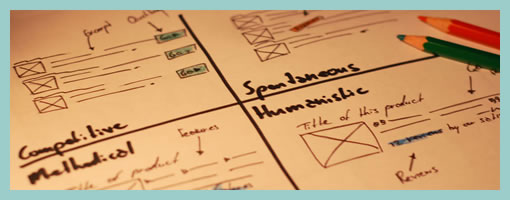
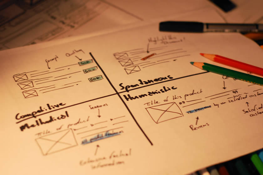
Here is another interesting sketching approach which Henk describes in detail in an article on his blog. Basically, the framework he uses aims to support various personality traits based on the Myers-Briggs Type Indicator, as originated from the psychologist, Carl Jung. In this approach, the designer is forced to generate concepts for these distinct personality types which are segmented into four areas. These types include: competitive, spontaneous, humanistic and methodical. I guess it’s interesting to see designers find inspiration from 100 year old ideas.
Credits: Henk Wijnholds
Tags: alternatives, sketch
Posted in Samples | Comments Off on MBTI Sketching Framework
October 6th, 2009
Theresa Neil, who recently co-wrote Designing Web Interfaces with Bill Scott, is taking on another O’Reilly book on the topic of designing for mobile. She’s looking to interview a few designers who have experience in this area and asked me to post this up here. So if you want to share your work experience on one of the following platforms such as: iPhone, Enjoy, Palm Pre, Android, or others, please get in touch with me (see email on right navigation) or reach out to her directly. Theresa wants to do a walkthrough like interview and get at the best practises around each platform. Now how cool would it be to end up in a book? :)
Posted in Announcements | 1 Comment »
October 6th, 2009
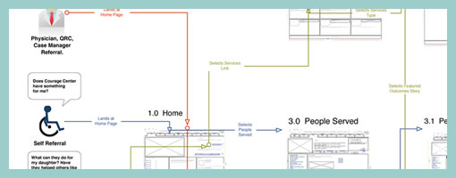
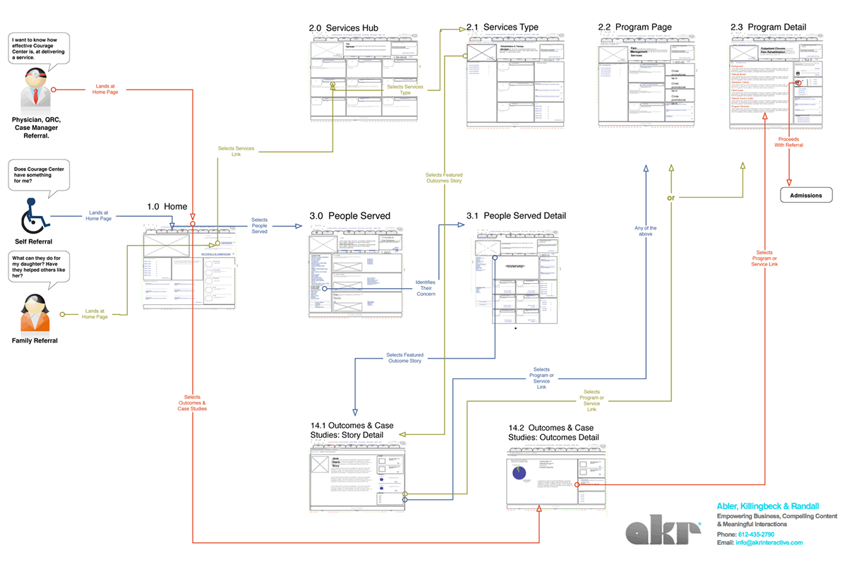
I enjoy seeing flows which try to capture more complex activities. After all, interfaces are under constant strain from various people which use it in a multitude of ways. Carlos has just shared a sample which represents a flow containing at least three different persons attempting to interact with the same interface. The different coloured paths uniquely indicate how the different users take twists and turns over the same screens. Come to think of it, the various users which start off the flow, could just as well be replaced with various use cases belonging to the same person type.
In his own words:
It shows three different persona on a navigational journey through a cross-linking architecture, that takes them through 2-3 different sections of a site — not including the home page, from which they all start. The “Self Referral” persona goes through three sections or the site: Who We Serve, Outcomes & Case Studies, and Services on their path.
The journey starts with the informational intent of the persona. From there you can follow their journey via a line colored for that persona, which describes action-events in brief notes on the line itself. The page thumbnails are the actual wireframes shrunk down. This document is meant to be read along side the wireframes, casting light on them, and vice versa.
Credits: Carlos Abler
Tags: activity, user flow, user journey
Posted in Samples | 6 Comments »
October 1st, 2009
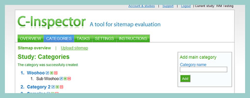
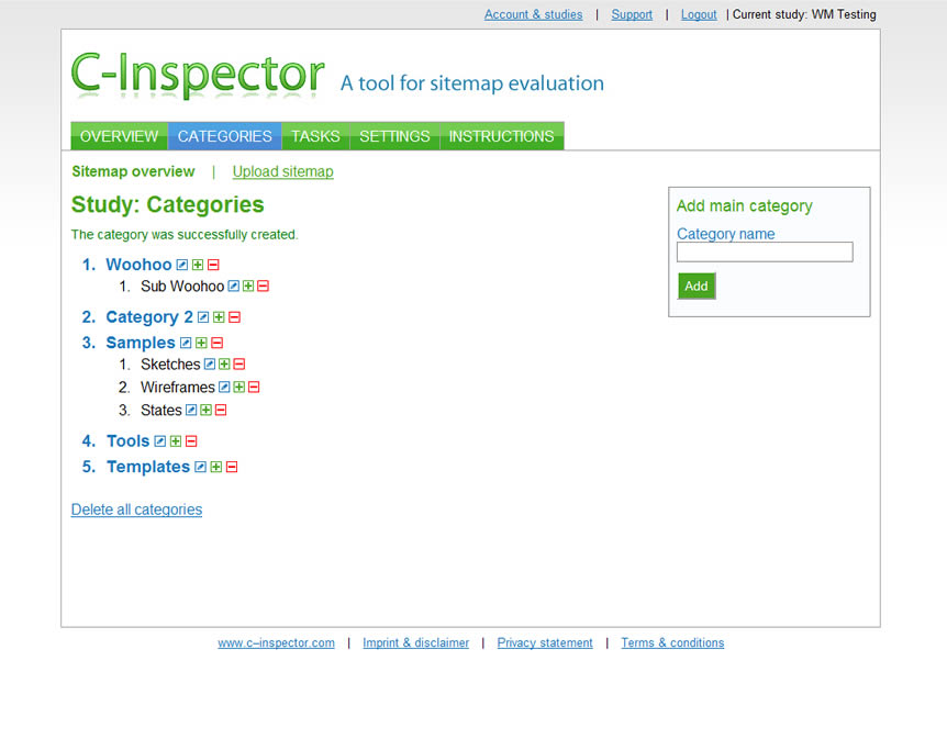
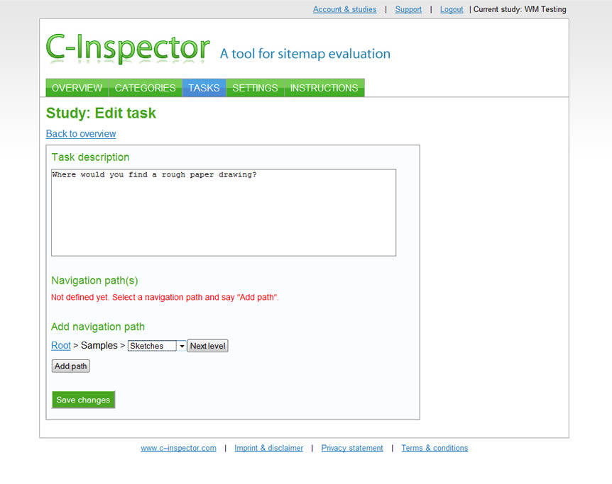
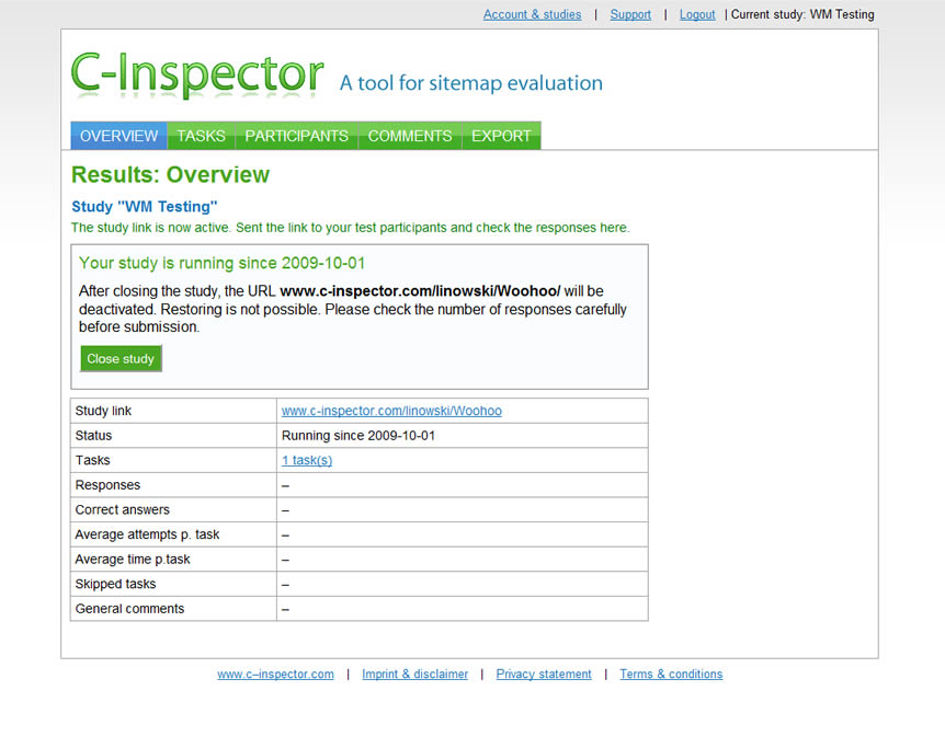
C-Inspector, as the name implies is an online category evaluation tool. The idea is quite simple and the tool works a little something like this. First, the information architect sets up a categorical multilevel sitemap of sorts. The nice thing here is that the categories can be manually adjusted using the online interface, or alternatively a CSV file (Excel?) may be uploaded. Then, the IA can setup a number of tasks which pose a “where would you find x” question. Once a welcome and thank you message is created, the project can be saved to a specific URL. As this URL is then opened by participants it initiates the test. During the test, users aim to identify a correct category which they think might be the appropriate answer for each task. When the test finishes, the IA can then look through an overview screen which shows which tasks where completed with what success rates, number of trials, and timings.
At a $99 monthly subscription, C-Inspector isn’t cheap. The manual category inputing or welcome message setting also aren’t very responsive as the interaction requires quite a few submits and button presses. Aside of the subtly interaction issues, the tool can be a powerful addition to an information architects arsenal.
Be sure to check out the 30 day free trial.
Posted in Tools | 3 Comments »
September 29th, 2009
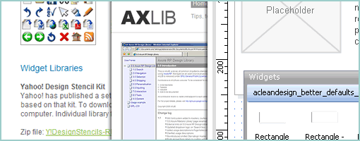
Axure is quite the popular prototyping tool for which a ton of widgets and libraries have started emerging. These downloadable and reusable pattern libraries can often speed up the prototyping process. Here is a quick compilation of the latest I recently found:
- Official Libraries & Widgets from Axure
- Axutopia – wide collection of Axure widgets and icons
- Layout grids for Axure and Pencil (from Userfocus) – a 960-grid system template
- AXLIB – a robust design library of usable interaction patterns
- Ari’s OS X Axure RP Widget Library – a comprehensive library of OS X widgets
- Free Axure Design Patterns (from William) – a couple popular UI patterns
- Conetree Axure Patterns – hand gesture icons & clear input field
- Total Wireframe – a few patterns (with a small price tag)
- A Clean Design – Better Defaults
- A Clean Design – Axure Design Pattern Library v2.0
- A Clean Design – Social Widget Library for Axure
- Konigi Icons for Axure
Did I miss anything? If so, please add to comments.
Posted in Templates | 12 Comments »


