September 24th, 2009
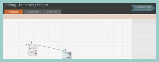
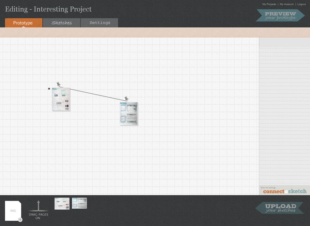
This little application is still in a beta development phase, but nevertheless has some interesting potential as a means for adding interactivity to UI sketches. Simply, Connect-a-Sketch is (will be) an online tool that allows to upload a set of images or sketches, which then can be interlinked with click-able hot spots. From what I’ve noticed so far, the interactivity that can be set is limited to basic clicks, but who knows what the future may bring. Look out for an upcoming release in the near future or follow the latest and greatest on twitter.
Posted in Tools | 2 Comments »
September 22nd, 2009
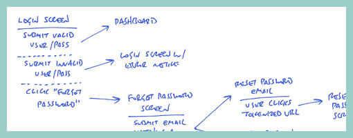
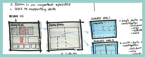
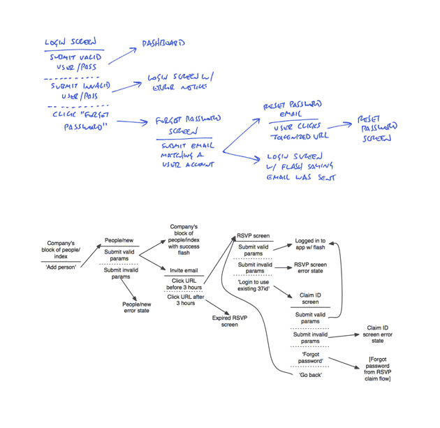
Amongst screens and wireframes, as interaction designers it is always important to consider the time element which binds and glues interface forms with human activity. Ryan Singer of 37signals just wrote an awesome little article about a quick way of noting down one of the common time-based documents we deal with – user interface flows. His shorthand version of a flow relies on making clusters composed of interface states or screens (above a horizontal line) and the actions which users take (below a horizontal line). These interface-action combinations are then transformed into a flow with the help of arrows that show possible sequences.
As basic as the approach sounds, it offers something quite unique in its potential for flexibility. Interestingly, Ryan has figured out a new way of how to represent alternative user actions per each screen (something I haven’t seen done before). These various actions which the users may take, can be separated out using a dotted line. More so, the notation also allows to visualize combined interface results stemming from a single action with the help of forking or branching arrows.
Overall, in an agile fashion, Ryan does not give much weight to these documents. Just like any other light and sketchy work, he hints at these flows being ephemeral and perhaps even a bit self-targeted:
Now don’t forget: all diagrams are destined for the garbage. The meaningful work is work that directly affects our customers as screens they can see or code that functions. But we still need to communicate and manage our work along the way. This shorthand has met a bare minimum for me to get a flow out of my brain in order to move on to other things. I hope it’s useful for you too.
Credits: Ryan Singer
Tags: activity, agility, alternatives, sketch, states, user flow
Posted in Samples | 2 Comments »
September 17th, 2009
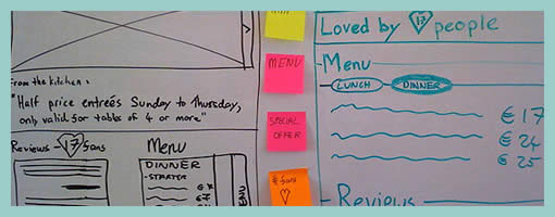
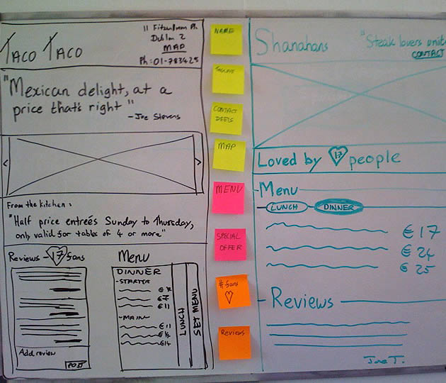
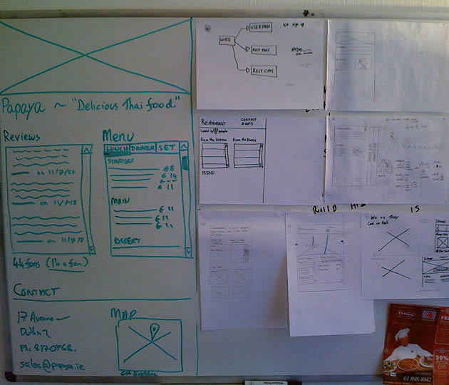
Des just sent me a link to where he describes his early design process with a few whiteboard wireframes. One thing he does is create some sort of inpage requirements with the help of sticky notes which are placed alongside the UI work for inspiration. These rough and abstract textual ideas or requirements guide his thinking during the wireframing process. More so, he goes even further and uses colour coded stickies to denote priority.
In his own words:
They’re colored by importance. For this project it was:
Yellow = super important, site is useless without
Pink = nice to have, but requires restaurant owners to do some work
Orange = social features, relies heavily on people using the site (might not be there at all).
At the same time, I also found it very interesting that Des explores variations or alternatives as not to fall into the pattern trap. There is another interesting article related to this which he wrote about, Thinking in Patterns, on his company blog.
Credits: Des Traynor
Tags: alternatives, colour, priority, sketch, sticky notes
Posted in Samples | 1 Comment »
September 15th, 2009
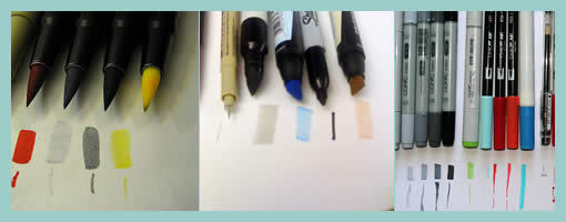
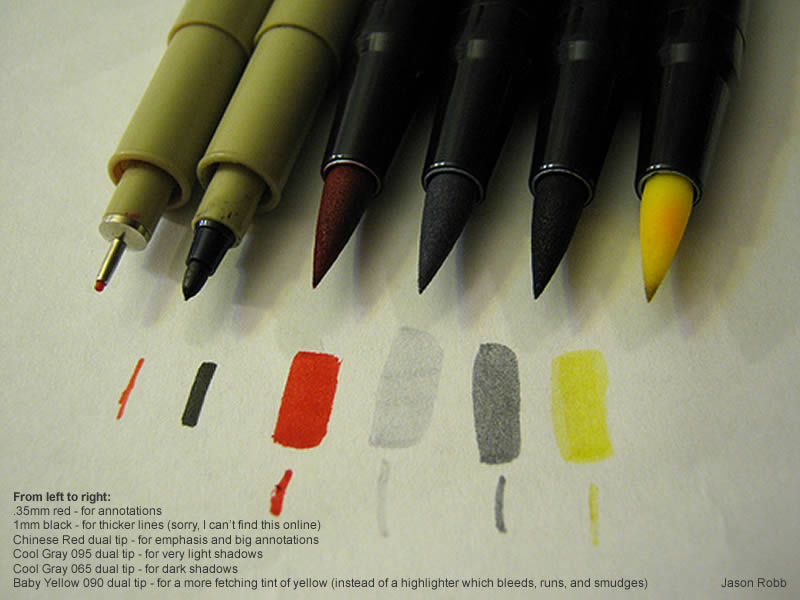
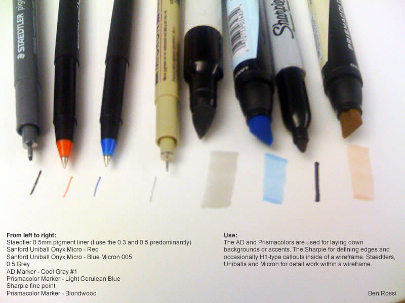
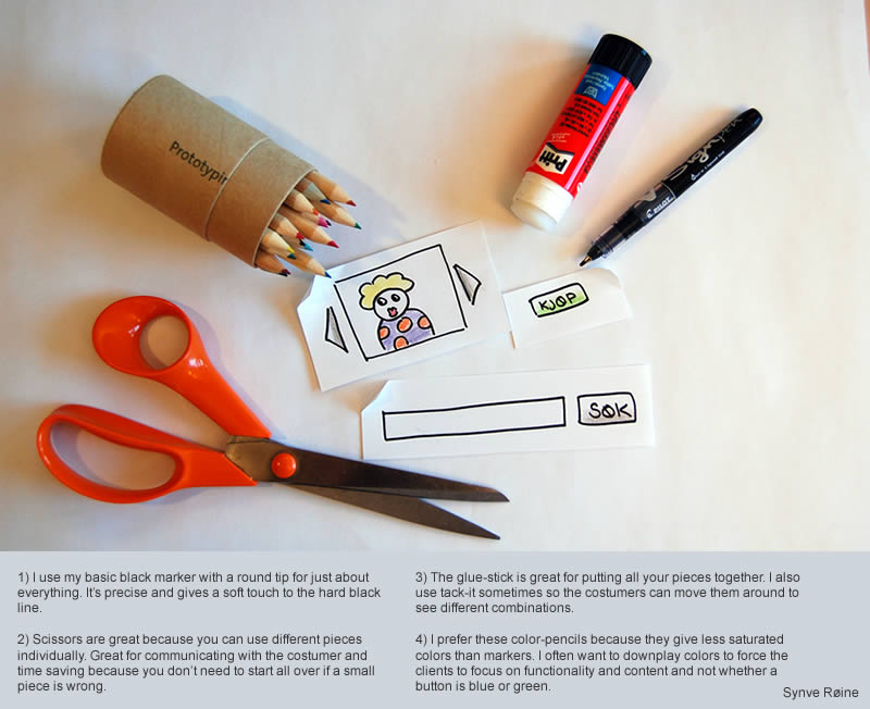
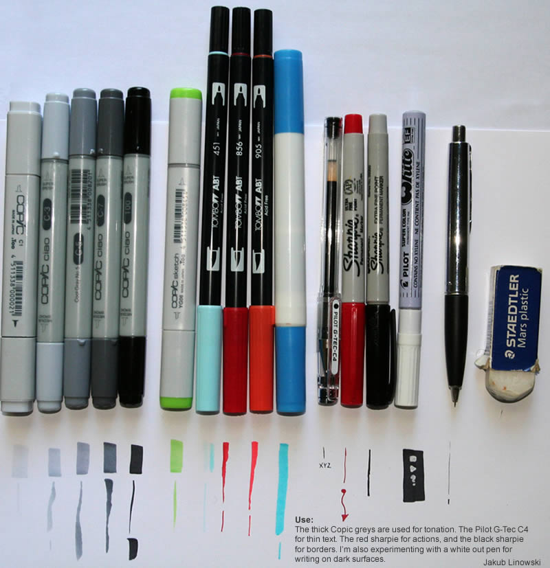
Ahhh, the good old tools. Last week I asked around about who uses what type of markers, pens and pencils, and here are some results. In general, people tend to have at least a few light to medium dark and thick grey markers for laying a foundation down. On top of the greys, a few coloured options are also used for extra emphasis when needed. Then, most designers also rely on using some form of a thin gel pen for detailed work such as text. Pencils and sharpies are also visibly used for callouts, annotations or defining interactions. One other nice thing about markers such as these is that you can also layer them to achieve higher saturation. By putting a few extra strokes on top of one another, more of the ink seeps into the paper and you can have darker tones. Aside from markers, Synve prefers to use crayons over markers as to have an even stronger control over saturation. Nick also uses an empty business card holder for drawing box outlines and blue tack for attaching modal windows. :)
The more popular markers which people seem to buy include: Copics (refillable), Tombow (less pricey, but equally good), and Prismacolor.
Thanks to: Jason, Nick, Ben, Synve, and Jakub
Posted in Tools | 15 Comments »
September 10th, 2009
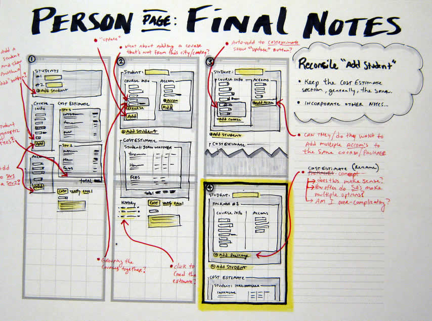
Quite often user interface pages will have to be long and scroll. As obvious as it sounds, here is a sketch which supports this. Jason has simply decreased the size of his frames and made them taller. On the same note, one of his sketches also makes use of a zigzagged line. I would guess that has been done to suggest a continuation of sorts, allowing him to communicate that there is more to the page without having to go into detail. I also like the heavy emphasis used on the title. Nice!
Credits: Jason Robb
Tags: annotation, colour, forms, scrollable, sketch, wireframe
Posted in Samples | 1 Comment »
September 8th, 2009
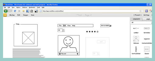
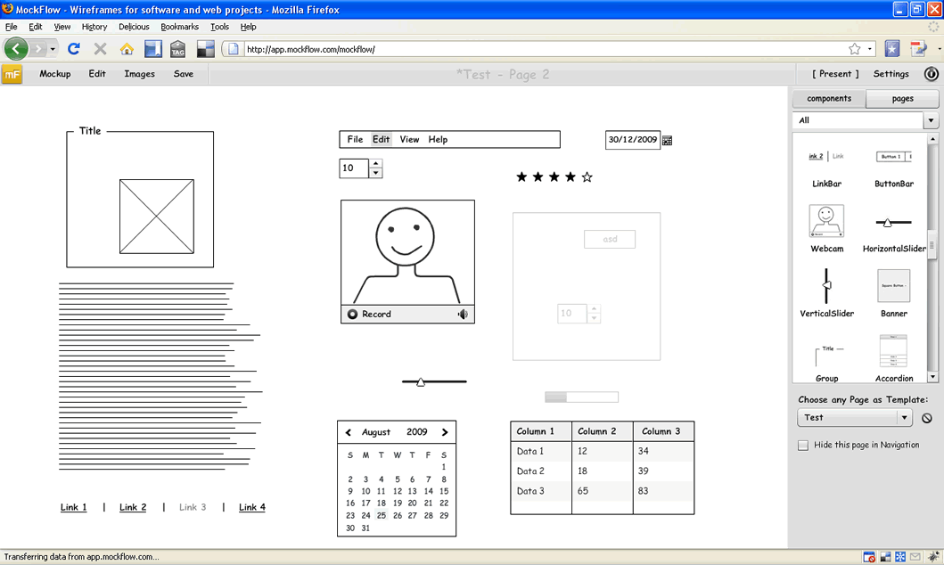
Another interesting online wireframing tool developed in Flash has just launched last week – MockFlow. It comes with pretty standard feature set such as: draggable components, pages, basic linking, sharing and online storing. There is a nice ability which allows users to change any page to a master. Other than that, I haven’t found much more which stands out as unique on this one. MockFlow is quite simple and resembling existing UI tools out there, is an nice alternative which comes without a high learning curve.
Give it a try right here.
Posted in Tools | 3 Comments »
September 3rd, 2009
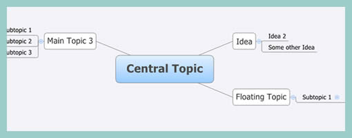
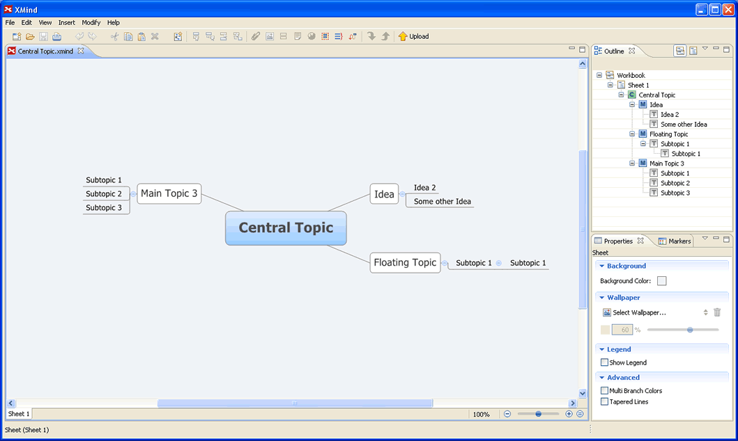
In the light of the previous post about creating Functional Mindmaps, XMind is another open source tool to help with just that. The software is available for Mac, Windows and Linux, and allows to brainstorm ideas in a social way. Mind maps can be generated to explore abstract requirements or ideas. After a mind map is created, the document can be shared online free of charge. XMind also comes in a Pro version which allows to share your work privately. Pretty cool.
Download it here.
Tags: opensource
Posted in Tools | 5 Comments »
September 2nd, 2009
Here is a quick idea to try to squeeze out some samples from all of you out there. I just ran into Jason’s latest flickr photo about the markers he uses for drawing UI’s and I thought it would be cool if I’d ask all the WM readers to do the same. Once I receive some examples, I’ll post them up here in a short article. So:
- Line up your markers, pencils, etc. (showing what they can do on paper)
- Grab a photo of them
- Describe what they are and what you use each one for
- Submit by email (listed on the right).
Just thought it might be interesting …
Posted in Announcements | 1 Comment »
September 1st, 2009
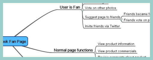
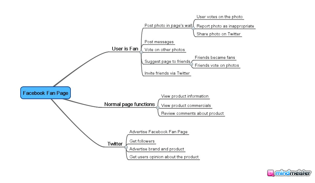
Abstracting away from the way the interface looks, we begin to face higher level goals, functions or activities that the design ought to support. Eugenio here has done just that by using Mindmeister software to generate a high level mind map of the activities users will be able to accomplish. Thinking about functional requirements such as these before jumping into wireframing is a divergent design tactic as it allows more flexibility in interpretation. In other words, by being more ambiguous these functional mindmaps can generate a greater variety of new ideas. Comparatively, wireframes or sketches which are more concrete, are a convergent tactic which steer us in a single direction with the aim of getting us all “on the same page”. In my opinion, a design process that makes room for both divergent and convergent tactics, generates the best results. I guess, Eugenio’s sample here is a nice reminder to think a little bit bigger beyond the boundaries of the wireframe.
Credits: Eugenio Grigolon
Tags: activity, alternatives, mindmap
Posted in Samples | 8 Comments »
August 27th, 2009
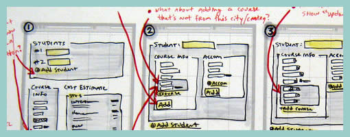
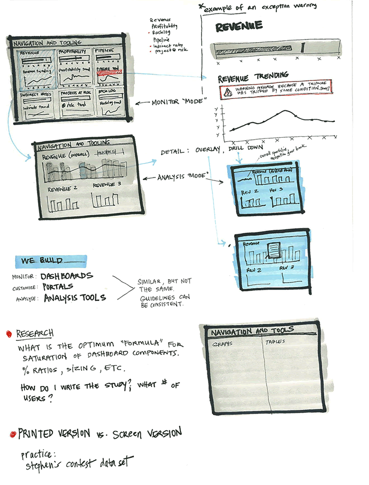
Ben just sent me a sketch which uses a number of techniques seen previously. One thing which is a bit unique perhaps are some of the short lists of requirements or goals which he combines with his sketches (seen on page 1 and 3). These seem to guide his thought process at the outset, and are often at the top of a page in the form of a list. Another cool thing he does is break up his ideas into some conceptual chunks with distinct titles that are highlighted. He also emphasizes his sketches similarly to some approaches listed earlier. To draw attention to certain elements, the thickness of borders is varied and some of the screens use colour overlays. Ben’s sketches are also occasionally loaded with question marks – something I’ve noticed to appear in my own drawings as well. Here is how Ben describes his process:
1. I usually lay down a 10% cool grey field where I am going to show “the screen” (or whatever object I am going to sketch)
2. I then draw in the frame of my screen, usually with a Sharpie. I like the effect of the bold border, and it helps me to set up a hierarchy within the sketch with different line weights (Staedtler 0.1, 0.3, 0.5, 0.7 mm black pigment pens)
3. Once I have the screen set up, I just sketch as needed, showing different levels of detail depending on what I need to document
4. I use a wash of blue (very light blue marker) to set off anything that I want to emphasize, red pen for interactions or to call out areas
Sometimes I use a light color pencil to add dimension or texture if I feel it’s important for the design, beyond that, it’s pretty free form.
Credits: Ben Rossi
Tags: annotation, colour, emphasis, sketch
Posted in Samples | 4 Comments »


